


Ducks 3rd Jersey Leaked

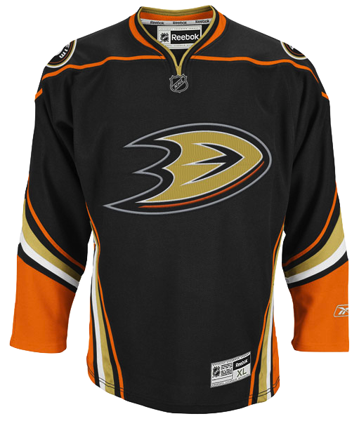 Anaheim Ducks 3rd jerseyThe Anaheim Ducks new alternate jersey has been leaked by the online sports retailer FansEdge.
That can't be good for their Reebok account. However, it is good news for us jersey geeks as Icethetics can now provide a visual sample of what you've read about for weeks.
By the way, Greg Wyshynski at Puck Daddy was actually first with this story. Check out his take on the new threads.
Despite it coming from a third party, this is official Reebok photography (right). We should all be very familiar with it. So at least for me there is no question whether this is the Ducks' actual jersey.
It makes sense that Reebok has provided images to retailers ahead of the November launch of the new sweater — though retailers were probably asked to keep it under their hats until then. Oops.
 But one image wasn't enough. FansEdge kept going. Here's a look at the back of the jersey (left).
Since it's not customized, we can't be sure about the number and lettering style. We could assume it will be the same as the home and road sweaters but you never know.
According to the Ducks, the jersey will make its official on-ice debut on Nov. 26 when they host the Chicago Blackhawks (on Black Friday, of course).
As far as the design, I'm not crazy about the striping up and down the sides. Of course these shots don't provide the best view. We'll have to wait to see it in action next month.
The upshot is the "D" logo on the chest. Been waiting for that since 2006, when the current home and road sweaters were unveiled. Plus, as you can see on the shoulders, the original Mighty Ducks logo returns in the new color scheme, as I mentioned previously.
What do you guys think? What did they get right? What did they get wrong?
 Chris
Chris
By the way, in case you didn't click the link earlier today, the image at FansEdge has since been removed. It will remain here on Icethetics, however, for informational purposes.

Reader Comments (120)
Meh, it's better than what they have now. I like their use of orange.
I'm calling that this will be their home jersey within two seasons, along with a white version for the road. I like it, especially the "D" logo.
It's rather dull... they took crazy horizontal stripes and made crazy vertical stripes instead.
Also don't like the shoulder. Didn't look right when Carolina first did it, nor when Minnesota did it last year. It looks even weirder here. And the collar... ugh.
Ducks really dropped the ball here. The striping "pattern" is exactly the same, although the placement is different (doesn't really make it better) and it just looks very awkward, altogether.
Only part of this jersey that I actually like in evfen the slightest is the logo.
Why another black sweater? The design looks like something an amateur would throw together in Photoshop. If it is the real deal it will be the worst third in the league, just barely overtaking the Sens' poor decision making skills by passing up on a classic look with stripes and the big "O."
I kinda hope the pants would be orange.
I like them. They're not perfect, but I think I like them a lot more than their current home and away jerseys.
Wow. Absolutely atrocious.
The logo is really attractive and makes more sense than "Ducks", but everything else is unwelcome, especially the orange. Sickening. Don't make Getzy wear that!!!
Mind you, I was like 13 in the days of cartoonish Ducks jerseys... But as someone who went to the first Ducks game ever and most games for the next 11 years, this is my least favorite Ducks jersey ever.
Wild Wing breaking through the ice was stupid, but at least it was creative. This jersey is so so so boring.
not sure what to make of it, but it certainly gives the ducks a fresher look than their current jerseys
I held my opinion on the duck foot logo until I saw it in full application and I have to admit that it looks worse that I'd imagined. I see the letter D... and then I see a foot... and yep... its a duck foot, woopie. I'd like to get a better view of the shoulder patch, but if its the modified and re-colored Mighty Ducks logo than I think that would've made a stronger chest crest.
Featuring orange more prominently is a nice change from the regualr jerseys, but too much of it doesn't mesh well with the gold. The gold pops and draws the eye in, kinda subdues the orange,
Not bad. Side stripes aren't horrible. At least they didn't do the vertical piping. I hate when teams do that. It's a simple and clean look. And I like the sleeves. No they ought to do a white version and lose their hideaous wordmark.
I'm willing to bet that by opening night 2011, these will be their full-time home jerseys. Not necessarily a fan of the design, but that seems to be the trend in the NHL, and it's definitely better than their current sweaters. Will we see a matching white one to accompany it?
Dig it. They should use this as a basis for a new jersey set, and develop a new third based upon the original logo, but with the current colors. I like that they used more orange in this one.
the shoulder yoke looks out of place...might look more complete sans yoke. love the logo though. 5 out of 10 from me.
Too much orange. And careful what we wish for, I guess; the italicized D looks off-center when it's alone on the front. I predict we see the return of the duck mask on the front within 5 years.
i love it! best third jersey in the league! it's so unique and fresh. i already own a purple jersey, and their current home one, but i want this badly.
As most people have said here, it's not classic Mighty Ducks material, but it's a definite improvement from their current threads. I hope Anaheim follows the recent trend of teams' uni changes: in a season or two, make this the home jersey with a white version of it for away.
Way better than what they have now and I like the arm striping. The stripes on the sides are kind of meh but way better than what they wear now.
Ew.
I really like them. At first glance this is a very interesting way to have striping on a jersey, I know the whole league is in a throwback phase so it is refreshing to see teams going out of a limb with some different patterns. Overall I would give it a 8/10.
I love it, the orange look surprisingly sharp and fit very well on the jersey. I'm not a fan of the webbed D logo at all, look too plain. But it is a huge upgrade over the wordmarks. I am glad to see the Mighty Ducks logo is going to make a return, I find it the best logo ever for the Ducks. Disney or not, it still look good!
MARGINAL improvement.
It's pretty bad, but not as bad as current jerseys.
I'm not that impressed with the design. Other than the webbed D logo as the crest there really isn't much else I like about it. I don't like the shoulder patch logo or the striping up the sides. But I'm sure Ducks fans will like the jersey.
I like the greater use of orange. However I don't like the orange stripe going across the shoulders. With that said I hope this eventually become their home jersey. Also the 'D' looks pretty far to the right, it could be the Edge style or just the style of Reebok's pictures. But to me it doesn't look like the logo is centered.
This design is about 1000x better than what they currently use. Sure the striping along the sides is...different...but honestly, bravo Anaheim for breaking free from this retro phase. I do like the retro stuff, but its getting a little overplayed, and oddly enough, its nice to see something like this, a breakthrough design. If only the black and orange were swapped on this jersey, it'd be gold.
Better than the current home and road jerseys, good to see the D up front and centre, but I don't like mix of colours. I'd have liked to have seen more of a nod to the original Mighty Ducks jerseys, the colours were bang on! All in all, its a miss in my books.
I like them better than what they've been wearing. I like the unique striping. The only thing I don't care for is the shoulder yoke piping.
I think it looks pretty decent, it's just a cool, futuristic jersey. Eventhough it would've looked much better without the orange striping on the shoulders.
Don't agree about the logo though, a big, silly "D" isn't much better than their wordmark. A team named "Ducks" should be able to much better than that.
I agree with Jon W., they are far from perfect - but are loads better than their current jerseys. I wouldn't mind seeing them play off of this but getting rid of the piping on the sides. Maybe even a black-on-white shoulder/body combo for away sweaters.
I'm not a huge fan of the shirt to be honest. I think with the should piping not only on the front, but on the back itself that it should have been a lace up shirt.
As for the side stripes I'll away a better picture as I'm not 100% on them.
However, for some reason it is pleasing to the eye, but I just don't like it. Mind you I'm happier with this shirt than I am of the Oilers 1st and 2nd shirts. That's possibly more praise than I would want seeing as I'm not a fan of the shirt.
It's a step in the right direction. That's not saying a whole lot considering their present set of jerseys, but at least they seem to be making progress.
They're better than the current Home/Road set, but really, what isn't?
As it stands alone, it's not good. It's a dull logo with far too complex striping patterns, and a yoke outline with no real shoulder yoke.
I would have like to have seen an orange third jersey personally. But I am also glad to see the D on the chest. It looks so much better than the wordmark.
Yeah, not bad, but could have been better for sure. I'll give it a B.
No bad...like the orange - Nice sized chest logo...readable at least
As a Ducks fan, I love it. Especially the orange/black/gold detail on the collar, having the orange blend into the yoke piping is an interesting idea. And the Disney era logo on the shoulder makes it that much better. Been waiting for the standalone D as well.
anything is better than those god awful jerseys they wear now...anyway, i like this a lot, the only change i would make would be to remove the solid orange on the sleeves, it seems like too much, the orange piping like what borders everything else would seem more fitting...but lets see what they look like on the ice
ew... i didn't think it could get worse than their home and away jerseys.... must have hired the same guys that did the seahawks 3rds.
They aren't necessarily bad, but they REALLY lack creativity. The Duck's current home uniform is black. Should not the alternate at least partially deviate from the norm? Yes, I know Boston didn't, but that didn't make it right there either. At least the Rangers went for a darker, retro look. I was hoping for something amazingly hideous from the ducks, like a burnt orange type of jersey. Awful, but at least it would be unique.
Looks horrible. Apparently Anaheim and Reebok haven't gotten the message about their newfangled stripes and swooshes. People don't like them, hence why all the retro designs are back this year, and fans are loving them. Ditch this noise.
Wish we could get a better look at the shoulder patch. Feels like a "third for third's sake." The third should stand out, this looks like it could easily just be a cast-off of the home design.
Leaked with not even a whole month left until its official unveiling. Oops.
But yeah, I'm definetely liking what I'm seeing here. The D finally takes centre stage as a jersey crest, and my personal favourite the original Mighty Ducks logo makes a welcome return to the shoulders. Part of me isn't too surprised that it's not primarily orange, but considering that it's the team's "favourite" colour it's nice to see it being heavily focused on as the secondary colour.
The Blue Jackets are looking more and more amazing to keep theirs quiet.
Yuck! I dont like it AT ALL! Reminds me a little of the way the Canucks looked like in the late 80s early 90s and that was simply gross,,Cmon Ducks the Kings can be black cause they used it first, as thier rival, you should not use black, put more accent on the ORANGE!
Sure beats the old set, though that isn't saying much... I give it a C.
I like it better than their regular jerseys because of the D Logo alone as the front crest but the striping is a bit overdone, especially running up the sides as mentioned. I personally would have liked to have seen the team incorporate in green, that of a Mallard Duck instead of going the black jersey route but I guess they stick to predominant black. Overall, not bad but it just seems it could have done more.
Personally, the side piping ruins it for me. It's too busy at the bottom. Maybe it will look better when it's actually worn by the team, but the stock photo makes me dislike it.
My first impression is that there are too many stripes, but I guess I should've expected that from a jersey in the Reebok era. The orange piping on the arms and sides is a bit redundant and I think a full orange shoulder yoke would've worked better.
Bottom line, like Jon said, they're better than the Ducks' current jerseys, though that doesn't really say much. Don't mean to be so negative, but after the black/eggplant/silver third Anaheim came out with when they were still "Mighty," it's disappointing to think of how much better this could've been.
Like Chris explains for the reasoning behind the way he did the galleries, however, you can't fully judge a jersey until you see it in action.
Ditto.
I like.
Definately an upgrade on the crest. Love that they brought back the original loco on the shoulder patch. But not really liking the overkill of the orange on the shoulders. I'm curious to see how far down those lines go. It looks like they wrap down to the wrists. That may be a bit too much. Otherwise, I like it.
Definately picking one up on game day.