


Saturday
Oct092010
A Beautiful Sight
 70 Comments
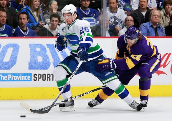
There's no news here. I just want this picture to be the first thing Icethetics visitors see for a little while. Color is slowly making its way back into the NHL. Because here's what this game would've looked like on any other night:
So enjoy it.

Reader Comments (70)
HA! I was HERE when it was posted! Nice work to keep the streak alive, Chris. You did it with 12 MINUTES to spare!
I'm undecided. I don't really like either of the jerseys personally.
hopefully the kings make these their third jerseys for next year and they make their current thirds the new home along with new road. loving this game.
Now that's what hockey uniforms are supposed to look like.
Black is creeping out of the NHL, but we still need the dark unis to quickly follow. Was watching the Blues v Flyers game tonight and the Blues dark blue looked black on tv. Terrible.
Being an Icethetics regular, I already aware of how much a jersey-nerd I am.
But watching this game... just brings me so much joy.
It's beautiful. Truly beautiful.
I prefer the brighter colors of the past. I prefer LA in bright purple & yellow. I prefer St. Louis & Buffalo in bright Blue. I prefer Pittsburgh in, well, black. But with bright yellow as the accent, not cat puke yellow/green.
I absolutely love LA's purple sweaters. It just feels right.
better than the crap toronto wears.
So pretty!
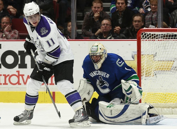
those look so great... any chance you have any pics that only include Jon Quick?
The Canucks should have the 3-color collars on their regular jerseys.
And it was quite interesting to see two teams going NNOB. The last team to go NNOB, I believe, was the Leafs in '97, when they had that c.1931 throwback with the stripes all up the sleeves, and they did oversized numbers in an odd font.
Got any pictures of Quick? His pads, catcher and blocker were all coloured to look like the tanned leather of the olden days. And speaking of history, it repeated itself. The Kings won tonight, on the 40th anniversary of the first meeting.
Im all for color/tradition. I love what the Kings and Canucks did tonight. I wouldnt mind the name plates being there or not. NHL needs to change it up and get some color back into the jerseys. I like yellow numbers and name plates, or orange numbers like the oilers. Instead of just the simple white and black. Boring......
Islanders, Caps, Buffalo, and soon to be the Oilers figured out their jersey problem. Now a few more teams need to follow.
Such as:
Canucks- White with rink logo and V on sleeves. Make home version same thing, invert colors. Third jersey-1994 black n yellow.
Kings- Purple home, Yellow away, 3rd black current 3rd or gretzky era logo black.
Oilers- ditch anything navy. Stick to old school royal blue and orange please.
Flames- Go back to red white yellow. No more black!
Stars-Go back to the Stars logo from a few years ago. Dallas written on the front is so boring. Make a new third if u must
Panthers-Relocate to canada please
Yotes- if your gonna stay, change ur jerseys to something better than you have now which would be anything. I am an avid collector and I wouldnt even consider your jerseys for my collection. If you are going to move, Keep it the Winnipeg Jets please.
Pens- Not bad, but I do prefer the Yellow, Black, White of the 90s. Wont cry if it stays the way it is now though.
Minnesota- 3rds are nice. Home and Away sweaters are decent. Not a big fan of the logo's though.
Nashville- see Panthers
Devils- Keep the christmas tree look. I honestly like it. The brown shorts also. Simply amazing. A true hockey outfit.
Ottawa- Keep home and away. 3rd should be replaced with the big O logo in place of SENS.
Ducks- boring logo and colors. Prefer the Mighty Ducks logo and colors.
Gorgeous!!!
I can't say I liked either of them. The no names on the back of the jerseys is a bad, bad idea IMO.
Don't care if I don't see either of those jerseys again. Atleast put the name on the back and I'll be okay with it. History or no history, no names sucks.
LOVED watching this game with the classic uni's! I wish the Kings would bring back the purple and gold for good, I miss the good old days. Too many teams now using black as primary color...its getting old.
I personally prefer the Kings jerseys with the full arm trim... but isn't it nice to see a Kings uniform with no black ANYWHERE?! (And I don't count the tape around Zeus' socks)
Those Vancouver unis are amazing, perhaps the best uniform that will be used this season by ANY team (Goodbye cookie cutter EDGE bullcrap). Anyone agree? LA's are a little over the top. Thats a lot of purple and yellow there. I would like to see a black and white home and away jersey for them. Those are quality.
I think both jersey's are stellar - I would really love to see both teams convert full-time to these jersey's and like you said Chris, bring back the bold retro colours!!!
You really cant get much better than this.
Great pre-game ceremony! Too bad we couldn't hold on... Interesting fact about the result though, the score of the first ever Canucks game 40 years ago was 3-1. Though the score was 1-1 at the end of overtime, take note LA scored twice in the shootout and the Canucks didn't. So history kind of repeated itself with a modern day twist. Almost makes me wish we were facing the Leafs on the 11th (Canucks' first ever win 40 years back) but seeing what they did to Ottawa tonight, (in their very good looking uniforms) it's probably better we are facing Florida.
I agree completely Chris. Notice how the colours of the stick and rink logo (simple as it is) matches the colours on the uniform. Hello Canucks: that's how it's supposed to be!! Instead, you have a dark monochromatic whale in which the detail gets completely lost (when viewed from a far) and just appears to be this lifeless logo rubber stamped on to the uniform. The other nice thing was having the home team wearing white. Hello NHL: That's how it''s supposed to be!!
Tony Pavao
Vancouver BC
I was at the game and I will say that this is one of the greatest uniform matchups I've seen in a very long time. It just kills me that the Kings' vintage purple and gold uniforms are not their primary look, which it should. If the NFL Vikings can keep their purple and gold, why not the Kings? Colourful, but simple and elegant in design.
As for my Canucks, great, great, great look. The stripe are sharp and the white "V" on the arms are a beautiful touch. The pants are awesome. Use these uniforms more often and beyond this season.
This is precisely how the Kings should look! Get a white home version with purple and yellow trim and the only obstruction to bringing back forum blue (the yellow road unis) is no longer an issue.
this was awesome to watch. pretty cool that neither team had nameplates. LA goalie (quick?) went all out old school with brown pads and his mask was like the cheevers tribute mask, with the 'jason' mask painted on the front and hair and ears on the side. pretty sick.
The canucks jersey should be their permanent away jersey and make their third jersey their home jersey. That way all will be right with the universe. Also it would make way for a Johnny Canuck based third jersey! Any clue on when these jerseys go on sale??????
I agree 100% with you Chris, It is a Beautiful sight! I honestly hate the fact that the NHL went HOME Team wear dark. When I was a lad and went to Pens games (bought my own ticket using paper route money) in the late '80's early '90s, it was so nice to see a plethera of colors at the Civic Arena: Flyers ORANGE/Black Pants. Devils RED/Green Pants. Rangers BLUE/Red Pants. Islanders ROYAL BLUE. Capitals RED/Blue Pants. Canadians RED/Blue Pants. Sabres BLUE. Whalers GREEN. Bruins BLACK. Nordiques LIGHT BLUE. Northstars GREEN/Black Pants. Blues BLUE, Blackhawks RED/Black Pants. Redwings RED. Maple Leafs BLUE. Kings PURPLE/then BLACK&SILVER. Oilers ROYAL BLUE. Calgary RED. Jets BLUE/Red Pants. Canucks BLACK. Oh the good old days...LOL!!
I like that the brightly colored jerseys of the past are making a comeback. I prefer seeing LA in purple & yellow. I prefer seeing St. Louis & Buffalo in bright blue. I prefer seeing Pittsburgh in... well... black, but with yellow as the accent color!
The retros were a beautiful sight last night, no doubt. The no names were hard to get used to. I can't even imagine how the commentators felt!
GO KINGS!
Quicks tribute to vachon was brilliant for those that remember him playing.
I love both of these jerseys. However as a life-long Kings fan, my dream jersey would be the original crown on the classic 'yoke' shoulder jersey but in forum blue and black (instead of gold). The purple/gold makes a great third, but the black ties in the Gretzky era. You couldn't do all three since gold, black and purple don't mix well on one jersey.
I know I'm in the minority among Kings fans (and players!) but I really don't feel the current third, and I hope the concept jerseys on Robitaille's couch stay just that, concepts. I like color.
That was such a good looking game... the purple and gold is awesome and I kind of like the look of white home jerseys.
Absolutely spectacular on both counts. It's too bad that both teams don't go back to their original colours/logos full time.
Jonathan Quick's Rogie Vachon gear was awesome. Aesthetically, a beautiful game.
I hate the stick in the rink logo. It's lame. But I hate the "Vancouver" over the Orca more. The Orca itself is meh, but still better than the stick in the rink.
I do like the "V" on the sleeve. Throw Johnny Canuck on the jersey and we have a winner!
It was a treat to see these live last night. But while the colour is nice, those Kings jerseys are really, REALLY ugly. The Canucks jersey looked great, and that's not just because I'm a Canucks fan. I really like those jerseys. Too bad we lost the game in that crapshoot that is the shootout. :(
Canucks look fantastic. Kings, not so much.
Seriously people. I get that they are classic and all, but Purple and Yellow together is just plain ugly. And yes, that means the Lakers too. Damn ugly. Really really really ugly. Did I mention I think they are ugly?
I have always thought that the Kings and Canucks are two teams with some of the ugliest jerseys in history. However, on this night the Canucks didn't wear their ugly one (the V).
Awesome looking jerseys. BUT, they need names. In this day and age, with HD and Fantasy Sports it's nice to be able to follow a game and who is who. Love the retro look, love the crown, love the V but keep the names on the jerseys PLEASE!
That was an awesome sight to see! More please.
That was a great game last night. I love those Canucks anniversary unis, and the Kings vintages + Quicks pads were pretty cool too.
found this article with pics of quicks helmet and pads
Looks like Old time Hockey. The game looked great on TV! The colors were amazing. We need more teams like this. My only thing is the white stripe on LA's pants. The have a white stripe in between the yellow, there isn't any other white except that 1 stripe.
Walt Disney presents: The LA Lakers ... on ice!
@ Tommy G,
I TOTALLY agree with you on what uniforms need to be worn by what team and what franchise relocations need to occur. However, there are three things I would do differently.
1. Canucks - Wear modernized skating Johnny Canuck on vibrant navy at home(kelly green would stand out more) and white away version, current 3rd as is, and the original white on heritage nights. Orca MUST go and the Stick 'n Rink doesn't stand out with blue stick in the white rink. Unless it has text or it has a distintive shape, logos shouldn't be inverted.
2. Stars/Wild - Time for Dallas and NHL to give Minnesota back the North Stars name, trademark, and history record books. North Stars with the N-Star crest with kelly green at home, white away('81 white jersey, not '91 version) with NO black of any sort. Dallas, on the other hand, could go with "Lone Stars". Baseball has both the Red and White Sox afterall. Dallas, would look great in navy blue with silver and light blue trimming.
3. Senators - Go with the new 2D logo on black at home and white away. Black is a natural for Ottawa sports teams. Wear retro big O on a third red sweater.
@ Nathan,
The Minnesota Vikings also wear purple and gold. Purple and yellow/gold are as complimentary as royal blue and orange, or red and white. Purple and gold represent royalty and they have a California flavour to them. Black with white has become far too generic. The Canucks' yellow was great with black. Only the Double V was the problem.
@ Andre
I respect your opinion even if I completely disagree with it.
I don't care if the Vikings also wear it. It is ugly in my opinion. I don't pretend that my opinion is truth. Based on the comments here alone I see that I am definitely in the minority. However, I do believe that a lot of people are just basing it on history because before all this vintage stuff became popular I remember everybody thought the old kings jerseys were a joke.
And it wasn't the yellow and black that I disliked so much about the Canucks jerseys. It was the addition of orange/red. For some reason when yellow is mixed with orange or red it completely turns me off. Luckily I also hate the Flames so it works out for me. But it is the same for Germany soccer jerseys. Another colour I can't stand is teal (Sharks colour). These are just some colours that turn me off for some reason no matter what jersey they are attached to.
If you really want to go back to old time hockey, the original six is the proper suitor for that phrase. Teams wore dark at home and normal, moderate colours were used. No bright stuff like Oilers blue and orange, or the kings yellow and purple. If you think the good old days were the gaudy times of 70's and 80's, you're looking over an entire era of history and tradition in the original six. THOSE were the classic times, whether you were around for it or not.
Agreed 100%, Andre. Ottawa should return to black/white primary jerseys with a red barberpole "O' vintage. I don't think there's any argument there. However, I was at the home opener vs Buffalo the other night and the Scotiabank Place media gurus are insisting that fans "Be Red" ...whatever that means. Personally, the Sens should go back to their 1997-98 season templates (check it at nhluniforms.com) but with the updates logos and instead of the winged "S" replace that with the vintage "O" on the shoulder. I would buy that stat!
@ Gurg Molskard,
I totally agree with you on the simplicity and classy look of the Original Six. However, the NHL has 30 teams today. The only colours worn as a primary back in the day were mostly red and dark royal blue, with the Bruins being the one exception with their black and gold. This isn't baseball where every team either uses navy, royal blue, red, or black. The uniforms of teams of the First Expansion of '67 and beyond designed their uniforms after the Original Six, but with the use of their own colours. It's called "variety" and "uniqueness". That doesn't mean that teams should come out with pink with brown or light green with red-yuck. However, seeing LA in purple and yellow, Philly in orange and black, or Edmonton in royal blue and orange adds more flavour to the great game of hockey.
The Canucks jersey is a beauty Only if they have a name plate. I wasn't born in the era that teams doesn't have name plates on it.
The Kings look awful.. It like Crown Royal sponsor the team and at the same time it look like pajamas. Yuck! Purple and yellow doesn't look good together either.
It's great to see these uniforms seeing the light of day again, and they look great! The Vancouver and L.A. clubs got them down just right-- Even working within the confines of the Edge jersey! WHY THEN can't my Islanders get it right?!? Yes, they brought back the overall design and original colors of the classic uniforms. But the stripes are disproportionate (WAY too wide), and in the case of the socks, don't even match the pattern. I'm thrilled to get rid of the "pajama shirts" of the last few years, but why couldn't we get this right???