


Thursday
Jan302014
0713: The Big V
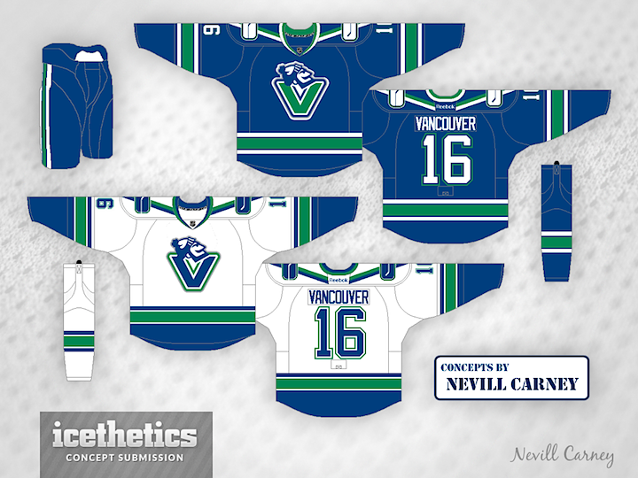
This logo has been pretty divisive in the past, but I can't help but like it. It really says "Canucks" in a way the orca never could. Nevill Carney presents a set of jerseys that would make for a great uniform in Vancouver's future. Who's with me?
Designed by  Nevill Carney
Nevill Carney 
Reader Comments (11)
Awesome shoulder stripes!
Call me crazy, but I actually kind of like the orca better
This looks more like a canuck
While I have no problem with the logo (although it could be shrunk a little without really losing its effect), I think the rest of the jersey can be simplified. Having the V striping on the sleeves along with a big stick in rink logo on the shoulders is too much. Use one or the other - not both. The green outlines on the numbers also just seem too much - I like the one colour numbers they use now.
any jersey that uses the johnny canuck logo on the front has five stars from me.
I really like those "V" shoulder yokes! That works so well for this team, I do think it'd look better without the stick in the rink logo on the shoulders.
While I agree with using either one element or the other on the shoulders, I don't agree with using just one colour for the numbers. The Canucks are a blue and green team and they need to utilize the green in both the collar and the font. While I still prefer just a single outline, I would be more than happy with a double outline that includes green on traditional block font.
The current Agency font with no green looks cold and corporate and is a poor version of the Maple Leafs who are just blue and white.
There would be good for them to use in the future, I wouldn't mind. I'd miss the Orca, though.
@Nick N Yes they are, and they're implemented from their 1985-1989 jerseys.
i would like to see the green V logo on the white jersey, the blue V plus blue johnny canuck isn't doing it for me
I haven't liked a lot of the concepts that use the 'V' Johnny on the front but this one really works. As much as I wish the Canucks would just stick with one look for at least 10 years before getting bored I would welcome this change. I would like to see what the home jersey looks like with either a white or a blue 'V' on the front though, the green looks distracting to me. And already been said but just pick one element for the shoulder (my vote is for the stripes).
I agree with alex ward