Review: Flames Alternate Jersey
 8 Comments
The wait has been long enough. This review now needs to be epic. It won't be, but at least it's here.
The Calgary Flames unveiled their new third jersey on Oct. 27. The new look made its on-ice debut on Nov.1 — so by now, we've had plenty of time to fully appreciate it.
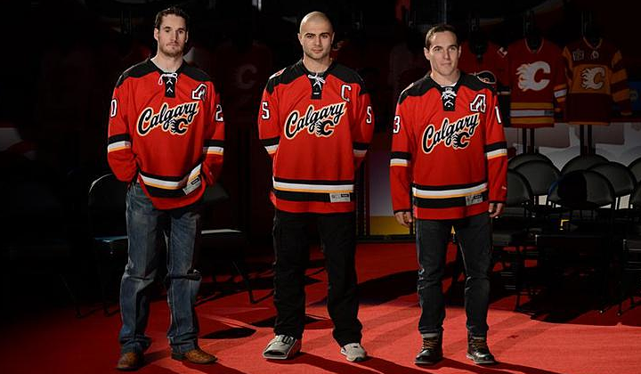 Photo from Calgary Flames
My expectations for sweaters designs from Canadian teams are typically high. I feel like the nation that birthed the sport should have the best-looking teams. That's not necessarily sound logic, just a feeling. I tend to hold the Canadian teams on a higher pedestal in this regard.
However, when we learned the Flames had a new third jersey in the works this year, my expectations were a little different. In 2009, the Flames introduced a retro third jersey — modeled after their original uniforms from the 1980s. Most people — myself included — felt like that was the pinnacle of Calgary third jersey options. (The home and road could still have used some work, on the other hand.)
How could the Flames improve upon their first black-free jersey since 1994? Simply put, they couldn't. Even a lateral move was off the table. They could only hope to do something different. And that they achieved.
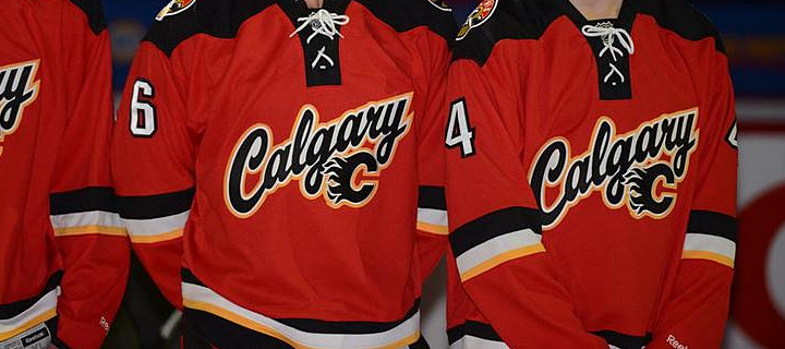 Photo from Calgary Flames
In typical fashion, the jersey was red. But for the first time in team history, a wordmark adorned the chest of a Flames sweater. The team wanted to declare pride in its city. But on first glance, it seemed like a knock-off the Buffalo Sabres' third jersey from 2010 — the retro-style script with the classic primary mark underneath.
In the last two weeks, my opinion of the crest hasn't changed much. I'm not from Calgary, so perhaps that's why it's difficult for me to appreciate the sentiment. But I am from Tampa and care little for the "TAMPA BAY" scrawled across the Lightning's road jersey. I'd prefer seeing a simple symbol represent our city. I don't think there's any better symbol for Calgary than the flaming C.

But since that's already on a couple of jerseys, this is what I would've rather seen on the chest. I will admit that roundel logos have been overdone in the NHL and the style of this one is slightly reminscent of the Flames' provincial rival in Edmonton. But with a bit of simplification, it could've made a brilliant crest.
Needless to say, I think it makes an excellent shoulder patch for this jersey. The logo represents the many natural facets of Calgary's surrounding region from wheat fields to mountain ranges in front of the setting sun. It's clever imagery and a slick design.
However, the two logos featured on this jersey do not feel like they belong on the same sweater. The styles are worlds apart. I get the sense the two logos were perhaps part of separate proposals and mashed together by a decision-maker without an eye for design. But I could be wrong.

In the last few years, Reebok has appeared limited in its template variety. A handful of basic jersey designs seem to permeate all of the hockey world at this point. But the Flames' new third shows the manufacturer is willing to try new things.
Not only is this a completely new template, it's custom for a specific look the Flames were going for. Check out the shoulder yoke. That unusual design was inspired by the classic western shirt — a staple of any cowboy's closet. This is the sort of thing I absolutely love about third jerseys. Every team should try something a little outside the box now and then.
Speaking of unusual, the graphic suggests the designers were trying to take an overused feature like the lace-up collar and make it their own. Apparently, this one was designed with the intent to string it upside down. But looking through pictures of the Nov. 1 game, none of the players were interested in wearing it that way.
 Photos from Calgary Flames
Good effort anyhow. By the way, you'll notice the alternate captains' "A" in the form of the Atlanta Flames logo is carried over from the primary jerseys. Nice way to keep Atlanta alive in the NHL even if it can't have a team of its own.
 Photo from Calgary Flames (via Twitter)
What I love most about this jersey is the attention to detail. Hardly any jersey introduced in the last couple of years has been able to avoid Reebok's trendy "hanger effect" — the design on the inside of the collar. Here we see elements of the shoulder patch reprised.
It's a great feature for jersey buyers. Owning it is really the only way to appreciate it. And I'm certain that was Reebok's goal. They are a business after all.
 Photo from Calgary Flames
On the other hand, I don't love every detail. The 5 — along with the full number set — was designed to be distinctive. But I'm afraid the it missed the mark a bit. It's distinctive, but not for the better. It just looks like a flipped two. Our brains are not accustomed to quick recognition of a shape like this. Until we get used to it, it's going to feel like an error — like someone stitched a digit upside down.
I can't help but wonder if it ends up being a situation similar to what the Lightning had back when they introduced the italicized electric numbers in 1995. The 1 always looked like a 7 and the 8 barely looked like an 8. Adjustments were made quickly to help with legibility.
Apart from the 5, I do like the rest of the numbers. In particular, I like that they're white. The black on red isn't unreadable, but it's not as easy on the eyes. And the thin yellow stripes on the jersey help to tone down any similarities to the New Jersey Devils' look.
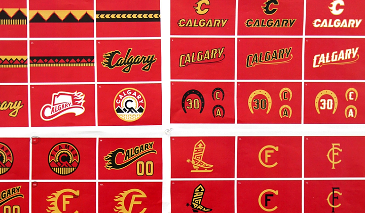
Let's wrap this up with some thoughts about what might have been. The Flames released a video on their website after the unveiling talking about the new look. It included a shot of a wall covered in unused concepts. In some of them, it's clear why they were cut. In others, less so.
I love the simplified flaming C at the top of this photo. What a great way to move that classic mark into the 21st century. But I certainly think the existing version will stand the test of time. I wouldn't be surprised to see the exact same logo still in use when the team celebrates its 50th anniversary in 2030.
If nothing else, maybe some of our concept artists can have a little fun with some of these designs. I look forward to seeing what you guys come up with.
Summary
This is always the hard part, so I'll try to make it easier with a pros/cons list.
PROS
- Attention to detail, namely the shoulder yoke and collar
- The shoulder patch and "hanger effect"
- White numbers
- New striping pattern
CONS
- Had to be red to be a crowd-pleaser, but I think a third jersey should be a third color
- The wordmark crest is disappointing
- 5
What are your pros and cons?
And don't forget to check out the updated Jersey Galleries!