Just To Freak You Out XXI
 Friday · Dec 28 · 2007 | 2:32 PM PST
  14 Comments
 The Freak Out series hits 21 this week — old enough to get hammered. And boy, I think some of the designers this week had to have been hammered. I mean, just look at this.
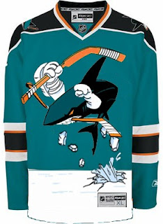
It might take a moment or two to notice that this is an "If They Mated" example. It's the new Sharks secondary logo merged with the Mighty Ducks third jersey of the mid-90s. But I love it!
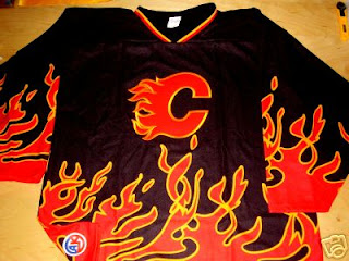
This Flames jersey is on fire! Someone on eBay is really selling it. For real.
Sidney Crosby recently dropped the gloves in a rare on-ice event. This picture isn't real but it cracks me up nonetheless. There's just so much about it that's so wrong. I'm curious to see if the guys over at Pensblog have anything to say about this.
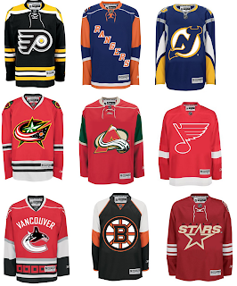
And finally, we have a plethora of "matings" here to share.
To sum things up, what you see above is the Flyers and Bruins, Rangers and Islanders, Devils and Sabres, Blue Jackets and Blackhawks, Avalanche and Wild, Blues and Red Wings, Canucks and Hurricanes (weird!), Bruins and Flyers (opposite of the first one) and Stars and Coyotes.
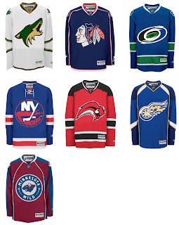
But wait, there's more.
This one is interesting because it's all opposites of the previous image. They are the Coyotes and Stars, Blackhawks and Blue Jackets, Hurricanes and Canucks, Islanders and Rangers, Sabres and Devils, Red Wings and Blues (what the—?), and Wild and Avalanche.
Hope you enjoyed being freaked out. Have a fantastic weekend!





Reader Comments (14)
First Concept, Looks like the Shark is having a temper tantrum. Flames...That looks like it could have been one of the first third jerseys introduced in 1996. Would have fit in fine with the others. Crosby...Very Funny. Can't really say much about the If they Mated concepts.
I think pretty much anything will look good with the Bruins design and colours.
Ironically, I like that Black Flames jersey alot more then what they're currently wearing. The flames on the hemline seem to fit alot better then the idiotic striping pattern they have now which is easily among the worst in the NHL. Also any Flames jersey without the eyesore of the clash patch is an improvement IMO.
most of those "mated" are pretty bad but if u look closely and the coyotes green and gold it actually looks alrite
Wow when the flyers mate with the bruins, it creates a masterpiece in my opinion.
(gag)
I actually like the Isles logo on the Rangers sweater. That looks good to me.
The 'Jackets logo with the 'Hawks colors and jersey actually looks pretty good. Other than that...well...um...yea. And don't get me started on the Sharks one!
lol just to freak you out was old enough to hit hte hooch 3 weks ago here in canada
I think the Sharks jersey is pretty weird. But i would probably end up buying one just to say i own it
These are pretty interesting concepts, I have no doubt about that... certainly whoever put these together really worked hard on them with thoughtful planning.
I would never want to see for example the Rangers and Islanders to swap jerseys. The current Islanders RBK Edge jersey is an atrocity. They like a handful of other teams should've just kept last year's designs. The Islanders are definitely one of those teams. The Flames are another.
the Wild logo on the Avs jersey looks kind of cool i think
rangers and isles should never mate either
it was traumatizing
I kind of like that canucks in red
Weird, but I like them. It's difficult to say, but I think I like both of the Bruins/Flyers jerseys.
The second "Cane-ucks" one looks like what would have been if the Hurricanes had kept the Hartford colors when they moved!