NHL Tournament of Logos

Entries in blackhawks (56)

Tuesday
Oct092007

Rbk EDGE Review: Blackhawks

Part 16 of 30. All 30 NHL clubs have unveiled new jerseys under the new Rbk EDGE Uniform System for the 2007-08 season. Here at the NHLToL, we're going to review every one of them. Read up and then rate the new sweaters. We'll do a full ranking after completing all of the reviews.

Rbk EDGE Uniform System

Chicago Blackhawks


New Uniforms

Old Uniforms

The Unveiling
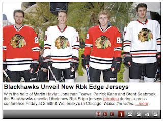
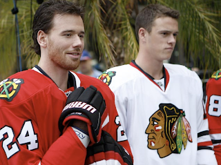
Friday, September 14. The Blackhawks unveiled their new jerseys at a press conference in Chicago. Martin Havlat, Jonathan Toews, Patrick Kane and Brent Seabrook were on hand to model the uniforms.

Home vs. Road
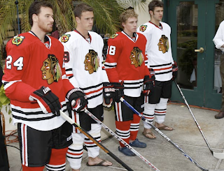
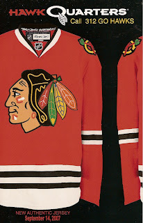
Home: Red. Road: White. The two sweaters are essentially mirror images of each other with slight differences in striping patterns and feature secondary logo patches on the shoulders.

The red home jerseys feature white-black-white stripes around the elbows and white-black-white-black stripes around the waist with white extending down to the bottom. The collar is white with black trim on the inside and the primary logo serves as the crest.

The white road jerseys feature spaced black-red-black stripes around the elbows and the waist with black cuffs extending to the the wrist around the sleeves. The collar is red with black trim on the inside and the primary logo serves as the crest.

In The Details
The colors are different on the shoulder patch between the home and road sweaters. The same numbering and lettering style has been retained.

New & Old
There is hardly a difference at all between the two uniforms. The old design was simply adapted to the new EDGE cut. The one noticeable difference is in the collar, which now, like all new jerseys, features the NHL shield.

Standard FAQ
Numbers on the front? No.
Laces at the collar? No.

NHLToL Editorial by Chris
By now all of you must be aware of my aversion to the Blackhawks' logo and uniforms. It's just a personal preference thing. I don't see what's so special about it and why it's often been called the best uniform in all of sports. I don't think it's ugly by any means, but I don't understand it's allure. One thing is for sure, though. You always know when you're watching a Blackhawks game. But personally, I think you could do just as much better as worse with this one. It's not bad but it's not great either. Now go on, tell me how ridiculous I am for holding such an opinion. 3/5


Buy your new Blackhawks jersey!

Monday
Oct082007

Poll: Blackhawks vs Nordiques


vs
Chicago
BLACKHAWKS
Quebec
NORDIQUES


Place your vote and then feel free to leave a comment as to how you came to your decision. Tell all your friends to drop in and vote! The more voices heard, the more accurate the results!

Poll opening date
Mon Oct 8 @ 4:23 AM
Poll closing date
Fri Oct 12 @ 11:59 PM

07VNTRN | #1C | CHI37vQUE

Sunday
Sep302007

Result: Blackhawks Logo History

BEST ALL-TIME
1964

68% 2,740 votes

4,019 total votes

1937
14% 579 votes

1955
13% 518 votes

1935
5% 182 votes


Poll opening date
Sep 22 @ 10:26 AM
Poll closing date
Sep 29 @ 11:59 PM

07BONLH | LHCHI

Wednesday
Sep262007

Concepts For Logo Upgrades

All right, if you've been reading for a long time (or even a short time), you probably know about my distaste for the logo many consider to be among the best in sports. That of the Chicago Blackhawks. I just don't see the allure.

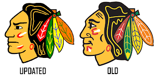
You might find it surprising that I don't stand alone. In fact, in the past I've even posted changes folks have made to the logo. Well, I have another one. I still don't love it, but with a little work, I'd call it a big step in the right direction.

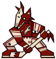
Then I thought this one was kind of funny. Not crazy enough to freak anybody out, but definitely different. Imagine the Phoenix Coyotes using both logos together with their current color scheme.

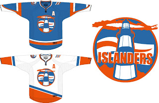
Okay so maybe it is a bit scary. What's not scary is this New York Islanders concept. I don't know. It just feels like such a special thing when you run into a concept this well-designed. Dump the text out of that logo and you've got yourself pure gold.

I like these jerseys so much. Even using the current logo on the shoulder is a great touch. Hell, I could even live with this lighthouse logo as a secondary. But I really do think the Isles should reintroduce something of this nature. I just feel like a lighthouse would make such a great logo for the Isles.

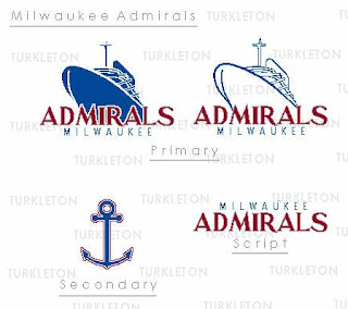
And finally, we go completely off topic here. This is a fan made logo redesign for the AHL's Milwaukee Admirals.

Thought it was pretty decent. It feels a little familiar to me, like I've seen it somewhere before. But that could just be my brain playing tricks.

What do you guys think? Feel free to drop a line in the comments.

Saturday
Sep222007

Poll: Blackhawks Logo History


1935
1937

1955
1964


Place your vote and then feel free to leave a comment as to how you came to your decision. Tell all your friends to drop in and vote! The more voices heard, the more accurate the results!

Poll opening date
Sep 22 @ 10:26 AM
Poll closing date
Sep 29 @ 11:59 PM

07BONLH | LHCHI

Friday
Sep142007

Blackhawks Unveil New Uniforms!

Keeping with tradition and a design that many have called the best in professional sports, the Chicago Blackhawks unveiled their new Rbk EDGE uniforms today. Look at them here.

So you want to know the first thing I noticed?

They altered the secondary logo on the shoulder. And I think it looks great! There wasn't really anything wrong with the old one in my mind, but the changes have given it such classic feel that it lacked a little bit in years past.

Martin Havlat, Jonathan Toews, Patrick Kane and Brent Seabrook were on hand in the Windy City to model the jerseys for the cameras. You guys know how I feel about the Blackhawks' logo and uniforms, but I like these a lot. They've done a very nice job keeping with their tradition while also moving forward with the design. It kind of makes me glad the NHL and Reebok are doing this.

Any thoughts on this matter?

Thursday
Sep132007

'Hawks Show Off Unis With Season Tickets

Yay for photos! All right, I know we've all seen EA Sports' renderings of the new Rbk EDGE uniforms, but it's time for some photos. Chicago Blackhawks season ticket holders were treated to the new home sweater.

It says the jerseys will be released tomorrow — the date we already have. Hopefully I'll be able to share more photos with you then.

Thursday
Sep132007

EA Unlocks Unreleased Jerseys?

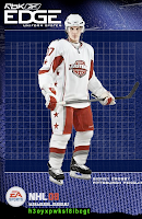
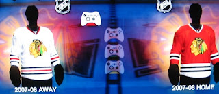
Got several emails today about EA Sports' NHL 08 which was released this week. We kept hearing an unlock code would be provided for the new Rbk EDGE uniforms.

Apparently, that code was released today, supposedly unlocking all of the uniforms in the game. Here to the left you can see the unlock code available at official Rbk EDGE web site.

I've seen screen grabs for only a handful of team jerseys so I don't know that they're necessarily all available at this point. (Someone correct me if needed.)

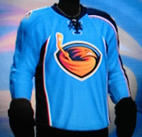
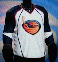
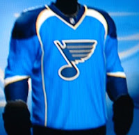
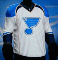
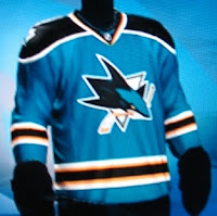
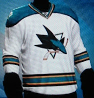
The teams I've seen via stills from email and around the web are the Thrashers, Sharks, Coyotes, Stars, Oilers, Blackhawks, and Blues. And while they are from video games (which you know I'm opposed to), I'll post a few here just for fun. I'm still going to wait for teams to show off the uniforms themselves to count it as an "official" unveiling.

Many Thrashers fans may be happy to see the "ATLANTA" retained on the left sleeve of the home jersey. Of course, I'm just guessing it's there since we can't actually see it.

The Blues and Sharks sweaters look nice — if not like they've been swapped. I like the sholders of the Blues sweater and the striping on the Sharks.

And the conservatives among you will probably like the fact that nothing much has changed for the Chicago Blackhawks.

Just remember that while there's no reason to doubt the designs here are accurate, I won't call them "official" until we see it from the team or the league. That's just how I roll.

Thanks for all the emails on the subject, everybody! I'll try and get some more images up later on.

UPDATE (12:36 PM): Here's a great photo gallery featuring all the new AHL and NHL sweaters. Enjoy!

Wednesday
Sep052007

Result: Blackhawks vs Oilers

Edmonton
OILERS

51% 13,518 votes

Chicago
BLACKHAWKS

49% 13,123 votes

26,641 total votes

Edmonton Oilers
Advancing to Quarterfinals to face Colorado Avalanche

Chicago Blackhawks
Eliminated


Poll opening date
Aug 29 @ 4:27 AM
Poll closing date
Sep 5 @ 11:59 PM

07CHTRN | #W2B | CHIvEDM

Sunday
Sep022007

Concepts For 'Hawks, Ducks, Devils

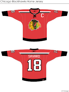
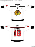
I'm curious to see the reaction in this one. A lot of you profess the Chicago Blackhawks to have the "most beautiful" uniform in all of sports. I don't see it but that's only me. However, I could very much get behind a design like this.

Even the white one is awfully sharp. The striping is clean and very minimalist. But would something like that result in an upheaval of the hockey world? Do things always have to stay the same?

Either way, the design work is very clean and I'm curious to see comments on this set.

This next one will be met with nothing but hate I'm sure. The striping is one thing. The name above the logo is another.

I'm sure that would result in even more blowback than 'VANCOUVER" across the front of the Canucks' jersey. But of course, these are all just fan-created concept designs. A bunch of what-ifs.

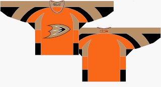
Here's a thought for the Anaheim Ducks.

It's the orange sweater Flyers fans have been begging for. Personally, I think it's too much for the Ducks. I think orange needs to be an accent for them. Let gold be the main color. As much as I don't like black jerseys, I think the Ducks' look sort of requires it. Thoughts on that?

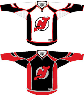
And then we have a look at all-star template-based New Jersey Devils concept.

You know you love the piping. I like the idea of a black Devils jersey — despite that fact that I just said I don't like black jerseys. The reason here being that too many teams have red jerseys now. You can add the Wild and Capitals to the fray this season. Red's a good color until it gets overused. Which is right about now.

I'll have more later. By the way, I have tons of Canadiens and Flames concepts for tomorrow — they day before their big unveilings!