NHL Tournament of Logos

Entries in jerseys (477)

Monday
Sep102007

Flyers Push Up Jersey Unveiling

I just got an email from a reader pointing out that the Philadelphia Flyers have updated their web site with a new date for the unveiling event for their new Rbk EDGE uniforms. We will see the jerseys on Friday, September 14.

You'll see the date way down at the bottom of the screen shot. Apparently the AHL's Phantoms will also be unveiling their new sweaters at the same time. It's worth noting the link goes to the pre-order page and the image to the left of the text is last year's home sweater which is quite different from the new one.

We got a preview of it a week or so ago courtesy of season ticket holders. Thanks to Kara for the info on the new date!

I'll have photos posted as soon as I can on Friday.

Monday
Sep102007

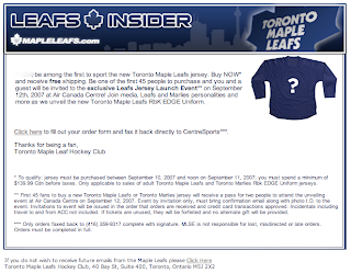
Leafs Insiders Learn Of Jersey Unveiling

Thought I'd point this out. Apparently, subscribers to the Leafs Insider received an email recently outlining information relating to the new Rbk EDGE uniforms being unveiled by the Toronto Maple Leafs. See the email below.

To sum up, the Leafs will be unveiling their new sweaters before a relatively small crowd (the email calls it an "exclusive" launch event) on Wednesday, September 12 at the Air Canada Centre.

I'll be keeping an eye out. And as you've come to expect, as soon as I can post photos I will.

Monday
Sep102007

Looking Ahead: Third Jersey Concepts

As we all know, the NHL is abandoning the third jersey program for this season. However, there are many indications that it will make a comeback as early as the 2008-09 season. Having said that, some people are getting a jump on things. Here I have a few alternate jersey concepts to share.

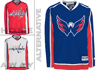
We'll start with the Washington Capitals. While the return to red, white and blue has grown on me, the wordmark logo has not. However, they've got a great shoulder logo that could use a little more mileage.

I especially like the idea of a blue jersey. Moreso than the red. Kudos to the designer on this one.

Keeping it in the Southeast Division, I've also been sent some Tampa Bay Lightning art.

Speaking as a Lightning fan, I do like the idea of a blue alternate jersey, but the logo needs the circle. What do you guys think of that? I think it looks even plainer without it.

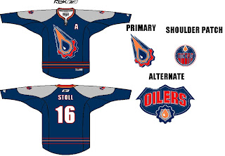
Moving on to the Northwest, check out this rather colorful Edmonton Oilers rendering.

I like the gear logo better in silver. But that's just me. Let's finish up with a look at some Minnesota Wild concepts.

I remember back in 2000 when the Wild first unveiled their logo — the crest you see on these jerseys — and I was horribly afraid the jerseys might look like this. (I was thrilled by the bear head logo.) However, I kind of like the green as an alternate for some time in the future. Might be a little much though. Thoughts?

Sunday
Sep092007

Stars Drop Clues To Invitees

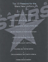
All right, I take it back. One more post and then I'm going to bed. Turns out the Dallas Stars have sent out invitations for their new uniform unveiling ceremony to season ticket holders. The invites drop some subtle hints as to what we might expect for the new uniforms.

First off, let me give a nod to snlsmith at The Goalie Store message board. I snagged this information from his original post.

The inside apparently states the number 1 reason as being, "It's a great excuse to throw a party." It also indicates the event will be held Friday, September 14 at American Airlines Center and the uniform unveiling will happen at 6:02 PM.

This all is according to the post I referenced above.

The number 10 reason listed on the mailer seems to indicate that the black jerseys we've been seeing with "DALLAS" plastered across the front are more than likely the real deal. Sadly. What I'm saying is, prepare to see the Stars unveil something very similar to this on Friday.

Any Stars fans out there? Are you worried? Are you excited? Indifferent? Tell us in the comments. Good night!

Sunday
Sep092007

Pens' Prospects Exhibit New Sweaters

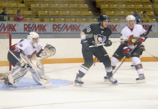
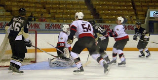
One last post today. We've got a few pictures of Pittsburgh Penguins prospects wearing the their new jerseys while playing the Ottawa Senators in Kitchener this weekend. Thought I'd share.

As has been pointed out, the players aren't wearing the new socks and pants, only the sweaters.

You know, the Panthers and Penguins come to town wearing their new Rbk EDGE uniforms. It begs the question: Why aren't the Sens' prospects wearing theirs? They've been unveiled already. Anyone know?

Anyway, for me it's just another example of the new Rbk EDGE jerseys looking better on players than hangers. We'll make t-shirts: "Better on players than on hangers." Have a great night all!

Sunday
Sep092007

Prospects Put Cats' Threads Into Action

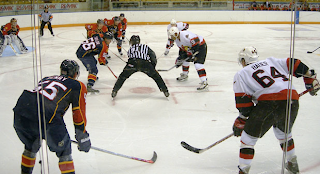
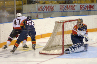
Seems a handful of teams have sent their rookies to Traverse City this weekend with their new Rbk EDGE uniforms. All right so not everybody is in Michigan. These guys are in Kitchener, Ontario. (Thanks for pointing that out to me in the comments, guys. I should read more!)

Anyway, it's cool because it gives us a preview of what's to come, not only in talent, but aesthetically as well. The Florida Panthers prospects were wearing the new threads and we have pictures courtesy of the Ottawa Senators' official web site.

I know a lot of people have been complaining, but if you ask me, these jerseys look pretty damn good in action.

What do you guys think? Do you like what you're seeing so far? Or are you dreading the new season?

Sunday
Sep092007

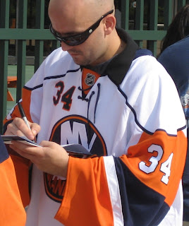
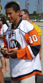
Isles Players Show Off Jerseys

Single-game tickets for the New York Islanders went on sale yesterday and a couple of Islanders players were on hand to sign autographs. A couple of people who were there and took pictures have emailed them to me to share.

Wade Dubielewicz, Bruno Gervais and Richard Park kept fans occupied while they waited in line for tickets.

All three wore white road jerseys to the event. All of the photos I was sent have been added to the Islanders album in my official Rbk EDGE gallery if you want to see more.

Thanks to Kevin and Dale for the photos!

I'm still not crazy about these jerseys but here's another perspective. Dale said, "I think they do the jersey more
justice on the player than on a hanger."

Fair point.

By the way, if you have or know of any other photos for the Isles or any other team, feel free to email them to me at nhllogos@gmail.com. I'm always looking to expand the photo gallery.

Sunday
Sep092007

Wings Prospects Wearing EDGE?

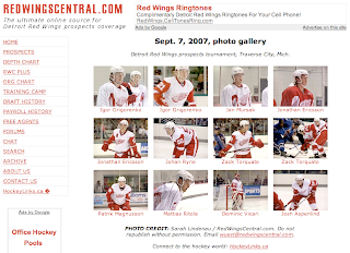
It seems that the members of the Detroit Red Wings at the Prospects Tournament in Traverse City, Michigan are wearing the new Rbk EDGE jersey. RedWingsCentral.com has a great photo gallery up from Friday. I recommend taking a look.

You can see Thrashers and Lightning players in a couple of the photos but they appear to be wearing last year's sweaters.

If I get permission from the photographer, I'll post some of the pictures here in case the link ever goes away.

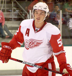
UPDATE (9:03 AM): I've been given permission to repost some of the photos so check these out. They were taken by Sarah Lindenau for RedWingsCentral.com.

From the previous photos we'd seen of the road sweaters, it wasn't clear if the sleeve element would remain the same. Seems it will. You'll also notice the "A" on the right shoulder for the alternate captain in this photo. Here's another for your viewing pleasure.

Huge thanks to RedWingsCentral.com from me! I should point out, too, that the folks at RedWingsCentral.com are not confirming that these are Rbk EDGE jerseys, but I believe they are. The collar and tight fit lead me to this assumption. Just wanted to put that out there.

Incidentally, there's a gallery of photos taken yesterday also available here.

Saturday
Sep082007

No Word On Ducks' Jerseys?

We've managed to go this long without hearing anything from the Anaheim Ducks regarding the unveiling of their new uniforms so I'm not anticipating a big announcement.

However, Anaheim was the only team left not yet in the sidebar countdown so I added them for this Thursday, September 13. The reason being they have their first preseason game then and will likely be wearing them. So while we may get no unveiling ceremony, I expect we'll see them on that date.

As a side note, I just wanted to mention that I'm working on a Rbk EDGE FAQ because there seems to be a handful of people with inaccurate information. Just to clear everything up, I'm going to put all the facts in one easy-access post. Hopefully I'll have that up tonight at some point.

One big thing that seems to be misunderstood: Teams will be wearing darks and home and whites on the road this season. I don't know if that will change in the future, but that's how it stands now.

Saturday
Sep082007

Atlantic Division Concepts

I've been going through my email looking at all the concept art I've been sent in the past several weeks. Let the Concepts Gallery serve as a small indication. Anyway, I've grabbed a couple of designs for the Flyers and Devils I thought were interesting.

First off, one designer said, let's rebrand the Philadelphia Flyers a little. Here's what he came up with.
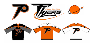
The designer had this to say about his creation.

The idea for the primary is just an updated Flying P - a little faster and sleeker looking than the current one. I've always been bothered that the current logo just doesn't evoke speed to me. As for the secondary, it's supposed to suggest something flying away from a planet or something.

Just something interesting to share. There's also this design which has been floating around a little bit. I think the idea was to fit as many letters as possible horizontally across the front of the sweater. Mission accomplished.
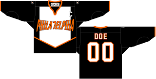
I can't see the Flyers ever wearing anything like that, though. However, something interesting that was sent to me was this concept for a secondary logo for the Flyers. Many who've suggested a secondary logo for Philly have simply gone with the Liberty Bell. What woudl you Flyers fans think of something like this?
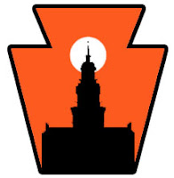
Pennsylvania's nickname is the Keystone State. That should explain the outer shape — a keystone. What I like is the white sun in the background because the first thing I thought of was the orange circle in the Flyers' primary logo. Very clever.

I was impressed with that. I was also impressed by a third jersey someone came up with for the New Jersey Devils.
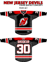
I know the league is abandoning those this year, but I think it could work just as well as a home sweater. I've always thought a black jersey would make the logo on the chest stand out more.

But I guess we'll never know. Devils brass have stated that the jerseys will be the same as the previous design, merely adapted to Reebok's new cut. Still, I figured this was worth a look.

Expect to see the Flyers' new sweaters on September 16, followed by the Devils' a day later in their first preseason game.