NHL Tournament of Logos

Entries in jerseys (477)

Thursday
Aug022007

A Wild Design!

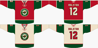
Check this out, Minnesota Wild fans. Some among you seem to think your team can break from the pack and wear something other than white at home. Outrageous! Seriously, though. Check out this fan-created concept.

We have heard that the Wild will be converting their red third jersey to their permanent home jersey, dropping the greens altogether. But this design suggests using the wheat color on the road jerseys. A radical concept to be sure, I think it would be great! All that white... it blends into the ice, you know?

Actually, I like both of these designs a lot. I think they would be among the best in the entire league if the Wild go with something in this neighborhood. But I want to know what Wild fans think. Do you prefer the red or green at home? And would you like white or wheat for the road sweaters?

Thursday
Aug022007

Jersey For New Jersey

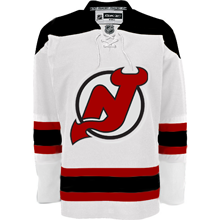
How many times do you think I'll be able to make that joke as we get information about the New Jersey Devils new uniforms? Anyway, today I have a fan-made graphic to share. It comes from a Devils fan message board.

It's not the actual jersey, of course. I mean let's not fool ourselves here. It's merely a manipulation of the Boston Bruins' road jersey which was unveiled back in June. It just gives us an idea of what can be done if the team were to keep its current uniform design on the new Rbk EDGE jersey cut.

I'm not sure I like the collar laces, though. What do you guys say? Should the Devils keep what they've got or go with something completely new in the vein of, say, the Predators?

Wednesday
Aug012007

Mull Over These, Sens Fans

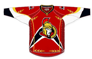
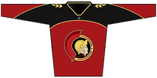
We've already seen the purported new Ottawa Senators logo yet we haven't heard word one from the team with regard to this matter. No worry, because where there's image manipulation software, there's hockey fans to use it. Enter this.

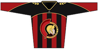
I'm sorry, but what a mish-mash. I applaud the effort but, um... yeah. There's sure a lot going on. And hey, they make use of that new logo we've been seeing. On the shoulder, though, this fan opted for the striped old-time Ottawa logo. Speaking of stripes, how about this puppy?

The vertical stripes make it look like a European soccer jersey to me. However, I do like what this designer chose to do with the logo. He dropped the black pointy things from behind the galea and gave the logo an overall 3D effect. For a look at a cleaner version, sans the stripes, see the image below.

Impressions, Sens fans? Do you guys like the potential new logo? Or do you prefer the proposed design in the bottom two concept sketches? Or would you rather not see it change at all?

Wednesday
Aug012007

Covered In Coyotes Concepts

I feel like I've been ignoring the Phoenix Coyotes fans out there. This is certainly not intentional. There just hasn't been a lot of news to post for them. Until today, that is. I've scoured the far corners of cyberspace for a few images you might find beautiful or repulsive — or something in between.

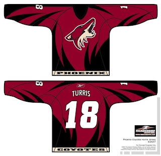
This design was created by someone who designs the outsides of racecars, I believe. Anyway, it's really quite — something. I couldn't see them wearing anything like this because the whole reason they changed their logo was that they wanted to go the classic route and simplify everything.

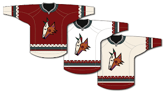
Well, to me, that was a sad thing. One fan designed this jersey set in memory of the old days when the Winnipeg Jets first arrived in the desert.

It's got that desert Indian look that was very cool. This design uses only the head of the original Coyote logo. It was first seen by itself on the green third jerseys they had for a short time. This is closer to what they actually wore in those days.

The big difference being that the Coyotes wore black dark jerseys, not maroon like they wear now.

I haven't seen any Rbk EDGE jersey concepts based on their current logo and uniform design, but haven't you heard, horizontal stripes are so out. Seriously though, don't be surprised if it comes out looking like the Capitals or Blue Jackets new jerseys.

It'd be nice if the league would unveil more of the new uniforms. Chances are we've still got another month ahead of us before we start to see the rest of the teams trickle out. Anyway, Coyotes fans and others alike, what do you all think of these designs?

Wednesday
Aug012007

Nothing Official From Canucks Today?

Damn. As it turns out, the Vancouver Canucks are supposedly having a private shoot today with the new Rbk EDGE jerseys. Yeah, not so much with the public unveiling thing. However, there's another alleged leak.

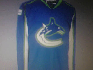
Saw it on the Canucks official message board. They're calling it a cell phone photo of the new jersey but you know how these things go. With it, one fan apparently finished off what could be the look which you can see in the graphic below.

I don't know now. I'm reading dates like mid to late August for the team's official announcement. I don't know if they team has said anything specific about a date, but I have seen August 29. I'm not holding my breath, though. So it probably won't be in the sidebar countdown — until we do get some sort of confirmation.

Shame about that. Though I can't say I'm surprised. The Canucks seem to be yanking their fans around quite a bit on this topic. I think they should just unveil the thing and be done with it.

Tuesday
Jul312007

Possible New Stars Uniform?

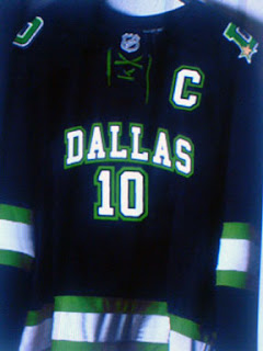
At last I have non-Canucks-related news to post. It seems there's a chance the Dallas Stars new Rbk EDGE uniforms may have leaked. I found the following image posted at HFBoards.com.

What we've been hearing is that the Stars will be going with a jersey that doesn't have a crest on the front but rather the word "DALLAS" and this jives with that. However, it doesn't make a lot of sense to me that a team would put their city on their home jerseys. And we've been hearing the NHL is keeping the dark jerseys for home ice.

This sweater also lacks the current Stars logo which has been rumored to be changing. In fact, there's a whole new logo on the shoulder of a "D" with a gold star in the bottom corner. Frankly, I like it. The horizontal green and white stripes are a classic throwback to the teams early days in the Big D and I think it would be a definite upgrade — assuming this is the real deal.

As far as debunking it — a task which has become necessary as we've seen more than our share of bad to half-decent Photoshop efforts — I can't say the overall feel looks familiar. I could be completely wrong, but I'm checking the real-deal box on this one. What do you guys think? Will Dallas be wearing these in the fall? Or have we been duped?

As official announcements go, a Stars official team message board administrator recommended we mark our calendars for Septmeber 14.

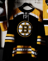
UPDATE (6:29 PM): ...And we've been duped! Just came across this photo of the Bruins new home jersey. Examine the creases and laces and you'll see what I'm talking about. Click the photo to enlarge it.

Stars fans, this will not be your team's new home jersey. Rest easy. Gotta say though, these Photoshop endeavors are getting better and better if you ask me. Sad to see we don't have anything that could possibly be the real thing, but we'll live.

Tuesday
Jul312007

Last Of The Canucks Surmising (Hopefully)

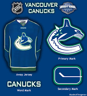
We're anticipating the unveiling of the new Vancouver Canucks uniform tomorrow despite having no official word on that from the team itself. So having said that, there's a little more fan-created artwork I wanted to post prior to that because Canucks fans seem to be the most interested in what's going to happen to their club's uniforms this year.

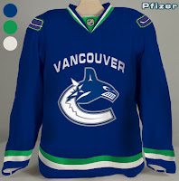
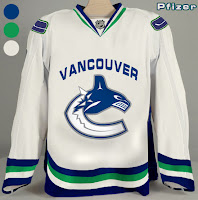
This design is based off of what appears to be "Fin's Friends" promotional material posted yesterday. The only thing is we've been hearing that the bottom part of the "C" will be white, not blue like it has been in the past. You gotta figure this is at least worth a look anyway and may even possibly be close to what gets unveiled by the team.

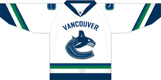
Another fan came up with these designs.

Personally, I'm not a fan of "Vancouver" being written above the logo but I guess it's not for me to say. You Canucks fans have any opinion on that? Tacky? Cool? Doesn't matter?

If I come across anything else, I'll try to get it posted by the end of the day. Meantime, keep your fingers crossed for an official announcement tomorrow.

Monday
Jul302007

Possible New Canucks Jersey?

All right, so I thought I wasn't going to have anymore news tonight, but it turns out I stumbled upon something very interesting on the Vancouver Canucks official message board. This.

I didn't have time to read the full details in those posts, but obviously, the skeptics abound. You can go here if you want to learn more. First reactions are that it's a Photoshopped job based on the Washington Capitals or Columbus Blue Jackets jerseys since they've already been unveiled.

Still, I thought it was worth a look. And I don't think it'd be the worst thing in the world if that was the actual Canucks home jersey. The colors are all right and I say that despite the fact that I really did like the two-tone blues, silver and maroon from before.

Any thoughts? Is it a fake-out? Is it the real thing? The Canucks will supposedly answer that question on Wednesday.

Monday
Jul302007

Get Ready To Be Horrified

Okay so I didn't want to go to bed before I got one more post in for today. (I go to bed by 7 PM because I have to be at work by 4 AM. I work on a TV morning show. Which should explain why I have so much time to do a blog like this. I get off work at noon. And that's enough parenthetical nonsense for one day.)

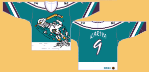
Anyway, this is what I have to offer. A joke.

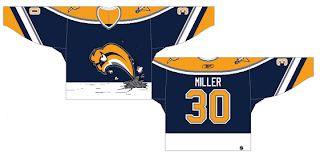
If you don't get the reference, look below. For what served as the inspiration to this mockery, you have to get in your time machine and travel back to the 1995-96 season when the Mighty Ducks of Anaheim donned this monstrosity on a couple of rare occasions.

Probably the worst third jersey ever. And you want to know the worst part? I have one of them in my closet! And if you were thinking that part was the joke... no, sir. I actually bought one back in the day because I was 11 and thought it was so cool. Let the ridicule begin.

Anyway, how much do Sabres fans hate the Buffaslug?

As far as actual news for your Monday night, I'm afraid I'm at a loss. Maybe Wednesday we'll get to see the Vancouver Canucks' new uniforms. Maybe. That reminds me. I found a bunch of mock-ups and fan art, I believe, at Canucks Central. So we can all look forward to that tomorrow on the day before August 1.

If you know or hear of anything else, I'd be happy to hear about it. Leave me a comment. Thanks.

Monday
Jul302007

Avs, Blues Jersey Concepts

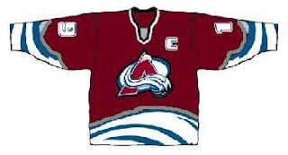
Just when you thought I'd posted enough fake jersey designs for one day, oh no, just you wait. First we'll have a look at something that was put together for the Colorado Avalanche.

If you can look past the poor design quality, well, there's not much to this that rings of goodness. It's certainly interesting to look at, but Avs fans shouldn't worry about this. From what we've heard, there won't be any changes to the logo or uniforms — just an adaptation to the new Rbk EDGE style.

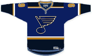
Now here's a look at a St. Louis Blues concept design.

I'm not real keen on the color scheme, but hey, it's not my team. As far as design, it's simple and rather close to what they currently wear. Although we haven't heard anything specific from the team regarding an unveiling of the new uniforms, I wouldn't expect to see anything much different from what they currently wear.