


Mississauga Steelheads Unveil Logo
 15 Comments
 Earlier this month, the OHL's Mississauga St. Michael's Majors were sold to new ownership who decided the nine-syllable name was too much of a mouthful. Beginning this fall, the team will be called the Mississauga Steelheads, and will have a sharp new logo to go with the new name.
The name was selected through fan voting and announced just after the sale of the franchise. Then on Tuesday, the new Steelheads logo was unveiled.
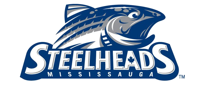
After the previous blog post — the unveiling of the Denver Cutthroats logo — I have to ask why trout are suddenly taking over hockey branding. Is it just the names? Granted, Steelheads and Cutthroats sound pretty menacing but when your logo is a silly-looking fish... Is it just me?
By the way, just because the fish looks silly doesn't mean the logo does. I'm a big fan of this one — you know, as far as fish logos go. And it's miles beyond the Cutthroats logo. Uniforms for the Steelheads are still to come.
In other news...
The ECHL is in the middle of another one of its growth spurts. Aside from the two expansion teams beginning play this year — whose branding efforts we've been following over the past few months — the league as also picked up two more graduations from the Central Hockey League.
Joining the Orlando Solar Bears and San Francisco Bulls as newcomers in 2012 are the Fort Wayne Komets and Evansville IceMen. I don't expect any significant logo or uniform changes for these teams as the graduate into a bigger league. By the way, the Colorado Eagles made the jump from the CHL to ECHL last year and now they're hosting next season's ECHL All-Star Classic.
As of the 2012-13 season, the ECHL has 23 teams in 16 states — including Alaska!

Reader Comments (15)
Actually it was the terms and conditions of the sale from Eugene Melnyk to Landmark Sport Group Inc, which prevented the new ownership from using the St. Michael's Majors name and image.
Actually, the Steelhead is a variety of trout that is abundant in the Credit River of Mississauga. Like both the name, and logo, and can't wait for the jerseys.
I'm also happy that I picked up my Majors jersey ten days before the sale became official.
A much better name than the long and confusing St. Micheal's Majors.
And a much better logo than the Denver Cutthroats.
what is it with these fishy logos??
I actually think this logo looks great. Very sharp and way better than the Cutthroats logo. It's just difficult to use any cool animals since many of them are in use already (Bruins, Sharks, Panthers, BUFFALO Sabres, Penguins, Coyotes etc.)
It's better than the cut throats but not by much. There's only so much you can do with a fish logo.
I like the Cutthroats logo better. At least it looked kind of menacing, this one looks like it's gasping for air. I don't mind detail but this one looks like it has just a bit much going on. Sometimes simplicity is better.Granted the Cutthroats isn't the best but I still prefer it over this one. Plus I am from Colorado so maybe I'm biased.
It looks surprised. Pretty disappointed with this. Thought it was cool for about 3 seconds. Good colours though.
IS THAT A MUSTACHE ???? Cutthroats is better.
Why does every new team in Canada have to have a maple leaf in their logos somewhere? American teams don't have stars in every logo.
I think this logo is pretty sharp, except I have to agree with a few others. The fish looks surprised or scared rather than menacing.
Look closer Guess Who, lots of American teams do, you are just choosing to ignore it.
It's alright, I guess. The logo itself looks pretty good, so I'll be interested to see what the jerseys look like. I am getting a bit tired of all the fish names, though.
That's who: I did look closer and I must say that you are very observant; there are more American teams with stars than I thought though I wouldn't say 'a lot'. It's just that in Canada, there is an attitude that a logo has to have a maple leaf otherwise the team is not patriotic. That was what I was mainly going on about. I mean, first there were the Winnipeg Jets, then the Victoria Royals and now this. If you go to any shopping centre in Canada, you will see that many American restaurants have added maple leafs to their logos. It's just overboard if you ask me.
Komets will apparently have new unis for next season. go to komets.com go to shop and if you look in jerseys it will say so