Hurricanes Unveil Third Jersey!
 56 Comments
  Wednesday · Sep 10 · 2008 | 10:12 AM PDT
  The Carolina Hurricanes became the first team to unveil their new third jersey. They did so at a new conference this afternoon which was streamed live via their official web site.
We even did a live blog today here at Icethetics.
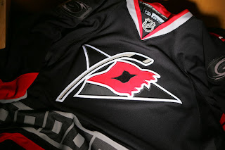
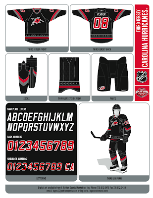
As you can see from the picture, the new sweater is black with the team's secondary logo with the storm flag on the front. It features thick red and silver stripes around the arms and a red stripe around the waist. Above that red stripe is a stripe of storm flags similar to the ones on the regular home and road sweaters. The difference being the flags are black with silver outlining and a silver square in the middle. On the shoulders is the primary logo in black and grey.
These images are from the live video stream of the event.
The team made the following image available on their site so you can see the complete look.
It was announced that the jerseys would go on sale to the public at the Caniac Carnival next weekend. And on their official web site, there's a fact sheet outlining some interesting information.
The team began development on this jersey in October 2003. The release states, "With the popularity of the secondary logo and the way in which the Triangle is represented in that symbol, it made sense for it to serve as the focal point. Since our primary team colors are red, black and white, and our other sweaters are red and white, it made sense to choose black as the main color of this new look."
The release also confirms the new sweater will make its on-ice debut on October 13 when the 'Canes play the Red Wings. They also list the dates of 14 other home games when the jersey will be worn. Check out their official site for more information.
By the way, a reader who attended the event sent in some pictures from his cell phone.
All in all it was a short event but to the point. They brought out the players, talked a little bit about the design and development and said goodbye.
The jerseys look great and it's nice to finally see them. Up next: the Buffalo Sabres on September 20!
UPDATE (9/11 12:10 AM): Just like I did last year with the Rbk EDGE jerseys, I'm keeping galleries for each new third jersey that gets released.You can now find photos of the Hurricanes' alternate sweater by clicking here. Check out the slideshow on the right.
But wait, there's more. In case you missed it, the Hurricanes posted the video from the unveiling on their web site. You can watch it there or on YouTube.
I think that about does it for the coverage of Carolina. Moving on to Boston next.


Reader Comments (56)
i like everything, but i dont like the black logo on the shoulders. it would look better if they left it alone.
otherwise, great jersey
still waiting for the rangers
I don't see why people are so down on black jerseys, in an overcrowded league of 30 teams it's getting harder and harder to find a color scheme that hasn't been taken (although a green or orange jersey might be nice, yes I mean you philly and dallas) besides, this is a third jersey, it's not like it's a permenant change.
however, I really don't see the point in a shoulder logo if it's the same color as the jersey, but that's really my only problem with it. overall these are very sharp.
meh, I could do without the black.
the logo is OK
but I love the flag border thing. Glad they kept it
I really don't like these, as soon as I saw them skate on the ice for the release, they looked awkward. It just seems like they are trying to do too many things all at once with the angled stripes, squared line bottom trim, black on black, new logo; and when the 'A' or 'C' is there, its almost touching the logo. But That's just being picky and it seems like Canes fans like it. I'm just glad the Pens aren't messing around like this.
You know, the more I look at these jerseys the more I like them. I especially like the black primary Hurricanes logo on the shoulders.
I have to chime in too and say that the jerseys and socks really aren't all that bad, but they would look SO much better with the red helmets, red/black gloves and red pants. I think that would add a lot to the look and not make them appear black like so many other teams in the league.