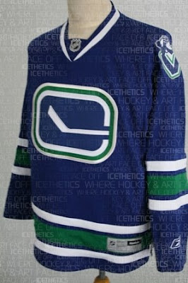
Canucks Third Jersey LEAKED!
 56 Comments
  Tuesday · Oct 14 · 2008 | 9:05 PM PDT
  Yes, it's true! I have it for you right here on Icethetics. The Vancouver Canucks' third jersey for the 2008-09 season has leaked!
Have a look for yourself. It's got the updated stick-in-the-rink logo as well as the new Johnny Canuck "V" logo on the shoulders.
I'm thrilled about that Johnny Canuck logo making its way onto a jersey. I think it's such a great design. Also interesting to note about this jersey is the complete lack of the orca logo. It's similar in overall design to their current home and road sweaters expect for the the striping pattern. The colors are the same.
It's important to note that this is not an official image. The Canucks have yet to make any sort of announcement regarding their third jersey. This is merely what's believed to be a leaked photo of it.


Reader Comments (56)
looks awesome. thanks for the updates. your the only blog i ever visit
Yesterday, I went to Chris's other website. It is www.sportslogos.net. If you go there and check out the evolution of crests from other NHL teams, you can see that the Canucks are not the only team to alter their crest. Teams, including the Original Six, have made changes over the years, though, most not so recent. The Rangers' original shield looked more like an MLS team badge. When they won the Cup in 1940, they did not have serifs and 3D shadowing on the wordmark on their sweaters. Similiar overall look, but different design from what they had in 1994. They also tinkered with the badge over the years, up until 1978. The Bruins and Leafs have had several incarnations of their respective crests. The Vancouver Whitecaps modified their Ball on the Wave badge when they changed their name from 86ers back to Whitecaps. It wouldn't surprise me if they do some more tinkering if and when they join MLS.
The MOST important thing to remember is that the Canucks have gone back to their roots, but with an updated look that still looks traditional.
Yesterday, I went to Chris's other website. It is www.sportslogos.net.
That's not my site. That's another Chris.
My apologies Chris. :)
There's nothing wrong with the new design of Icethetics...I use Safari on Windows XP, so I can't see the new backgrounds and changes...oh well :P
the new stick in the rink logo is unnecessary as the old 1 still kicks ass - but i agree with the johnny canuck logo and the v, as an ode to the vancouver millionaires, should be up front and center. colors still great though.