Oilers Unveil Third Jersey!
 33 Comments
  Tuesday · Oct 7 · 2008 | 9:05 AM PDT
  The Edmonton Oilers became the sixth team to unveil their third jersey for the 2008-09 season. They did so today by launching a beautifully produced seven-minute video on their official web site.
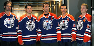
The jersey is similar to the blue sweater worn prior to 1996 with a few slight tweaks. The collar has been changed and the 30th anniversary logo will be on the right shoulder. Here you can see the captains wearing their new duds.
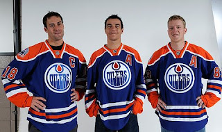
And here's another great photo from the team's web site.
The video delves into the history of Oilers sweaters and it's explained that the fans were very much a part of the process of choosing the final design for this third jersey. Overall the video is very much worth watching whether you're an Oilers fan or not.
Even Todd McFarlane gets a shoutout. Funny, I just wrote a post about him yesterday.


Reader Comments (33)
I like these jerseys better than their current home jerseys .... so far my favorite is still the Blues thirds
I was never a big fan of those jerseys back in the day, and I still don't really like them that much.
The best part of that video is all the game clips... and the color problems made me laugh too. I didn't realize the Oilers were blue & red in 1990 (and apparently they were blue & green in the early '80s). LOL...
totally awesome, reminds me of when i was a kid watching Isles vs Oilers stanley cup finals. I soo need one of these new jerseys.
Isles look better in orange and blue. Mainly because the other color options they've ever had was orange, blue, teal, silver, and white color scheme. The oilers look fine and modernized with bronze. Throwbacks are fun anyway.
Well done! Glad they didn't mess this up. No "modernizing" with piping or changing colours. A classic is a classic, let it be.
I found it interesting that they didn't have anything positive to say about the regular set. I wish they'd have done some research before ruining those. Hopefully after the minimum time required has passed (three years I think I remember it being?) they'll be returned to what they were pre-Edge and all will be well in the Oilers uniform world.
I think we can go ahead and say that they win this third jeresy thing. Dang that looks nice.
daniel what are you talking about he video worked flawless for me the whole time. Maybe you need to update your codecs
Lance, I'm not talking about the online video quality. I'm talking about the original VHS (or whatever it was) quality. The shoulder yoke is pretty red in the clips from the 1990 Cup win, and then there was that one clip where they talk about Kevin Lowe scoring the team's first NHL goal and the shoulder yoke is a weird greenish-yellow color.
I just thought it was funny. I guess I'm easily amused. *shrug*
Too bad I have to wait till Nov 18 to get it :S
I'm sure the focus groups unanimously agreed they only wanted to wear the uniform for 14 games this year too...
Like the Sabres New Third, the Oilers jersey should have been introduced as "The New First Jersey"
good job on the oilers' part. their fans got what they wanted.
the next move for them is exchange their super ugly white jersey for the vintage white.
2 interesting things about the last two new thirds: the collar.
RBK managed to impose a single style of collar to all NHL teams (we could say 2 styles if you count the lace up).
however, the leafs' and oilers broke the trend. the leafs has only one colour (all other teams have 2 colours) and the oilers created a new kind of 'ending' for the V : instead of finishing in a V, it has a square ending.
the more the teams are allowed to break the RBK mold, the better.
only thing i dont like about this jersey is the neck. it looks weird to me. other then that, its sweet. sabres and oilers got the best so far.
s-m the oilers apparently wanted a triangle affect but obviously them and rbk/nhl compromised in the end.
dan, sorry for the confusion.
Hey Chris, for the Pittsburgh jersey countdown, you have it listed as the Blackhawks. just wanted to point that out to you
s-m and lance there are actually 4-5 collar styles for RBK Edge jerseys. The Hurricanes new 3rd jersey has a more triangular collar. There is the lace, this Oilers 3rd collar, the Sabers Home/Away, Calgary Flames and a few more. Quite a few styles out there to choose from.
Great jersey! This will look awesome once they redesign their home/away jerseys.
Apparently the Oilers goalies are even going to have unique masks and pads that they will wear with this jersey. Dwayne Roloson will have a Grant Fuhr replica mask and pads. Matthieu Garon will have a mask that will be a Fuhr/Ranford/Garon fusion. Nice touch!
http://www.nationalpost.com/sports/story.html?id=866217
I'm a fan of these. I've been waiting to start an NHL 09 franchise based 90% on if I liked this third jersey, and it turns out I am liking it quite a lot. Instead of my Caps, I may go with the Oil now.
I like that they're doing the whole kit and caboodle. Sometimes, they just change the sweater, and it looks dorky with the different colours.
Now I have to scrounge up $140 or whatever for this come November. Is that a good thing or a bad thing?
cptjeff said...
I think we can go ahead and say that they win this third jeresy thing.
Came here to say this.
wasn't disappointed.
Should have gone with the standard collar.
Otherwise, awesome.
Wow, involved their fans in the process? What a crazy idea! Great job Oilers!
I love what the Sabres ended up with for their third, but a focus group might have nixed the silver piping, not to mention what they would have done to the slug back when that decision was being made.
The slug is a godly logo, way better than the sheeps head and the original, but I love the original with silver piping. Oilers third is boring we need something new, Blues are way better by far than all third jerseys released so far.
The jersey is modeled after the 1979 sweaters.
are you kidding, the slug a godly logo?
well this is actually a little different than the 79 sweater as the stripes around the waist are MUCH smaller and there is more blank space around the crest
lol @ a Bruins' fan and a Flyers' fighting about whether the slug sucks or is great.
Well they look a hell of a lot better than their regular uniform
Bravo Edmonton Bravo!!! That's the way a retro uniforn is supposed to look. I like the sabres new 3rds but HATE the silver piping crap. Now hopefully my Pens will follow suit and create a 3rd or even all new uniform when they move into the new Arena. Maybe, I don't know, the '91 - '92 Cup uniforms!
I like this new jersey. I honestly was not a big fan of the McFarlane Oilers 3rd. It was too... well it looked like a Chevy Kings style jersey with a new logo.
The collar though I don't think I like. Looks like its incomplete but other then that I think it looks fine.
I looked on the site, you can preorder this jersey already and they finally did something smart! They brought the BIG size replicas/Semi pro's back, you can order a 3 or 4 XL now. I'll probably still buy the pro.
Arrowcatt11 has a good idea, I'd love to see the Cup winning penguins jersey back too. That Blue winter classic jersey sucks. People laughed at Atlanta when they had a powder blue jersey, but Pittsburgh brings back a jersey that was considered ugly in its day, and for whatever reason people love it? Not me. So hope they come out with a 91-92 jersey someday.
Love it! LOVE IT!! As a long-suffering Canucks fan who hated the Oilers during their glory years, I always had a soft spot for these classic sweaters. Royal blue and orange look so great together and they say "Edmonton Oilers". These uniforms are colourful, but simple and traditional. Does anybody remember the January 1982 edition of Sports Illustrated with Wayne Gretzky on the front cover? That's when I realized how sharp the Oilers uniforms looked. I hope the Oilers bring these uniforms back full-time.
Now, if only the Flames can bring back their original deep red, white, and gold uniforms from the 80s and early 90s. Those were the TRUE Flames uniforms. Sorry, but red and black is just too common, ie. Chicago, New Jersey, Ottawa, Carolina.
Love it also!! FINALLY, some old-fashioned SHOULDER BARS!! And bright colors with no black overtones!
Once again, old is better. This jersey never should have changed in the first place...
Another question though, with all those captains, wouldn't it be easier to find a guy who ISN'T an Oilers captain? Just saying...
I LOVE these jerseys... But what was the point of a big unveiling when they're the vintage jerseys? Why not just say "We're going to wear our vintage jerseys as alternate jerseys this year."?
I would also like to see the Oilers bring back their 2002-2007 alternate jerseys. Those were HOT!!!