Logos Revealed In Public Docs
 8 Comments
  Tuesday · Aug 19 · 2008 | 10:24 AM PDT
 A rather industrious reporter for the Ottawa Citizen may have found some new third jersey logos. In his blog Hockey Capital, James Gordon writes, "Potential new logos and third jersey centrepieces are starting to trickle out of public document filings in the lead-up to the 2008/2009 NHL season and I've posted a few here for your perusal."
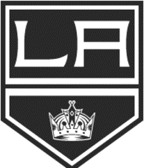
The new image we haven't seen before is this one, which appears to be the Los Angeles Kings logo described by Howard Berger last month.
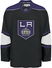
He said, "The Kings will unveil a predominantly black jersey with the letters 'LA' inside a pencil-point logo on the front." If he's right, this appears to be our winner.
This concept jersey I posted a few days later is the closest yet.
It doesn't end there. A logo he found for the Coyotes all but confirms the logos I posted here and here.
Though this is the black and white version. I really love that logo, by the way.
And for whatever it's worth, Gordon also had this logo for the Edmonton Oilers' 30th anniversary celebration.
My unending appreciation goes to Greg at Puck Daddy for the tip as well as continuing to pimp Icethetics!


Reader Comments (8)
(Sorry, left out the Coyotes comment in the post I deleted above)
They said we'd be get shoulder patches here in Edmonton this year, and that would be an awesome addition to our BOOOORING pyjamas... errr... jerseys that we had last season.
Phoenix. Cool logo. Would be decent on a third jersey, but not many other places IMO.
... and then there's LA. Who ever is in charge of their graphic department, can it be arranged that they fall off the side of a mountain or something? I can see the conversation now... "OK, let's take our regular crown, throw some clipart behind it as some kind of crest, and then I've got this cool font that I downloaded, but haven't been able to use yet. OK, what do you think?"
Good God, that Kings logo is fugly.
LOL yeah i dont know whats up with the King Design Team But they have the Worst Taste in what Looks good. Right from the bigging it had just looked Bad. and this one is just another to put on the top of the heap of Garbage they call Logos for that hurting team. I dont even think the kings fans Like what they are getting. Some one needs to help then. Lets send in Matt!.
Kings fan/season-ticket holder here.. I can tell you, I don't like what we're getting. Good Lord, please fire whoever came up with this pitiful idea.. if it were the concept jersey posted a couple weeks ago, then that'd be perfect.
Not only that, but the crown is about the same size as the gap in the 'A'. Seriously, for future designing of alternate jerseys, the teams should consider fan feedback, and I don't think this terrible design has any.
An addendum: if that is the logo, I don't care what awesome striping pattern the team can come up with for the jerseys (although I can't expect an awesome pattern to come from the guys who made this logo). This alternate jersey in my opinion greatly surpasses the Oilers' 2007 pajamas as the ugliest on-ice product of all-time.. the product on the ice wearing those ugly jerseys isn't exactly great either.
The LA logo looks more like a shoulder patch than a crest.
I'd like to see the Oilers patch on the front right breast of the jersey where most "celebration" patches go.
Coyotes logo is okay. I reminds me too much of Greyhound Buslines though and not so much a hockey logo. http://www.greyhound.com
That Coyotes logo is SOOOOO awesome, except for the gimpy right, hind-leg....it looks way too disproportionate compared to the rest of the body, but I'll still buy the jersey :)
That kings Logo reminds me of the old UPS logo
http://www.logoterra.com/logodesign-logo-design-logo_design5/GIF/UPS-logo.gif