Blues Unveil Third Jersey!
 40 Comments
  Sunday · Sep 21 · 2008 | 10:35 AM PDT
  Today, the St. Louis Blues became the fourth team to unveil their third jersey for the 2008-09 season.
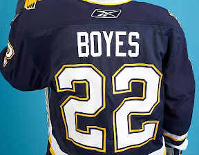
The team posted a photo gallery on their official web site shortly after the unveiling ceremony at FANfest. It features Brad Boyes wearing his brand new sweater.
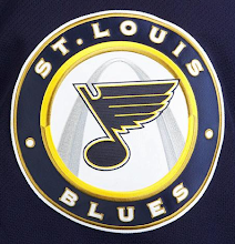
Below you can see shot of the complete uniform and a close-up of the crest — a new logo featuring the iconic Gateway Arch.
From what I can tell, they kept the same pants but got new socks to match these sweaters. They've also dropped the lighter blue from their color scheme for this jersey. They have a very classic yet not retro feel to them.
The third jersey features the same numbering and lettering style as the regular home and road jerseys.
For what it's worth, it looks like the sneak peek I posted yesterday was dead on — just really terrible quality.
To the right you can check out the full photo gallery which now includes several pictures sent to me by folks who attended today's FANfest in St. Louis where the jersey was unveiled and on display.As with all of the photo galleries, I'll add game action photos when the jerseys finally hit the ice.


Reader Comments (40)
I think this is a solid jersey. A Vintage look. I love how the arch is silver and not a darker color. I feel a darker color would've taken away from the blue note. Overall, I give this jersey a solid 8.5/10. Take away the white wrist color and make the yellow arm and waist striping an inch or two thicker for it to rank a perfect 10.
Very nice. I'd have to have one if I were a Blues fan.
I am a Blues fan and I really want one!!
Very, very sharp. Now, that's being creative without going overboard. Now, if only the Blues can design their primary home royal blue and road white sweaters EXACTLY the same way. That means getting rid of the vertical gold piping and going with the same striping except have more gold than white. Overall, another fine third sweater.
I like it, but it does look a bit like the Sabres with the dark purply blue.
those are awesome. I can only hope the Sharks 3rds are on par with those. I know they wont be though = (
Wow, that looks awesome. Love it. Not even a Blues fan, and I almost want one.
I'll take one! Excellently done by the Blues.
I'm not a Blues fan, but I certainly want one. Too bad I haven't got the money.. I guess I'll have to settle for my complimentary LA Kings third jersey.
Classy. That's two winners in a row. Wonder if this one becomes the home jersey in a year or two as well? ;)
What no trumpets? J/K. I like it, very classy...the pants leave a little to be desired but all in all nice system. I especially like the metallic gold accents on the crest...giving it a dimensional look. Thumbs up St. Looie!!
This jersey is fantastic. It really screams vintage hockey, but looks fresh and new. I think with their current home and away jerseys, the Blues have some of the best jerseys around. As others have said I only hope the Kings third jerseys look this good.
5/5. One of the Best Third Jerseys to come out of an NHL Team. Classic style and Freakin Awesome! Probably gets the Award for Best "New" Third Jersey. (not a vintage revival like Buffalo's) It's like Minnesota's Jersey only a bit more modern and 10 times better.
hopefully the new pants (or pant shell) weren't in yet and they will change those as well for a better overall look.
From the pics we had seen I was really worried that arch was going to detract from it, I still almost think this jersey would be better without the arch, but I like how the arch doesn't overshadow the bluenote.
it's a shame that anyone would call this a "vintage look"... 6 years ago it would just be another decent hockey sweater. "Wow a design that doesnt have lines going in twelve different directions, that is so retro!"
I must admit I'm disappointed they could not have incorporated the light/royal blue in the jersey, at least as a piping or border color bewtween the navy and gold. It does seem that everything recently has to look like Buffalo's color template. I wish they would have made the shoulder bluenots royal blue too. I have to say I prefer the current jerseys. These are not great enough for me to go spend $$$ on.
One more thing: I know the bluenote is centered, but the tip of the wing overlaps the gold outlin of the circled. Seems like they should have justified it.
Again, too much white, no royal blue, and the numbers should be gold as well, like every Blues jersey up to this point.
My vote as a lifelong, ardent Blues fan. 3/5.f
Not the most original idea to put the logo inside a circle, but these sure are beautiful jerseys.
Great job by the Blues organization. It does remind me of the Sabres' third, though having more white and a yellow, rather than a gold, makes it seem a little brighter. The logo is very well done and, yes, a little Wild-esque. The only small detail that I'm not crazy about is the single white/gold stripe, but it's not terrible, just ... meh.
Something about these I just don't like. They just don't scream "blues." They seem almost TOO generic. Not terrible, but not great either. 3/5
Really nice jerseys, but I agree with Paul that it doesn't look like the Blues for some reason. Maybe it's that I'm used to nothing but the Blue Note and the circular crest is throwing me off. I'm sure it'll grow on me.
To provide some clarity 'bout the pants, new gloves, socks & pants will be designed to compliment the third jersey when they are debuted for actual game play. IMO, for a third jersey it's not bad. Growing up bleeding blue I believe I never want the Bluenote no other way than it has always been, presented alone. But if they were going to change it for a alternate jersey this seems nicely done. Takes some getting used to . . . like many other posts I want more gold.
WOW. I freakin' love it. Perfect enough not to change the team identity, yet different and original enough to warrant it's existance.
I'd never want this to be the main jersey but it's a bloody wicked third for sure, very sharp, glad they put the logo on the shoulders too, very necessary and very attractive.
Love it, getting it, just gotta know who's name to put on it.
Good work!
now please, go back to the main jersey, edit the back, that stupid RBK logo ruins the flow of the lines on the back of the jersey, don't box it, keep the lines straight and put it over the lines... (other than that i like the main jersey too)
_looks good, better than sabres' 3rd
_would be real good without the white at the end of the sleeves
_overall, great job -now just take away the ugly piping on the current home jersey.
as a blues fan I love it.
the only better 3rd I can think of is the pens blue
Not great. But pretty good.
Perfect.
Nice and simple... I'm pleasantly surprised.
I'd just like to point out the "insider" blog that we were all basing our predictions on was only 50% correct.
He said this jersey would have "broad white stripes trimmed with black." In actuality it has modest white stripes with a smaller yellow stripe below.
So next time I'm not going 100% on blogger descriptions.
Ew. Their current jersey is way better. I was looking forward to this one, and I've been let down.
I agree with Ogre, this jersey is a let down, I've always loved the St. Louis image; especially their current jerseys. But this one just looks like its from a McDonalds charity tournament. Too bad they missed on this one.
in 1995 thay had an arch in their center ice logo
Was the guy designing this loaded when he was making up the new Logo?? I like it and all but why not center the Blue Note right int he middle of the inner circle?? Why is it so that just the tip of one part of the note is touching the yellow circle? It should be centered IMO, you'd see a bit more of the top of the arch and it would male the overall look of the complete logo way better!!
Way better than the Sabres, the Blues actually did it right...NO PIPING.
The arch in the background reminds me a little too much of Micky D's.
The logo makes me think about McDonalds. I am hungry for a big mac now. Thank's a lot blues.
Not bad, nothing that really makes me cringe. I only wish it was in their original expansion blue rather than this navy blue.
The jersey itself is OK, but I especially like the logo. Well done!
Living in Vancouver I'm definitely a Canucks fan, but after seeing this third jersey, I can admit I am jealous, and I would love it if the Canucks had a 3rd jersey as sweet as this one.