Bruins Unveil Third Jersey!
 Monday · Nov 24 · 2008 | 9:16 AM PST Comments Off
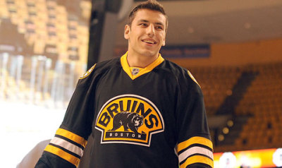
  The Boston Bruins unveiled their third jersey this morning on their web site, making them the final team to do so for the 2008-09 season.
Though they were the last to officially unveil their alternate sweater, the Bruins were the first to leak it — multiple times.
NESN cameras were permitted to shoot a player skating around the ice in this jersey last February in video which later made it to broadcast and then the pages of Icethetics. Then in September at the State of the Bruins event for season ticket holders, Milan Lucic made an appearance wearing the new threads. This was mentioned on the team's web site at the time but no pictures were posted.
Until today.

I love that logo. And I like the use of the primary on the shoulders. But in my opinion, this is a rather lackluster jersey. Why black? Why the same stripes as the home and road sweaters? Why no tie-up collar?
I think the Bruins missed a golden opportunity here (wink, wink). I also think their home and road jerseys are among, if not the best in the league. So don't try to copy it, you'll only ruin it. And that's what happened. They should've taken a completely dfiferent tack with these, just like with their first third jersey.
But that's just my opinion.
And now that all 18 third jerseys are out, I'll be posting my complete ranking tonight or tomorrow. After that, you guys will get to vote.
Also coming this week, I've got news on a couple of teams with plans for alternate sweaters next season. Plus, now that the third jersey hoopla is coming to a close, I'm going to start to steer Icethetics back to its original purpose. I'll talk more about those plans later this week.


Reader Comments (43)
well, not surprised...since we saw them already lol....kinda boring...like san joses....especially with the all black pants they will use....they (like SJ) should have put a little more color in the pants so it wasnt too much black...i like the jersey but the whole uniform together is kinda eh
That picture was from the season ticket holders meeting, though it has been exactly the same since first unveiled.
Chris, they had a golden third jersey before. It was hideous. I don't think any pro team can successfully pull off a golden/yellow jersey. Those who have tried have failed. Hard.
Agreed, yellow would have been interesting. These are far from bad, though. They don't compare to their regular set which is my favourite in the league, but it doesn't hurt the team's overall look like I think Phoenix has.
Thumbs up if I have to rate it, but a third seems so unnecessary when their regular set is so great. Why wear those less often?
I like it but a gold stripe at the bottom of the jersey would do WONDERS. I also wish they would go with different socks but oh well.
I'm a little disappointed with this cause gold jersey would have been awesome, seeing as they would be the only one in the league with one and with basically everyone going to black, that would make the Bruins stand out even more.
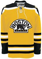
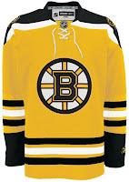
I think something like the gold jersey like either one of these would be unreal:


Oh and Drew, Gold is totally different from the Yellow they used to wear.
This is Yellow and just EWWW! Gold would be different.
So how does gold differ from being yellow without going full-on horrible "Vegas gold" like Pittsburgh wears?
Is there a concept of that gold bruins third above with the black logo on front and not white nick? I think the black patch on the front of that would look way better than the white one you have.
i dont really get everyone's vendetta against black jerseys. They're pretty crisp and sharp looking, in my opinion.
My vendetta against black jerseys is there's too many of them. They're not original. I see team after team unveil black third jerseys and after a while it's just really underwhelming. Meh, another one? Big deal.
Now having said all that, these jerseys are a HUGE improvement from the Mustard Winnie-the-poohs the Bruins wore earlier this decade. Boston and Nashville have forever ruined gold/yellow hockey jerseys for me.
Great 3rd jersey.
Moosehabs summed it up nicely for me.
These aren't as good as their normal home unis; if anything, they should have gone the yellow/gold route like Nick posted.
The Bruins are one of the few teams that can actually pull off the black look, largely because it has been their main color for decades. The current crop of black jerseys were introduced largely because some marketing execs think they look "intimidating", when in reality most of them are just drab, ugly, and uncreative. There's nothing worse then when teams go to a predominately black color scheme (Ducks) or don't have black in the color scheme and trot out a black jersey anyway (Coyotes). Yuck. What is the matter with color?
Black sells. Colours are more subjective to people's taste. Sure the Flyers orange third looks good but not everyone will want to walk around town looking like a pylon.
I LOVE THIS JERSEY. I think it's one of the best in the league. (Maybe it's just my Boston fan mindset)I agree with roccot. black sells. And I want this jersey.
i really think it is a nice jersey but what i do not like about the rbk edge system is that they only permit certain colors and black everyone has done but this is one of the nicer black ones unlike the seators that were below average .....they should have used the classic o shoulder patch as there altenate logo ....well w/e nice jersey bruins i give it a 8/10
The Bruins were the first team to wear black (out of the origonal six), so why should the bruins have to wear a different color? Dont blame the Bruins for donning a black sweater, they deserve it. We should be complaining about all the other teams with their black jerseys.
I think that yellow mockup of the new jersey would have more diverse, and I'd probably be more prone to buying one like that instead of another boring , black Boston jersey.
Don't get me wrong, I love black jerseys. But if you already got one.....
New third jersey plans for next season?! I'm going to get excited already, I hope something has leaked from the Preds office because we really to spice things up a bit with our uniforms.
Nick's Gold mockups are pretty much perfect; that is what I wanted as a Bruins fan. Would be even better with some extra "barber-pole" striping on the arms and socks...
Guys, this is a concept I did about two months ago that Chris posted. I love brown in B's jerseys, as you can see. I would love to see this. I also did one with black, as shown here too (which is similar to the gold/black one up above in the comments). I know there is mixed reaction toward the real jersey, but how would you guys like either of these? I know there is a big negative emotion toward the yellow Pooh jersey, and I'm genuinely curious. Thanks for any feedback.
Also, I'm very disappointed that they want to have a "Blackout" in the Garden. the more I think about it, the more I wish there was no third.
Actually Drew, I loved those old Bruins thirds, and Nashville's old alternates.
By the way, thanks to that pun, I think Chris might be my real father. :O
The jersey is SICK! Cant wait to see what Savard will look like in it. The black just makes the team look like the Hawks from the Mighty Ducks, very aggressive.
As for the jersey code, the 09 producers said they have to wait on a mutually agreed date with Reebok. David Littman said sometime in December. I would rather see a patch for the PS3 than the jersey code.
GBM, those are killer.
i'd like to see this jersey in yellow
I agree a "golden" stripe along the bottom would have been nicer. I also think if you had this particular jersey in yellow it would be alot nicer than the last time they tried it.
On Molson That's Hockey tonight (basically just a hockey program on TSN in Canada for those of you who are American and possibly don't get that channel) Geno Reda the anchor was doing his Plus/Minus of the league for the last week. He gave a BIG Minus to the "boring" (his words) new third jerseys in Ottawa, Tampa, Atlanta, etc. I'm glad to see some of the expert staff at TSN, who live and breathe hockey, are putting in their own two sense on this issue.
Love it, GBM. That's how it should be done.
They're All Out! The team that leaked their third first unveils their jersey last, how Ironic.
The Picture makes them look good but without a bottom stripe it gets rated like the Sharks'.
The Highlights:
-Secondary Logo
-Primary on Shoulder (It looks nice)
The Lowlights
-Nothing New (We've known for about the last 10 months what they'd look like)
-No waist stripe (That Gold Waist Stripe would have been an improvement)
-Black Jersey (Not so much a bad thing but why didn't they think about Yellow?)
Basically that's all I have to say...
Overall
3/5
Well, the third madness is almost over... until next season! To me, Boston's jersey is meh, considering I have seen it through all of the leaks posted. Gold would have been nice and the jersey deserves a horizontal stripe at the bottom. Can't wait to see the news of alternates for next season, Chris! And by the way, that pun made me almost choke on my dinner!
The Bruins look sharp. I think it would have been neat if they went with the old yellow that Bobby Orr used to wear.
I don't know, I like it, and I don't mind the black cause it's their main colour. A yellow version of this would be interesting though. The concept art sent here look great, but the logo should be black, not white - the white logo on a yellow jersey looks disgusting.
Finally this is over! Will we get some concept art now? :)
Definitely a missed opportunity, considering the initial prototype was better than the final version. Those alternate yellow concepts by GBM and Nick are truly unique and very well done! Either one would have worked well as the Bruins new third.
The new B's looks ok. Nothing spectacular but nothing great (same can be said for my Sens).
HOWEVER I think a replica of what they wore for the 75th NHL anniversary could have been cool OR a version of the Bobby Orr period jersey could have been neat too!
For this B's jersey though I am curious to see what the name and number schemes will look like.
Boring and pointless (except for the $$$). It's not the worst I've seen, but it is way too similar to the regular home jersey. Teams are getting way too conservative with their designs. Boston, Vancouver, and Dallas especially should be slapped hard for their lame attempts.
Give me the bright blue and orange of the Oilers and Islanders over all this black crap.
MattyP, at least the Canucks didn't use black! Personally, I think that their new third was released with only new logos because it will become their primary in a few years, to replace Free Willy.
Sorry to put you down Nick, but gold would make this jersey look like a piece of crap.
Wingerdinger, I agree with you about the 'Nucks jersey. Black would look so UGLY! But sorry to say, the 'Nucks will never changer there third to there home (trust me I'm a 'Nucks fan) because the jersey is loved by the fans to much now.
i tought all jerseys were revealed last night lol!!!!!!!!
First, my two favorite teams are the Bruins and the Senators, and I haven't quite gotten over the shock of seeing them exchange positions in the standings. Anyway. . .
The Sens 3rd jerseys are great except who decided to put SENS on the front? How braindead is that? How could they not come up with a graphic? I loved the old Senator profile.
As for the Bruins, their 3rd is OK, but I miss the yellow with the big teddy bear. Intimidating is overrated!
i think that a yellow bruins jersey would look awesome. but i think they would have to use their primary logo on the front because we saw what the third looked like with the teddy bear. The providence bruins have a yellow retro jersey they sometimes where and it looks great

linktext
Paul, I agree with you that the Senators 3rd's look ridiculous with a 4-letter nickname across the front. Who's dumb idea was to start using words in place of logos? It's totally detracting from the game. Trust me. And I was quite pleased to read your comment on the Sens inaugural jerseys with the trojan profile. So much nicer than their current turned-face look. It just looks too much like a real face under that helmet! I own a white one (pro model) with Yashin name & #. Wish the Sens would revert back to their first jerseys. I think the 3rds have nice coloring.....but that's where it ends.
Bruins old style jersey with the bear in the gold w/brown accents was very vintage. I'd like to see that on them as a third. The new black one is way to bland.....or black!