


Connecticut Whale Logo Unveiled
 70 Comments
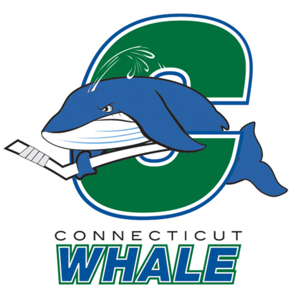 Connecticut Whale reveal logoThe AHL's Hartford Wolf Pack will be renamed the Connecticut Whale at midseason. Today, the marketing team unveiled the new logo that will take over when that happens.
Now I should preface this next part by saying regular readers know I'm never among the first to be critical of a new logo. I try to be neutral and let you guys make your minds up first...
...but this is just horrid. I mean it. This is an organization that's supposedly trying to recapture the excitement that once surrounded the Hartford Whalers. And this is the logo they plan to do it with?
Guys, what happened? Very disappointing.
There's a story on the AHL's website that contains a quote from Howard Baldwin that explains everything:
According to Howard Baldwin, chairman of the Whale franchise: “We have created a fun logo that not only captures the family-oriented approach of the Whale, but also represents the competitive nature of Coach (Ken) Gernander’s Whale team.”
There's your problem. Marketing to kids is important but that doesn't mean your professional hockey team's logo has to be a silly cartoon.
The logo was designed by Baldwin, the Whale marketing team and designer Erik Carlson. The Whale will introduce a secondary logo mark and official Connecticut Whale jersey designs at a later date.
After this, I'm not looking forward to the secondary logo, but my theory is that they can only improve from here.

Reader Comments (70)
I never understood those colors. Blue and Green don't even match!! How do they go from those beautiful red, white, and blue unis to these horrendous things?? Two thumbs down. RIP Wolf Pack!
Here is how much Howard Baldwin knows about logo designing...he is the one who singlehandedly changed the Pittsburgh Penguins logo from the super-popular "Skating Penguin" (which we have since reverted back to under the leadership of Mario Lemieux) to the "Corporate Bird." HIDEOUS!!
That is incredibly weak. All or nothing and this doesn't even come close.
The Whalers Sports & Entertainment logo shown during the news conference (hartford skyline with green whale tail in the background) would have been infinitely better. http://www.whalerssports.com/
Corporate advertising has a potential great sponsor with this: The Connecticut Whale sponsored by CW TV
What...the hell is that?!
What were you guys expecting? Howard Baldwin is the same guy that changed the Pens uni's/logo to that God-Awful PIGEON logo in 1993, even though the team had just won Back to Back Stanley Cups. I have never forgiven Baldwin for that and Personally I HATE the PIGEON logo, so glad Mario Lemieux changed it back to the Skating Penguin
I kinda think it would be a cool shoulder crest, but as a main logo not so much
Not good. Good Whalers logo, look to Plymouth of the OHL.
A space for sharing better versions of the CT Whale logo:
http://www.flickr.com/groups/ctwhalelogos/
I also really really really hope this is not the actual jersery http://www.flickr.com/photos/53818601@N04/5011174353/in/set-72157624879082381/
Monumental Fail :(
Maybe the Rangers are TRYING to make Wade Redden refuse to report? Forcing him to wear this atrocity might just do the trick. This is just BAD. And what makes it worse is the knowledge of how perfect the old Whalers logo was. Bluh.
Baldwin was chairman of the Penguins back in the 80s and 90s. He gave Pittsburgh the hideous Pidgeon in a Triangle for the whites and the lackluster PiTTSBURGH in diagonal for the darks. Then he drove the team into bankruptcy. This latest effort doesn't surprize me.
I spent just 20 minutes and came up with something I think is better than what they used.

these kindsa logos really bug me, especially their reasoning for them. i think these guys really underestimate a kid's ability to like a more aesthetically pleasing design. and also, it's ultimately gonna be adults wearing these uniforms anyway.
It feels like a concept that was rushed. It could have worked but the "C" is hard to read, as it looks very similiar to the "S'" of Springfield Indians (Harftord Whalers former minor league team) logo of the past. The tail looks extremely unnatural and the line weights are all over the place. Seems amateurish. An opportunity missed for sure.
I will never understand the colossal mind dead behavior of sports owners etc.,, don't they EVER think it might be a good idea, in situations like this to consult with and ask the opinion of their prospective fans,about such things. We could have given them a lot better design than this, and it would have been acceptable to them.
It's still not too late to run a contest of ideas from the fans, to see what they would like to see their rooting team to be.
It's not a very practical idea to put forth a team name and design that the fans will not be embarrassed about.
Egad
YIKES!
looking back on this im kinda happy that this sucked because it taught me a very valuable lesson. it taught me to never get my hopes up for anything...ever. which made dealing with the islanders 13 game loosing streak a little bit more bearable