


Connecticut Whale Logo Unveiled
 70 Comments
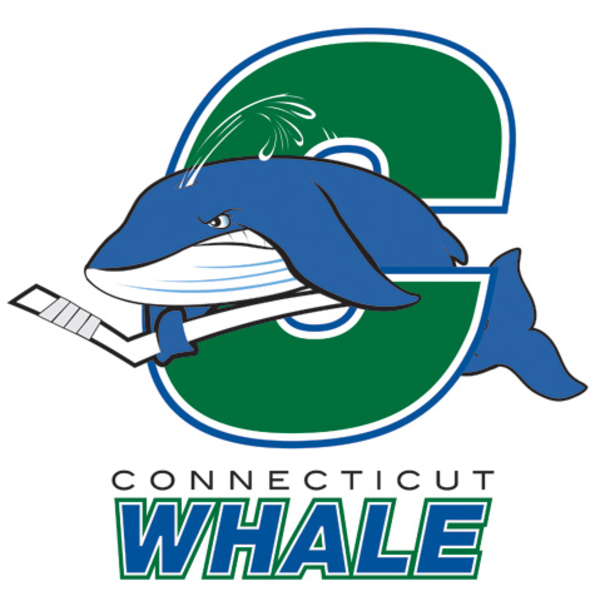 Connecticut Whale reveal logoThe AHL's Hartford Wolf Pack will be renamed the Connecticut Whale at midseason. Today, the marketing team unveiled the new logo that will take over when that happens.
Now I should preface this next part by saying regular readers know I'm never among the first to be critical of a new logo. I try to be neutral and let you guys make your minds up first...
...but this is just horrid. I mean it. This is an organization that's supposedly trying to recapture the excitement that once surrounded the Hartford Whalers. And this is the logo they plan to do it with?
Guys, what happened? Very disappointing.
There's a story on the AHL's website that contains a quote from Howard Baldwin that explains everything:
According to Howard Baldwin, chairman of the Whale franchise: “We have created a fun logo that not only captures the family-oriented approach of the Whale, but also represents the competitive nature of Coach (Ken) Gernander’s Whale team.”
There's your problem. Marketing to kids is important but that doesn't mean your professional hockey team's logo has to be a silly cartoon.
The logo was designed by Baldwin, the Whale marketing team and designer Erik Carlson. The Whale will introduce a secondary logo mark and official Connecticut Whale jersey designs at a later date.
After this, I'm not looking forward to the secondary logo, but my theory is that they can only improve from here.

Reader Comments (70)
uggg. i had my hopes up and everything.. the only thing that can make up for this is one darn good jersey. but its going to be hard to make this look good
So I was told that I might not want to look via the Twitter of Icethetics and I kind of regret doing so. That is just AWFUL. I can't imagine that logo on a jersey. It makes me laugh how bad it is. I loved the Whalers logo.. this is just a disgrace to the Whalers history.
I like it actually. haha We have to remember that this is still the minors and the minor league game definitely has a different feel than an NHL game.
This is one horrible logo. I was looking forward for a Whalers-esque logo. This is terrible. It looks like they came up with it in one day and had no other alternative logos. Very disappointed as I assume many people will be.
You're right..it is horrid. How disappointing. I thought they were going to recapture the Whale of old. Fail.
was it so hard to name the team the hartford whalers? my god that logo is just ...horr-awful. my eyes are bleeding.
i just threw up in my mouth a little. this is almost as bad as "Buddy Jesus" from Dogma. Nothing good has ever come out of marketing to children or the family crowd or the Friday Night Funpacks. Ask any hockey team that rebranded in the 90's. History and Icethetics have taught us that you start with tradition and work the other way. Baldwin blew it.
Why is whale singular?
This is very disappointing. I'm sad to say that I wasted time looking forward to this unveiling.
I think they should've just used that promotional logo which featured a C with the tail fin in the center, that was way better than this cartoony crap.
The Danbury Whatlers of the Federal Hockey League, they did an awesome job with their branding, A+ for their logo, and another A+ for their jerseys. But Howard Baldwin failed big time here with this Connecticut Whale logo and wordmark, he gets a big fat D-.
WHALE FAIL!
Yeah what a fail on this. Take a note from the Toronto Marlies. They brought in a alternate logo that was just marketing for kids. It has found its way out the door after only one season. It don't work Kinds are not your only client base. You have to market to the adults.
Now kids are going to be going from a cool logo to a boo logo. If you people knew anything about kids you would make a Cool logo for the kids. Kids like fierce too if it looks cool it will sell to them.
They should have also added hockey pants, socks and skates on the whale to make it more campy and look even worse
There's nothing inherently wrong with a pro sports franchise adopting a kitschy, cartoon-like logo... particularly a minor professional team. Frankly, that's the route that many minor-pro teams go. They utilize a kid-friendly logo as their primary mark, with at least a couple of ancillary marks that are geared more towards adults. Experienced, talented graphic design professionals including Dan Simon of Studio Simon and Joe Bosack of the Joe Bosack Design Company have proven themselves quite capable of developing attractive logo packages for professional sports franchises that fit this description.
The problem with the Connecticut Whale's logo is that it represents horrendous design technique. The line-weights are all over the place. Certain portions of the logo (where the "C" overlaps the whale's tail, the way the fin grips the hockey stick) look like a quick "cut-and-paste" rush-job. The fonts chosen for the wordmark are generic. The overall feel is dated - like something from the mid-1980s.
So, why did the Whale fail while other minor-pro teams have succeeded? Because a "design-by-committee" approach led by Howard Baldwin - an individual with no graphic design training - was bound to fail. Rather than hiring experienced design professionals who possesed a history of creating dynamic visual brands for pro sports clients, Baldwin opted to have himself and the Whale marketing team play too large a role in the design process. It strikes me that the graphic designer they hired - Erik Carlson - is probably a relatively inexperienced hand at sports branding. They went with "cheap and quick"... and it shows.
OMG....
This is just horrible .... Please lets hope that this logo is for the "Whale kids fanclub" !
But not for a PROFESSIONAL team !
Very disappointed.
Well we all know that trying to match the Whaler's famous whale tale logo was a lofty task to say the least, but this is just sad. Looks like a first draft of a high school project really. The concept is workable, but not by the artist that rendered this.
I don't mind it. I know its kinda cartoonish, but there is something about it that I find appealing. Its really the name the bugs me more than anything. Call them the Conneticut WhaleS (plural) or better yet Conneticut Whalers.
Pathetic. Baldwin needs his head examined.
It kind of looks like he broke his tail
Puke
nice to see that you are bringing back the old "just to freak you out" series, right?
"The logo was designed by Baldwin the Whale"
Taking out that comma sure explains a lot.
Would've preferred more of a Hartford Whalers feel to it, but I guess it's fine for a minor-league logo.
Seems like the perfect opportunity for the next Icethetics logo-design contest, no?
So disappointing...as a huge Rangers fan, and big Wolf Pack fan, im saddened and horrified...there was potential to come up with something really great, and they dumped this on us.
I used to love going to the Wolf Pack games, but now, who wants to see this crap.....
CRASH AND BURN!!!
Someone will call it the 'Connecticut Fail' eventually.
I'm sure even kids find this logo lame. In the thumbnail I saw in the Icethetics facebook page, I thought it was an 'S'.
Buffaslug finally dies only to be replaced.
i think johnny griswold's NE whalers concept would have worked BEAUTIFULLY here. "brian" has it best, its a rush job for the least amount of money. ive seen AVERAGE high school students come up with better stuff than this. poor choice. hope this isnt a precursor to how they're going to put this team together, sloppy and with little thought.
Here's the fail version for a whale of a fail...
http://i252.photobucket.com/albums/hh34/marcfosterftw/logos/ctfail.jpg
Heres to hoping the jerseys have a different logo on the chest, something more professional then this cartoon
Its not that bad, at least it doesnt look like a Slug carrying a hockey stick.
Honestly, the longer I look at it, the more comfortable I feel.
At first sight I was heavily shocked how they messed up a great idea. But like being said, it's still the minors and if you compare it to new logos (Lake Eerie, Milwaukee, Abbortsford(!)) over the past five years it just looks how it's supposted to: Old School!
And really: Who stops attending hockey games just because the team switches name and logo? It's not like they are becoming the Conneticut Cinderella and dress up in glitter spandex jerseys...
I was excited for Whale hockey. I was planning to go see Whale games... then this. Say what you want about marketing to kids. Kids know crap when they see it, too. This logo is a Cleveland Steamer on Hartford hockey. So much thought and care went into the creation of the original Whaler logo, but this looks like, as mentioned before, a rushed budget production. I am a Caps fan who lives in Massachusetts. I never was a Whalers fan, but I was living an hour away from Hartford when the Whalers left. The people of Hartford deserve better than this. As a hockey fan I am angry for them.
Horrible Horrible Horrible Horrible.
it looks like those secondary logos they give you on video games when you can make your own team. Just sort of generic and silly, crappy. From afar the white on the whale creates negative space that turns the C into an S. How ironic that the negative space that made the Hartford Whalers logo so great helps to ruin this already embarrassing childlike thing.
if i were to play for the singular named Whale i would be embarassed to have this on my chest. i mean c'mon. its bad enough they had to go and choose whale instead of whalers but now they have a very very poorly deigned logo to match. this is just my opinion but it feels like Bladwin isnt taking the TIME to make sure things go correctly. 1) whale not whalers, 2) name change in mid-season? 3) poor self-designed logo
You hit the nail on the head when you pointed out the "marketing to kids" line. I thought the same thing happened in Toledo when they developed the Walleye name and logo. They got too deep into "Family Friendly Atmosphere" and forgot it's a friggin' hockey team.
To hell with the kids. They like whatever their older friends like anyway. So forget about them. Same crap the Sabres fell into. Market to people who know better. The rest will fall in line.
Whaleaslug. :(
i hope js is right, that should be a kids club logo. hugh fail, i thought the wolf pack logo was corny, now im gonna miss it
Wow. This makes the Rockford Icehogs look like a top class logo...
The team is called "Whale" (singular) because the Whale is the state's official animal...also, Baldwin is "saving" the Hartford moniker for if* the NHL should return...but I believe it won't be long before the name changes over to Whalers (kind of ironic, naming a team the animal in lieu of the ones who hunt it)
Yeah... that's almost bad enough to make me not hate whaling boats. Hm. Maybe they should try one involving Spock mind-melding with a whale from Star Trek 4. Might actually be better.
Baldwin's dream is to bring back the HARTFORD WHALERS back to the NHL. This isn't the NHL, so no worries about a cartoon logo or a funny name. Colors are great though!
Here's hoping they go the Rangers/Wolf Pack route and go with the wordmark jerseys. I don't think I'll ever say that under most circumstances, but in this case it'd be a welcome blessing.
@Marc Foster : I see your Connecticut FAIL and give you my Twitter Fail Whale: http://twitpic.com/2t749b
The slug carried a hockey stick?
Either way, epic fail is epic.
I was at the game and my friends and I thought it looked like they combined the Springfield Indians' and the Plymouth Whalers' logos.
Maybe there is a tie-in with Twitter: Connecticut Fail Whale. Also, it looks like courtroom-like rendering of the Whalers' Chris Kotsopoulos getting caught in the hotel window while trying to sneak back into the room before bed check.