


Icethetics Season Preview 2011, Part 1
Before we look ahead to the new season, it's worth taking a brief look back. Over the past several months, Icethetics has been conducting a series of polls asking readers to rate all of the 90 uniforms worn in the NHL during the 2010-11 season. Now here they are, in the order you chose, from best to worst:
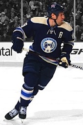
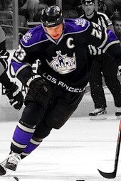
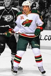
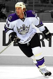
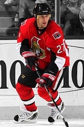
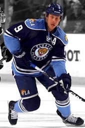
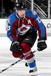
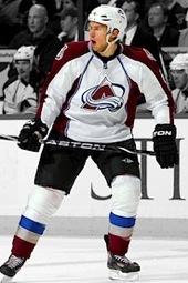
NHL Uniform Ranking 2010-11


 Chris
Chris
When I posted this today I forgot to mention the big number — how many votes there were. And actually, it's kind of impressive. In all, there were 483,790 votes cast amongst the 90 uniforms seen during the 2010-11 NHL season. That's about 5,375 votes per uniform.
The results of each poll were used to determine a numerical rating between 1 and 10. The highest-rated jersey (Oilers home) received an 8.642 while the lowest (Thrashers alternate) received a 2.003 rating. I can publish all of the individal ratings if there's an interest, but I figured the visual ranking would be more interesting. And for the record, there were no ties. Every jersey seen above actually rated higher than the one after it.
PollDaddy.com was used to conduct all 90 polls and I employed a feature that restricted voters (by IP address) to casting no more than one vote per day while each poll was open (two weeks for each poll) to avoid ballot-stuffing. It was the largest series of polls Icethetics has ever run.

Reader Comments (47)
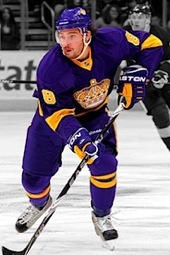
I agree with pretty much everything except those Purple Kings jerseys are super ugly, come on those Thrashers thirds are better than them.
I agree with Trevor, I'm usually all for throwback stuff (as long as it's not that weird classic/dirty white-tan thing) but it's weird when people confuse "classic" with "ugly" and let's be honest, that jersey is ugly.
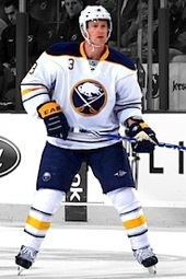
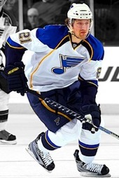
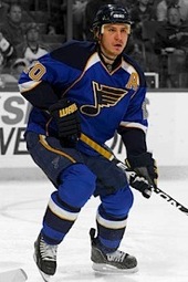
i'm actually surprised that the Buffalo thirds didn't place higher and that the St. Louis thirds placed as high as they did.
@ Trveor: I'm a Kings fan so i'm totally fine with the Purple Kings unis, ha
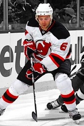
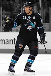
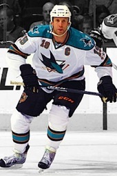
I'm disappointed San Jose's jerseys are so far down there, but then, I'm gay AND a Sharks fan, so my vote probably doesn't count for much in the long run. lol.
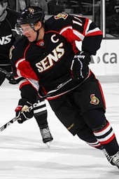
I'm honestly shocked that the Sharks' road jersey is their lowest ranked. It's one of the nicest road jerseys in the league. However, I feel mildly vindicated that they're all ranked higher than every uniform that both the Sens and Ducks wore last year.
Once again Penguins, your modern Vegas gold uniforms are near the bottom. Get it through your head, get rid or them!!!
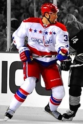
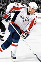
I'm a little surprised that the Caps home and road fell below the Coyotes home and road. Personally i think the Caps have one of the best modern looking jerseys in the league. Also I love the Ducks third jersey and think they should make it the home and add a white for road.
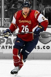
Also not surprised Thrasher third was last...
Trevor, really? Purple & Gold jerseys ugly, they are one of the coolest looking jerseys in the league. As far as the Thrashers jersey, I think you are in the minority, those things are/were a travesty.
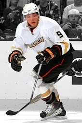
I'm suprised that the Ducks third was so low. I didn't expect the Flames third and Canucks throwback to be so high. 100% agreed with the top 3 and bottom 3.
I agree with the majority of locations but there are a few I found a little low, and a few more I found surprisingly high.
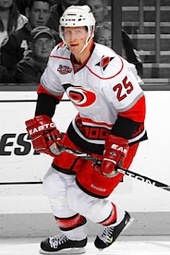
Too High: Vancouver (Home & Away) [Ditch The Whale, It Disgraces the Otherwise perfect uniform], All Carolina Jerseys [Maybe it's because I loved the Green Whalers Jerseys, or because I am mad the team moved; but the third is awful Whalers aside], and St. Louis' Third [I Don't Get The Appeal]
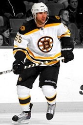
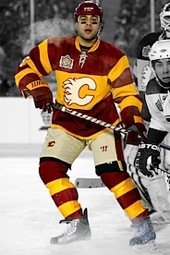
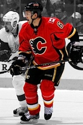
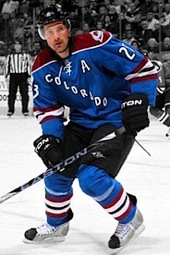
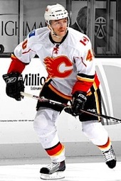
Too Low: Bruins Third [Only Issue I have with it is they ruined the franchise tradition of never having had black socks), Dallas' third (their edge jerseys suck, but I think it should be slightly higher), Columbus' third (a very good fake vintage look; logo could have been better), Calgary Away (IMO it's better than the home jersey)
The Thrashers thirds better than the Forum Blue? Blasphemy! Anyway good list, only the Hawks should be #1 :p
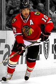
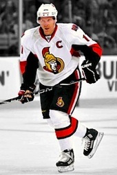
Its funny how the "retro" Oilers jersey is first and everything else they put on last year was at the bottom.
I'd like to see some trends analyzed here. For example... look at the top 10 vs. the bottom 10.
All of the top 10 have logos and a horizontal striping pattern. 7 of the bottom 10 have word marks and 5 of them have some sort of weird piping pattern... on top of that, the top 10 are way more colourful.
So, of the bottom ten, four are not in use this season, another got relegated to third jersey status, and six of the bottom ten are occupied by three teams. Not exactly shock here.
Dawson: Good remark. That's what I was going to say. The design needs to fit the philosophy. If you look at football for instance, you're more likely to see oval or curved shapes, for instance the Patriots and Ravens, just off the top of my head. Hockey is a very horizontal sport: The gameplay, the ice surface and what is on it.
Also, hockey fans are known to be traditional. We like our old logos and sweaters. Nothing wrong with that.
Say what you will but the more retro/original 6 uniforms kill the modern ones, and thank you Chris for making a poll that back up that argument.
4 of the last 5 have script logos.
For the most part I agree.
There are a couple I don't agree with (like the Kings purple eyesore), but that is to be expected.
the majority of what i consider the "EDGEified" sweaters (ie. Florida, Colorado, Pens, Sens and the like) all fell towards the end of the list. ATTENTION REEBOK!! it's nice to know that other hockey fans like the more traditional look vs. the Reebok EDGE look too! maybe i'm not nuts after all :)
Love that the Oilers home jerseys were voted the best (mainly because I agree) while their 3rd jerseys and (newly retired) white jerseys were voted to be very close to the worst. I'd be curious to see how the ranking looked for 2011-12 with all the new threads like the Oilers new roads, Nashville's, Tampa's, LA's new roads, and the Jets jerseys.
Further to that Dawson.....top 28 and 35 of the top 36 have horizontal waist striping of some kind. Reebok designers, take note. It's pretty clear what people would buy.
I'm glad San Jose's jerseys placed so low, but then, I'm straight AND a Sharks fan so my vote did count for something. The Sharks need to lose the fairy orange and bring back their original team color of GRAY. Just replace replace all orange striping with gray, ditch the useless and unneccessary forward facing numbers and put back the dorsal fin patches on the shoulders instead of the jumping shark and then you would have a winner.
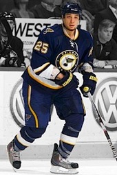
I was kind of surprised that the Blues home and road jerseys were that low, but that may be due to fan bias. I would love to see the Blues make a white version of their 3rd and promote them both to home and road status.
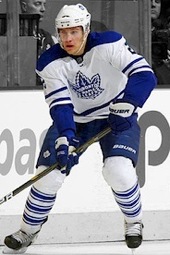
kris, you should never be surprised that anything the ducks wear is ranked low. everything they wear and have ever worn is awful. buffalo and toronto thirds should be higher imo.
i know it's already low but everything thrashers should be lower.
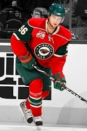
minnesota is the best "young" team as far as logo and uni design.
phoenix actually has really nice home and away unis. their logo just isn't very good.
I hope someone at Reebok and the NHL is reading this stuff and taking notes.
Wow, I'm really surprised with the placings of a bunch of these (except for the bottom few).
Sorry to join the "Pick On Trevor" Club, but I totally agree with the rating of the Kings' classic purple and gold uniform. In fact, that uniform should be their primary. Yes, the black and silver "Gretzky era" unis were sharp, but purple and gold reflect royalty.
If the Wild had gotten the North Stars' trademark, the white and gold N-Star crest on the green would have placed that uniform a lot higher in the rankings.
Overall, the uniform ratings are pretty much spot on. Classic uniforms and crests that are simple in design and unique in colour are much preferred over garish futuristic uniforms.
Interesting stuff. Top jerseys all kind of look alike with super traditional striping. And they do look good, I just think there are others that deserve to be up there too.
For example, the Capitals away jersey is absolutely gorgeous and I have no idea how the red version placed higher. Also, I really dont like the Caps third. Kind of corny looking.
As a Sharks fan, I'm pretty happy with where they're ranked. I'd move the teal one into the top 15 or so, and the away down a bit, but that's just me.
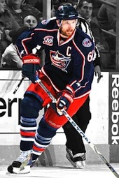
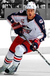
Also, what's wrong with the BJ's white? Looks good to me.
And in my most controversial opinion, I would move each of the Senators jerseys up about 20 spots. (Yes, even the SNES).
Im sure Reebok knows that the "edge" jerseys can be improved. They will improve them slowly and a whole slew of fans will keep buying new merchandise.
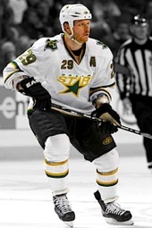
I really hope people in the Stars and Ducks organizations are reading this site and taking notes.
It's always tough judging these because the Original Six teams have a nostalgia factor with their sweaters that no one else has. I wonder how the Blackhawks' jerseys would fare if the debuted at the same time as expansion teams'.
Am I the only person who will miss the Thrashers sweaters - all of them? Even the third jersey had its merits: the Red/Gold/Blue colour combination was striking even if the missing logo deep-sixed the sweater. Also, I was hoping that the Jets would have held on to ATL's baby-blue for a home sweater. I think the Jets' roundel would look incredible on the light blue that Atlanta used; this blue is typical to the RCAF, too.
Finally, here's a potential poll for icethetics: why not compare all of Atlanta's sweaters to all of Winnipeg's sweaters? It seems that no one likes any of these jerseys, so it would be neat to see what comes a poll like this.
Many of these ranking make sense. However, there are a few that leave me raising my eyebrow. Meh, either way, the NHL hands down has the best uniforms in any sport for the most part. Even some of the weaker jeseys in hockey tend to be stronger than even the best in just about any other sport... Us NHL fans have been quite spoiled (besides a few exceptions over the years).
you really can see how big of a fail Edmonton's Reebok copper and blue jerseys are when you compare them with the current set. Even though they only have the home blue in the survey, the fact that it is first and the other two are in the bottom 6 says it all. I am sure the new road whites would be near the top too.
also if you look at it, most of the bottom rank teams have made a change to their jerseys. Nashville, Florida, Tampa, Edmonton, LA, Ottawa's third and Atlanta based on the moved to Winnipeg. Now if only Dallas and Anaheim and Colorado can make a change, the bottom 20 percent of this list will be extinct.
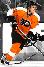
Okay. I have to say something here about the half-informed talk surrounding the Reebok Edge uniforms, and the guilt-by-association people have been heaping thereon. Have a look at the Bruins' pre-Edge jerseys and you'll see incomplete stripes on the arms, care of CCM or Starter, NOT Reebok. Look at the plain, black, and uninspired designs of the Flyers', Blackhawks', and Sharks' third jerseys, care of Nike, NOT Reebok. And compare the total uniform kits of teams like the Sharks, Flyers, Bruins, and even the Blue Jackets, and tell me the current designs aren't way better. Look at Ottawa's and Calgary's uniforms and understand that some teams simply haven't had quality uniforms for over a decade.
But put aside colour choice and stripe orientation for a moment and look at cut. Reebok Edge jerseys simply fit hockey players and their equipment better than any other design, and they handle sweat way better (I say that from personal experience. Wearing my Setoguchi jersey is way more comfortable than wearing my Bure jersey when I play pickup games.)
Finally, with Reebok jerseys, many teams are finding ways to return to more familiar appearances: Boston, Buffalo, Edmonton, the Islanders, Philadelphia, and the Leafs. While other teams are successfully blending old with new such as Florida, LA, and Vancouver.
I'm not going to try and defend all 90 jerseys of the Reebok Edge era, I just think it's being scapegoated unfairly and inaccurately.
I'd be interested in seeing the numerical rankings of the jerseys (if 1 is poor, 5 is neutral, and 10 is great, I wanna know how my team fits in). There's a big gulf between 8.642 and 2.003.
Although I may not agree with every ranking, I do believe every uniform is about where it should be. Some are way too high (Kings purple, Buffalos piping jerseys {logos good, Uni sucks}, Caps and Hawks 3rds to name a few). And some are too low (Flames and Wild Whites, Ducks 3rd) and I dont know how the Wilds Red and Flames heritage unis rated where it did, those should be in the bottom 10... maybe 5.
As a Sharks fan, I agree with where they rank. I think they have good looking unis and logos, but agree that there are better.
Good Job Chris. These polls are pretty cool.
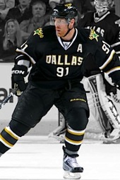
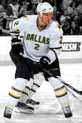
I understand all rankings from this list except for one: Dallas.
Gripe all you want, but the jerseys of the Dallas Stars actually reflect hockey history in Dallas, as opposed to the franchise's history there. They took visual elements from sweaters that Dallas area teams wore in the old Central League in the 1940s. This fact was mentioned by the team when the jerseys were unveiled. You want to talk about how traditionalist designs seem to win the public vote, well, Dallas has one of the sharpest designs in the league, bar none (though admittedly, they finally fall out of my top 10 this season), but doesn't get the recognition it deserves. Maybe if it were green, who knows? I can say this with absolute certainty...
They beat the hell out of those garish things they wore pre-RBK Edge system
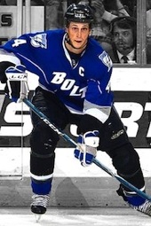
It appears the lightning have made changes to their bolts (3rd) jerseys. On their website they are selling a new Stamkos jersey that no longer has the logo on the shoulders, nor the white trim. It's a little odd, but it doesnt seem as though they've changed the blue, to their new shade.
Let's separate criticism of Reebok "Edge" from Reebok design: Reebok has improved the fit and function of hockey uniforms. However, the company was very heavy-handed (and the NHL too timid) when it first took over and tried to change everyone's look to something supposedly "more modern." The votes above don't lie: wordmarks, piping, and lack of horizontal striping are brainchilds of Reebok, and they generally don't fare well with fans.
When Reebok arrived, some teams, like Chicago and Montreal resisted and kept their look. Others didn't and the fans had to rebel to get the look of their team back to something more familiar. Uniform fit and function has changed in other sports, but no one tries to mess with the design of the Yankees, Cubs, Dodgers, Steelers, Packers, Bears, etc. A lesson learrned, and still being learned, perhaps too late by some franchises.
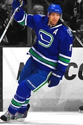
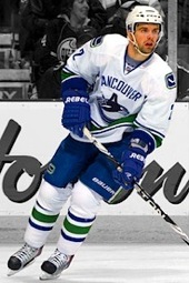
I love the Canucks home where the twins are doing the exact same pose.
Not shocked to see the Ducks' regular set ranked so low. They really are not the most exciting things to look at.
The third should've ranked much higher, but that's just my personal opinion.
how did calgarys heritage and 3rd get so high? there home is soo much nicer. the kings purple is ugly. i hate the canucks jerseys the colours are awful. the caps home and away should be a bit higher and the coyotes and ducks thirds should be alot higher. And all teams with blue, circle logo, retro jerseys should be near the bottom.(florida columbus st louis pitsburghetc. except buffalo and NYI) and also minnesotas red should be near the bottom. i dont really like the original 6 jerseys other than the rangers and habs but there classics so people like them.
When will a 2011-12 one be made? How about one for all of the uniforms that are on the site so far?
Well before we can do 2011-12, there will need to be a period of voting. Not to mention some of the jerseys that will need to be included haven't even been unveiled yet, much less worn for a game, such as the Rangers' Winter Classic sweater. The 2011-12 ranking will go up probably at the end of next summer.
I was looking back at this and found something interesting: Of the bottom 7 jerseys, 5 of them either are or will be retired by the end of the 2011-2012 season. The other two are the Dallas Stars. If Tampa does go for a new alternate, 6 of the bottom 8 jerseys will be retired by the end of the season.
Of the bottom 16 jerseys, up to 13 (depending on Tampa's alternate and the state of the Phoenix franchise) will have been retired by season's end.
By the way, maybe this story should have a permanent link on the side menu? It is the ranking of all jerseys in the NHL...even if it is from 2010-2011.
Once the 2013-14 season is underway and the new unis have been unveiled, we should really do a new ranking. So much has changed since 2010-11. If we were to do it though, it would have to be done after the Heritage Classic because that's when ALL the unis would be worn. Also, there's the question of the many uniforms on this list still being worn. Do we vote for them again or keep the old scores from this poll?