Rangers' Classic Jersey Coming 11/28
 Thursday · Nov 24 · 2011 | 10:38 AM PST
  11 Comments
  Exactly a week after the Philadelphia Flyers unveiled their 2012 Winter Classic uniform, the New York Rangers have announced they will do the same. The event will be streamed online for fans.
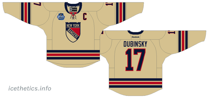
The unveiling is scheduled for Monday, Nov. 28 at 4 PM ET. Details of the jersey have been well guarded, but that hasn't stopped more than a few rumors from making the rounds. One such rumor is this design, which is what I currently believe to be accurate:
 Rendering of rumored design of New York Rangers' 2012 Winter Classic jersey / icethetics.info
We'll see on Monday if it proves as true as the Flyers jersey leak.
The following information about the unveiling was posted on the Rangers' website:
Fans can log on to Blueshirtsunited.com and Facebook.com/nyrangers to tune into the live streaming jersey unveiling which will feature select current players and will be hosted by MSG Network talent Dave Maloney and Al Trautwig. Official Winter Classic jerseys will be available for purchase beginning December 5th at Madison Square Garden.
If you're unable to watch the stream, just check back here for pictures on Monday. In the meantime, feel free to share your thoughts about what we should expect for the new sweater.
Oh, and Happy Thanksgiving to all my American readers!


Reader Comments (11)
It's a decent sweater. The Rangers have always have a very simple look, I'm not surprised if they don't stray very far and keep it this simple. I don't think it's great, I don't think it's bad. It's the only scenario where I don't think the off white compliments the rest of the sweat, just because there is so much of it, but that doesn't necessarily make it wrong to use it. We have to see it on the ice, right?
I like it. Just wish they went with the vertically arched lettering for the player names, as they do on their regular jerseys.
Seriously hoping for whites of the current third
I like the color, I hope that it just says New York diagonally though instead of having the shield on the front
I think it would look better in regular white than vintage white
I love the vintage white and this is because it's different from all others which either do have black, blue, white, red and so on ... look forward to get one as this is a MUST TO HAVE ....
... and even as the Flyers go special as well ... do like the vintage white from the Rangers much more ... the Flyers orange is what our roadmen do wear :-))
What is the deal with that crest? It is the only bad part of the jersey. Looks like the real one melted.
It would be cool to one day see the Rangers resurrect their one-year jersey from the 1940s with Rangers in arched lettering on the jersey front. Or borrow from the New York Americans. That jersey would sell like crazy I bet.
Not only do I love this jersey, I love the crest 100% more than the current one. I've always had an aversion to the squared-off shield and this crest looks more aesthetically sound in my opinion. I also feel it looks less childish than the current shield and holds more visual classiness which does well to encompass more of the rangers' tradition. Definitely a crest with honor that is worth defending.
since when is dubinsky captain? haha i like the jersey the vintage white here looks a little bit dark hopefully its more like the 2004 minnesota ASG jerseys and i think its cool they went with the original logo
I hate that crest on the front. The Rangers don't look right with a shield on their uniforms. Shoulda done something with a letterform and/or numbers instead. Or maybe they could have used the lady liberty and somehow made the logo look a little more retro.