


Lightning Listen, Add Bolts and Black
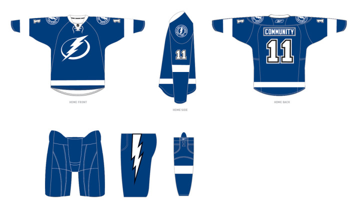
 The Tampa Bay Lightning announced today the final design of their new uniforms for the 2011-12 season, which includes changes requested by fans.
Most notably, the revamp includes the additions of lightning bolts on the pants, a fixture of Lightning uniforms since the club's inception, and black trim, one of the team's original colors. The newly unveiled logos will remain unchanged.
The team released this image on its website:
 Lightning unveil changes to 2011-12 uniforms / Tampa Bay Lightning
For what it's worth, it seems the regular blank jerseys that will go on sale to fans will not actually feature black at all, as it will only be used to trim the numbers and the bolts on the pants. But that seems to make sense from the standpoint of merchandising as the jerseys are likely already in production. To make changes to the sweater itself would mean scrapping everything that's already been manufactured.
Here's the statement from team management regarding the changes:
“After our multiple announcements in the past weeks we listened, as we always will, to feedback from our stakeholders,” said Leiweke. “While we have received overwhelmingly positive response regarding the direction Jeff Vinik is taking this franchise, we did hear from some fans regarding the traditions of black and a bolt on our pants. Thus, after consultation with the NHL and our design team, we are adding black as a third accent color and an elegant white bolt to our pant.
“While we are committed to pushing our franchise to new heights, we will forever honor the 2004 Stanley Cup and the other traditions and great efforts of those before us. The addition of the lightning bolt and the incorporation of black trim is an opportunity to send a message to Phil Esposito and the other pioneers that Lightning history will always be a part of who we are.”
The team also confirmed the BOLTS third jersey will stick around for years to come. Though they will likely swap out the shoulder patch with the new logo.
Now as a Lightning fan, here's my take: I love that they're keeping the bolts on the pants! That was the biggest thing in my mind missing from the new look. They're still leaving out the victory stripes, but most people outside of jersey geeks like us would have never noticed anyway. I'll miss it but it's not the end of the world.
Regarding the black, it seems they've tried to do as little as possible to placate fan complaints. Personally, I never thought we needed black, but if we have to have it, let it be in the small doses seen above. Overall, I'm ecstatic about the new look, especially now that the bolts on the pants are back.
So to those who didn't like the initial design, what do you think of the changes? Did the team address your concerns to your satisfaction? To those who did like it, do the alterations change your mind at all?
 Chris
Chris
It sounds like this won't be the last of the uniform tweaks. During last night's SunSports telecast of Lightning-Coyotes, CEO Tod Leiweke talked about the changes just announced. He said that it was too late in the process to make any significant changes to the sweaters at this point. (Likely because of manufacturing concerns.)
He also said that the bolts were put back on the pants at the request of Lightning founder Phil Esposito. He also said they've been listening to fans and taking their concerns to heart. And most importantly, he said that the victory stripes will be part of the uniform again at some point, possibly as early as next season.
I'm working on getting a video clip so you can hear it straight from Leiweke. My only hope is they don't add more black. Personally, I thought the uniforms looked better without it.

Reader Comments (72)
did they really submit this with a backwards '1' on the sleeve?
The mere fact that they were serious about taking fan ideas is encouraging.
The thing about the black....it's actually necessary. The team has had black since day one, it wasn't an addition to have black because everyone else says black is cool. Black breaks up the soft combo of white and that shade of blue. Plus, think about it from a conceptual and literal POV: thunderstorms go hand-in-hand with DARK SKIES. Claiming that the color scheme is representative of the blue waters of Gulf Coast Florida, wonderfull. It's just that BRIGHT BLUE SKIES do not lead one to think of violent storms. Taking away the color black from the identity turns the team onto the OKC Thunder.....clear skies have no thunder.
Just an observation.
for someone who has no support for hockey south of Colorado, I like these uniforms. however, the black needs to be all or nothing. unless seeing them in person changes my mind, it looks stupid being on half the jersey
Those little touches of black are awful. A uniform should be consistant throughout; in my opinion, if you're going to add black, do a little bit everywhere so that it doesn't look like someone screwed up at the factory. These uniforms looked way better with just blue and white. I'm happy to see the lightning bolts back, though.
So the reason they may have just added black to the numbers is because the jerseys are already in production, so that would mean if they decided to put more black in the jersey in a year or two's time, we'll have to spend more, once to get this jersey and then when or if they add black spend some more money to get the newer jersey. No Thanks I'll keep the two black jerseys i have the orginal and the current black ones until they figure out what they are going to do, I guess I still could get the BOLTS blue jersey. It'll be interesting to see if the BOLTS jersey out sell this blue one.
hate it. why bother hiring a design agency if you are just going to cave to the critics?
the logo is still boring, thumbs down
I liked the new jersey just the way they had it; a simple white bolt on the pants would have been fine. Leave the black out all together or just in the victory stripes.
This little addition of black reminds me of the blue and white unis the Nordiques wore for so long, and evenutally adding red trim to the numbers. The difference with Quebec, though, is that they ALWAYS had red in the logo. That's part of the reason this addition of black trim looks weird...it never figured into the design of these uniforms in any way. It's a two-color design...blue & white, red & white, purple & gold, whatever.
I wasn't sure how I felt about these uniforms for the LIGHTNING because black has always been their primary color, but as a set of hockey uniforms I love 'em. I'm a Wings fan and I've always loved the 60s Leafs unis so I think these are great. But throwing some black trim on them just to have some black on them mucks it up a bit.
What if they'd been plain black & white instead of plain blue & white? I wonder what the reaction to THAT would have been.
I still think the current lightning logo affixed to the current 3rd jerseys would have been phenomenal!!!
I absolutelt HATE that "Bolts" logo on the 3rd's.
These new updates are a "meh".
Still looks "Detroit- South" to me.
I think it looks great with just a touch of black, everyone is over reacting. It will look different when we see them worn, the black won't be that noticeable. I think its awesome they listened however, it would have been smart to wait on the mass production of them. - overall grade B+
Anyone notice the gray outline around the name patch before?
They screwed up a great thing. Now it looks like a clusterf***, totally mismatched.
A clusterf*** are you kidding? The black couldn't be more subtle.
If you photoshop or paint this to black instead of blue it looks better, as black and white then the blue and white
I like the fact that they're adding the bolt on the pant, but adding the black looks TERRIBBLE!!! If they have to add black, then outline the logo, numbers, and stripes. Otherwise don't add the black!!! It just looks out of place.
This new look is terrible. The logo is entirely too simple, and too cartoon/comic book-ish. My biggest problem is that this looks too much like the Toronto Maple Leafs color scheme and design. That's part of the problem in professional sports, too many teams copying others. The Lightning need to keep the black and be a little more original and stop copying other teams. We have enough teams with simple blue and white. The Lightning really missed the mark on this one!
Sometimes, you don't need to listen to the fans. Keep the black far, far away.
The black outline around the numbers would be much nicer without the white outline outside it. Chris where's my lightning concept?
the numbers before the update looked much better . . . could have easily just added a bolt because there is NO black on the jersey so why would they add it? looks dumb.
Well its been 7 months and while these jerseys MAYBE better then those previously worn, its still just too plain. The logo looks like a symbol you would see on a street sign, there is no detail. The Red Wings and Maple Leafs can get away with one color because they have detail in their logo's, whereas the lightning don't have any detail what so ever.
Fully agree w/majority that the timeless classic look of neck lacing (and no shoulder yokes) is awesome, that retaining the black and pants bolt was a no-brainer for our team's identity since this isn't Toronto, and that the placement of the black looks unbalanced, paltry, like an afterthought. Needs to look less like what someone REALLY wanted was to have the Leafs colours with the Wings pattern, but then begrudgingly was forced to put some virtually invisible black trim in a few spots, which looks really amateurish instead of bold, just to shut some fans up and be able to say they listened.
There's something really simple and powerful at the core of this. This team's colours have always been black & blue--surprised nobody's mentioned how incredibly perfect that is for hockey. Not to mention black looks tough and dangerous, black was ex-Bruin Phil Esposito's first choice when founding the franchise, and black skies produce LIGHTNING. They at least need to capitalize on this tremendous bit of good fortune If they're going to make black secondary rather than our main colour, and boldly re-introduce strong black trim in the logo, stripes, socks and gloves. That will be true to the team's identity, relieve the awful monochromatic copycat look, and make the primary logo look less like an example of boring, unoriginal, frankly blah clip art.