


Lightning Listen, Add Bolts and Black
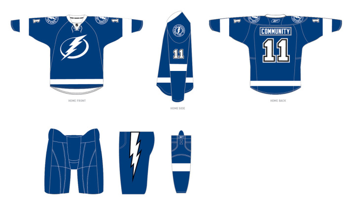
 The Tampa Bay Lightning announced today the final design of their new uniforms for the 2011-12 season, which includes changes requested by fans.
Most notably, the revamp includes the additions of lightning bolts on the pants, a fixture of Lightning uniforms since the club's inception, and black trim, one of the team's original colors. The newly unveiled logos will remain unchanged.
The team released this image on its website:
 Lightning unveil changes to 2011-12 uniforms / Tampa Bay Lightning
For what it's worth, it seems the regular blank jerseys that will go on sale to fans will not actually feature black at all, as it will only be used to trim the numbers and the bolts on the pants. But that seems to make sense from the standpoint of merchandising as the jerseys are likely already in production. To make changes to the sweater itself would mean scrapping everything that's already been manufactured.
Here's the statement from team management regarding the changes:
“After our multiple announcements in the past weeks we listened, as we always will, to feedback from our stakeholders,” said Leiweke. “While we have received overwhelmingly positive response regarding the direction Jeff Vinik is taking this franchise, we did hear from some fans regarding the traditions of black and a bolt on our pants. Thus, after consultation with the NHL and our design team, we are adding black as a third accent color and an elegant white bolt to our pant.
“While we are committed to pushing our franchise to new heights, we will forever honor the 2004 Stanley Cup and the other traditions and great efforts of those before us. The addition of the lightning bolt and the incorporation of black trim is an opportunity to send a message to Phil Esposito and the other pioneers that Lightning history will always be a part of who we are.”
The team also confirmed the BOLTS third jersey will stick around for years to come. Though they will likely swap out the shoulder patch with the new logo.
Now as a Lightning fan, here's my take: I love that they're keeping the bolts on the pants! That was the biggest thing in my mind missing from the new look. They're still leaving out the victory stripes, but most people outside of jersey geeks like us would have never noticed anyway. I'll miss it but it's not the end of the world.
Regarding the black, it seems they've tried to do as little as possible to placate fan complaints. Personally, I never thought we needed black, but if we have to have it, let it be in the small doses seen above. Overall, I'm ecstatic about the new look, especially now that the bolts on the pants are back.
So to those who didn't like the initial design, what do you think of the changes? Did the team address your concerns to your satisfaction? To those who did like it, do the alterations change your mind at all?
 Chris
Chris
It sounds like this won't be the last of the uniform tweaks. During last night's SunSports telecast of Lightning-Coyotes, CEO Tod Leiweke talked about the changes just announced. He said that it was too late in the process to make any significant changes to the sweaters at this point. (Likely because of manufacturing concerns.)
He also said that the bolts were put back on the pants at the request of Lightning founder Phil Esposito. He also said they've been listening to fans and taking their concerns to heart. And most importantly, he said that the victory stripes will be part of the uniform again at some point, possibly as early as next season.
I'm working on getting a video clip so you can hear it straight from Leiweke. My only hope is they don't add more black. Personally, I thought the uniforms looked better without it.

Reader Comments (72)
I like the bolt on the pants, but I don't get the black. It looks like they just added black for the sake of adding black.
sigh
Talk about a Band-Aid effort..
They have the right idea, but half-assed it at the last minute by only changing numbering.
Like you say Chris, it's probably due to a manufacturing perspective, but the end result may even be more questionable than the prototype.
I have my own two solutions:
A) Keep the prototype add a clean lightning bolt on the pants and call it a day.
B) Add black accents to the white stripes and negative area of the logo to even out the use of black on numbering.
Problem solved.
Slightly better... but only slightly.
Oh man, what a miss step by the bolts!!! The jersey looks mismatched with the pants and numbers now :(
seems like a waste of time why not add trim to the jersey and logos as well? just as an outline or trim.
these seems to be pointless id rather have no black then have just this minor tweak
Good job by TB to satisfy both, the fans desire for bolts on the pants and not looking like the Leafs/Wings and staying true to a classic and enduring look.
I commend them on recognizing that all of their ideas aren't going to be perfect and attempting to fix some issues.
Still a fail thin black piping around the thick white stripe is still needed, atleast I can still the BOLTS jersey its what they should have switched to in the first place if they wanted a blue jersey to be the home jersey. Still looks Maple Leafy its going to look like an Intersquad game when they play the Maple Laughs.
All they needed to change was the logo and add a bolt of lightning to the pants. Adding a black outline to the lightning bolt and the numbers looks stupid.
Add a silver background with subtle black accents to the logo. Add a white bolt to the pants with no black outline. DONE.
Oh, and get rid of that laceup collar. If you want a long lasting uniform don't add such a trendy detail.
I'm glad to see the bolt back on the pants, but the numbers do look a little off now to me. I think you added some black around the white stripes it would flow better.
I agree with MINH. The black is a very poor patch fix. The bolt was a great change but the black was not needed. I think fans who were rooting for the black to stay didn't mean for it to be used like that. They should have added the bolt but that's it for next year, then slowly bring in the black the year after. Rebranding isn't done in one shot, so it's alright to make a few tweaks over the years. Fan's would not have rioted if the black was left out. I thought it was better without it.
They need a thin black stripe in the middle of the hemstripe, arm stripes, and on the socks. It looks mismatched a bit now. More black is needed! Outline the logo while you are at it. This thing is still a minor misstep. They should have waited until the summer to start using the new logo when they knew it was accepted.
Yeah, I think it's better without the black. Go with the original aesthetic rather than applying a band aid fix. If you wind up putting black back in, you have to do it in a more integrated, substantial way. MINH's options are right. Either works, but honestly, the whole look has really grown on me, so I would go with option a. At first I loved the logo but hated the jerseys, but I've grown to like them as part of an overall look.
Thank god, I got part of my wish-list. Kudo's on the pants. The black is what I envisioned, but why didn't they add the black to the thing that needed it the most, the primary logo?, the most boring part of the jersey. Other than that some horizontal black piping would have made a nice uni. I think this jersey will eventually be everything that we wanted, it will just take time. Hat's off to Vinik, Stevie Y, and Todd for actually listening to their fans!
Wow! when I read the tweet, that the Bolts were going to add black, I was expecting the jersey to look vastly improved over the very very bland boring look they introduced a month ago. Man what a disappointment, again!
A step in the right direction, but as others have said, very half assed. You need to add black trim to the stripes and the logo now. Please swap the primary logo on the home uniform for the secondary logo and add minimal black trim.
I like the return of the bolts on the sides of the pants.
The black trim on the numbers? I think it'd be better if they only went with two layers - only the black outline around the white number, no white outline between that and the blue, for a more subtle effect. It wouldn't stick out like a sore thumb. The same treatment would also work for the white jerseys, with a black outline on the blue numerals, without adding a white outline in between.
Put a black trim around the accent stripes and the logo,the look needs more continuity.
First and foremost, I want to commend all those within the Lightning organization that had anything to do with this. Not necessarily for the product presented, but rather for their willingness to take fan reactions into account. It's a huge sign of class and respect to their fan base, and fans around the NHL. Thank you.
However, I think from an aesthetic standpoint, the black is simply overwhelmed. I am very much thrilled that the bolt was added to the pants, but I think the black outline is simply overwhelmed by the amount of blue throughout the entire product. I think the black around the numbers simply looks out of place without black anywhere else on the jersey/sweater. If you are going to add so little, you would be better off eliminating the black all together and keeping a plain white bolt.
No, the black accents are not perfect, maybe they should have outlined the white stripes as well for a more integrated look, but like Chris said, it is probably too late for that. They should have waited for comments before they finalized the jersey, but at least they made some effort to listen to fans this late in the game without ruining the good thing they had going. The changes they did make take their look, as a whole, another step away from the Leafs' and for that reason it is an improvement on their first effort. But what are they going to do with the road numbers? Outline the blue numbers with black?
I've kind of avoided reviewing this Jersey because of this, however adding black to the numbers and pants kind of screwed up its appearance. I almost want them to add black below the white stripes for appearance sake. Perhaps what they should have done is add black striping under the arms, that would have been a more traditional way to add in black without ruining the jersey's appearance. Otherwise, adding bolts to the pants was a no-brainer. So then...
Pros:
-Traditional look for non-traditional team
-Addition of "Tampa Bay" on the away jersey has a natural look
-Keeping the lighting bolt on the pants
-Shoulder patch logo (wish they'd put that logo at centre ice)
Cons:
-Logo is a little over-simplistic
-Addition of Black Executed poorly
(With relation to above I hope the numbering hasn't changed)
-Yet another "Logo Within a Circle" Logo (Shoulder Patch)
Overall: A Very Sharp Uniform, but it does lacks in places. 4 Out of 5.
(This would've been a 3.5 before today, I'm counting on physical appearance to keep at 4)
I think it is too clear that they didn't want to make a change to an uncustomized jersey already in production, as you mention. If that wasn't the case, i imagine they would have added a black stripe of sorts, definitely the victory stripes, and possibly a black accent on the logo.
Personally I did not like the initial design... now they've made it even worse.
This seems as a fix just for the sake of a fix. Saving money by not putting black on the logo makes it worse. They need a full revamp to add black not just on the pants and numbers. Now the black looks out of place. I do like that they added the lightning bolt to the pants takes away from the Red Wings look.
I'm glad they took action. They put 2/3 things I felt should have been incorporated into the design back in. The biggest were the lightning bolt on the pants and the victory stripes. Well one of those was put back in, the one you see the most. They black isn't perfect how it added but I like the minimal amount they added, the design is still simple and has the potential to be timeless...
Anyone else notice the minor detail they missed? The 1 on the left sleeve is backwards!
I agree the black on the numbers and pants bolt looks shoddy. They needed to add thin black lines around the other white stripes and around the logo (even better if they'd swap the secondary with the primary). Kudos for listening and adding the bolt down the pants at least.
Thank goodness the bolt is back on the pants, if they are going to be so lazy as to only add black to the jersey numbers, why not make the pants black so at least there is some justification.
Is the plan to keep the outline on the nameplate?
this is garbage. the least they could have done was add a black outline around the logo, and the white stripes.
the original design was better than this "lets add black to the elements we havent already shipped a million dollars worth of product in".
That seems like a pretty dumb idea, just to add black to the numbers and pants. Just seems like they threw black in there just to say to fans that they added black. Either do it the right way or not at all. That up there is a half ass design. If they are going to use black then trim the white stripes in black, add a little black to the logo itself and finish off the design. Otherwise just leave black out all together.
I think the black makes a HUGE difference in a positive way. Good move.
Not good enough, out lining the pants and numbers NO, now they look like the Detroit Lions got thrown into the mix.. wonder why? And no victory stripes.. FAIL.
Sorry they still look like crap, go back to the inaugural jersey or leave it be.
changes?? ok, putting the bolts back on the pants was a 'must do', but i really dont see the point of adding the black to the numbers, so no in my opinion this hasn't improved the overall design of the jersey.
Bad ... very bad move ..... when you start listening to people who are outside the "job" its getting worst ... just like this attempt
Black is OUT !!! Its just a "color" that you add when your out of "wow" on your design !
Exactly what MINH said. Good on the adding a white bolt to the pants, but the addition of black is very uneven, why bother.
It's still the worst in franchise history.
A brave, bold and beautiful choice. Less is more.
I agree with most here - glad they put the bolt on the pants, but that jersey needs something else. The blue and white is just plain, and the logo itself is just plain. It needs something. I also see a mismatch - black around the numbers is fine, but then you'd need some outline or trim on the front of the jersey to go with it. With all the great designers out there, this is the best they could do?
Yea. They should not have added black. What about the armpit stripes. Big miss in my book. I really liked where things were going with the intial jersey, they missed the boat big time here. The changes that should have been made simply should be the bolt on the pants and stripes under he arm pits. NO BLACK!!!!!!!!
Something that came up in the comments on Uni Watch regarding the updated renderings: the front view has the shoulder patches upside-down! I went back to the original release, and found that the version 1 renderings had that mistake as well. I'm surprised it went unnoticed this long.
i would add a black lace and black gloves.
(chris, what comment system are you using for your blog ?)
the black trim on the bolt on the pants makes ZERO SENSE from a design perspective. Its all about creating a consistent look, yet they decided to make the bolt on the pants look different than the bolt on the jersey? Would look SO much better if it was just a white bolt
And back to youth hockey uniforms we go with the Bolt on the pants. HOWEVER, the Lightning aren't my number 1 team so if that's what the fans want....why not? Ditch the black though. Was fine with just white and blue.
Adding the black just caused the jersey to be unbalanced now. Either go all in or leave it be.
You're half way there, adding black is a great idea, but you did it wrong.
There needs to be black in the logo, even just a slight drop-shadow, tiny, not much.
And for the love of god, where are the victory stripes?!
Chris is probably right when it comes to why they could put it any where else on the jersey. They should have gone the year without the black and then put the black on for the 2012-13 season. They could have done it better then. Love the lightning blot though.
The logo still looks juvenile.
The victory stripes are still a must need.
However, I do thank management for attempting to listen to us, the ticket paying fans.
It really blows my mind that many teams don't know how to brand or rebrand. As much as I cannot stand the "black for black's sake" disease that has plagued pro sports, the Lightning should have remained black. Now, that black has been added to the numbers and the bolt on the pants, where is the black in the logo and stripes? The one change I would have made would have been to rebrand the team, the Tampa Bay Bolts. Something that should have crossed Phil Esposito's mind. Imagine the Calgary Flames being known as the Calgary Fire or the LA Kings being the LA Royalty.
Awesome that they listened to fans response. It needed a touch of black, but they didn't quite do enough. Since the outlined the pant bolt in black they should have also put another touch somewhere on the sweater besides the number. I'm thing a very thin black line below the sleeve and torso stripes would even out the look. The back and front of the jersey look too different for me to love, definitely better than the old look though.
Adding black trim is actually more notable than we might think. Up until now, there are only 2 teams in the league which have just (2) colors on their uniforms: Toronto and Detroit. Every other team has (3) or more. If Tampa hadn't added black, they would have been just the 3rd team to feature only (2) colors (blue and white). Adding the new trim now puts them in with the rest of the teams. Just a little tidbit for ya there!
You shouldn't design by committee. Black didn't belong in this design and it looks silly to add it now.