


Best & Worst AHL Logos of All Time
 49 Comments
Yesterday I decided to start quantifying the history of hockey logos — seeing as a number of ancient cultures have predicted Friday to be the end of days. We began with the Top 10 logos in the NHL. We continue today with North America's top minor league — the AHL.
Minor league logos are tricky. Some teams just copy their big league affiliate. Many more just employ an angry animal wielding a hockey stick. These teams come and go as do their logos. So instead of a Top 10, I'll give you my Top 5 (along with some honorable mentions) as well as my Bottom 5.
Top 5: The Best Logos
1. Rochester Americans
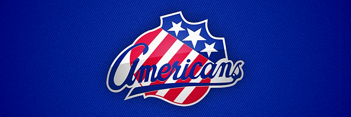
The Amerks. A true minor hockey classic. In a league where tradition takes a backseat to filling arenas, it's comforting to know that some things don't change. The Rochester Americans were founded in 1956. Their current logo has been in use since 1972 — decades longer than any of their AHL brethren — and the shield itself has been around since 1959. It's no coincidence that the oldest logo is No. 1 on my list nor is it a coincidence that this mark has been around so many years.
2. Chicago Wolves

In my mind, this is the quintessential minor league hockey logo, and yet it's not obnoxious. We have a crazy-eyed wild animal alongside a hockey stick and a puck — just to make sure you know what sport this is. And yet I just want to wear a Chicago Wolves jersey. The logo was created in 1994 when the team joined the International Hockey League. They were saved in 2001 when the IHL merged with the AHL.
3. Omaha Ak-Sar-Ben Knights

This is where I'll probably lose some of you. This may very well be a logo you have never seen. So how could I place it among my Top 5? Well, just look at it. The Omaha Ak-Sar-Ben Knights debuted in 2005 as the Calgary Flames' top AHL affiliate. That fact is clear when you look at the back of the knight's head. It's the fire from the flaming C logo beautifully incorporated into a logo that that has nothing to do with fire. I also like that while "Ak-Sar-Ben" gives the team an enigmatic vibe, it's really just Nebraska spelled backwards. The Knights existed just two seasons before being moved to Illinois. They currently exist as the Abbotsford Heat.
4. Manitoba Moose

Also in 2005 came this gem when the Manitoba Moose got all new logos and uniforms. Angry animals with text are the standard flavor in the minors, so it's really about finding the ones that stand out. This moose just looks like a badass you don't want to cross. It was a sad day when the Thrashers moved to Winnipeg, forcing the Moose to the east coast where they became the St. John's IceCaps.
5. Bridgeport Sound Tigers

Rounding out this group are the Bridgeport Sound Tigers. This logo has undergone some color changes over the years, but it's been one of my favorites ever since this team joined the AHL in 2001. The lines are perfect and the tiger is scary. It's a sharp design in a style we don't see very often. In fact, it's almost too good for the minors.
Honorable Mentions

Doing a Top 5 means a lot of good logos don't get a mention, so I've opted for some honorable mentions. The Peoria Rivermen logo is a minor hockey classic that's been around for years. It's existed as three separate franchises in three different leagues with the earliest dating back to the IHL in 1984. Each iteration of the Rivermen has utilized the same riverboat captain chewing on a puck though the palette always included red until the team joined the AHL in 2005. The question is, is this logo great because it has survived or has it survived because it is great?
The Milwaukee Admirals have been around for decades — at least since the 1970s. They went pro in 1977 when they joined the IHL but always had lame logos — until the skinless admiral appeared in 2006. And finally, there's the Hartford Wolf Pack. Again we have an angry animal showing its teeth, but that doesn't mean we don't have a solid logo. It has been sorely missed since the team was rebranded as the Connecticut Whale. Speaking of which...
Bottom 5: The Worst Logos
1. Connecticut Whale
Yeah, it's no secret around these parts that I have nothing but hate for this logo. Howard Baldwin promised a return of the whale. I didn't think he meant that would be the team's actual name. And I didn't think the logo would be so pathetic. It's everything that's bad about minor hockey logo design. It was so bad it spawned a new word. When the logo was unveiled, Icethetics reader Connor Hanley famously called it "horr-awful." And he was right.
2. Rockford IceHogs
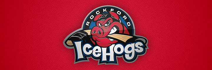
The second-worst logo in AHL history was actually born in the now-defunct United Hockey League in 1999. It ticked all the terrible boxes: A ridiculous name with "ice" tacked onto it, a silly mascot biting a hockey stick, and a pathetic font. There's nothing to like about this logo and there's no reason to name a hockey team after swine. The IceHogs joined the AHL in 2007 after winning the last UHL championship and didn't bother to update their name or logo.
3. Albany River Rats

It would be easy to just keep cherry-picking logos that feature angry animals wielding hockey sticks, but the offenders on this list are the worst of the worst. The Albany River Rats logo debuted in 1993 after the Capital District Islanders were sold and rebranded by their new owner. McKinley Griffen was the design firm hired to give the River Rats their new look. It was their first ever sports logo, and they now take credit for setting an industry trend (angry animal with a hockey stick isn't something I'd be proud of) along with "multiple awards." It also led to them getting more sports logo design jobs.
4. Kentucky Thoroughblades

You want someone to blame for these logos? We have the name. McKinley Griffen. A couple years after "setting a trend," that firm brought us this monstrosity. Lexington, Kentucky got its first pro hockey team in the form of the Thoroughblades when the AHL expanded in 1996. Today, the team is known as the Worcester Sharks — and it has much, much better logos.
5. Abbotsford Heat
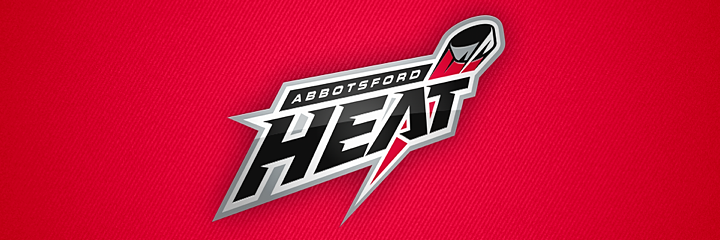
We finish this list with the AHL's westernmost franchise. I'll be honest, this is technically bad design. It's just lazy. Their NHL affiliate is the Flames. They're called the Heat. But I don't get any feeling of heat from this logo. Just a FoxTrax puck flying around. It's as bad as the NBA's Oklahoma City Thunder. You can do better, Abbotsford. Just look at who you used to be in Omaha.
That wasn't too painful. Any glaring errors on this list? I got taken to task here and on Twitter for leaving out the Maple Leafs and Red Wings from my NHL Top 10. Did I leave out any critical AHL logos?
The ECHL is next up tomorrow in the same format. Then Thursday we get the Top 10 worst NHL logos. If we're all still here Friday, geez, I don't know what I'll do.

Reader Comments (49)
The only one that surprised me was the inclusion of the Wolfpack as an honorable mention.
Rockford's logo has always been terrible, but it worked for the minor-minor UHL. An upgrade should have been made when they moved up to the higher league. I half expected to see the Chops on here, but admittedly our pig was significantly better than Rockford's.
I would love to see your take on the best and worst AHL logos for teams named after their NHL affiliate. Or a side-by-side comparison between them. For example, I think both the Iowa Stars and Texas Stars logos look better than the Dallas Stars.
Don't feel bad for leaving the Leafs out of the NHL list. The team's name written on a maple leaf? Sure, it's unchangeable but it's not creative or clever.
Currently living in Des Moines, Iowa gave me a first hand look at the Iowa Chops
http://www.sportslogos.net/logos/view/qo53kqrzra2t5eltgn9rk3zo3/Iowa_Chops/2009/Primary_Logo
And that was only after Des Moines lost the Iowa Stars, Des Moines has seen both the lazy and the terrible.
http://www.sportslogos.net/logos/view/2233/Iowa_Stars/2006/Primary_Logo
I'm surprised by the Wolves, Chris. That's an aweful logo. While I agree animals weilding sticks are ridiculous, this logo goes beyond that, by merely putting a puck and stick in the background, just sitting there. In it's current state, that's a bottom feeder. Lose the stick and puck and you have something decent at best.
In my opinion the Americans and Wolves and 2 are horrible. The Americans logo is just bad in every way, as for the wolves, it looks like clip art and the puck gets lost in the black wolf. Just because a logo is old that doesn't mean it's great.
Awesome I really like these Top X logos of leagues. I hope you will continue with the QMJHL, OHL, WHL and perhaps ECHL.
I was also a big fan of the Omaha Knights logo and was very sad when they moved, especially with the boring lazy thing they came up with (Quad City Flames).
Also, my little touch, I would have included the Philadelphia Phantoms logo somewhere among the bests.
I agree with your list, especially your Top 5 Best Logos. If there were any (dis)honourable mentions for Worst Logos, I'd have to say the Iowa Chops, Saint John Flames and Lake Erie Monsters.
That Thoroughblades logo takes the cake for me. Just plain awful in every imaginable way. The font is awful, colors are awful, that "horse" is awful, and every damn cliche jammed into this logo is awful. River Rats would be my number two. McKinley Griffen has to be the worst sports logo designer I've ever seen.
The Thoroughblades' logo reminds me of the failed experiements the London Knights of the OHL and the Kamloops Blazers of the WHL had when deviating (on some level) from their traditional (and current, in both cases) logos. It just doesn't look right, no matter how you spin it.
i may be biased- okay, i am- but in my opinion, the wolves have the best logo in all of hockey. however, having said that, if we needed to lose to someone, the amerks logo is probably the one i would give the okay to.
(and this list just adds one more bullet point onto the list of why the icehogs suck.)
Why doesn't Abbotsford use the old Atlanta Flames logo? If the Flames use it as the alternate captains "A" it would imply that the Flames own the logo.
The current Milwaukee Admirals logo is the worst in the team's history. I don't see how any of the old logos were "lame" in any way.
As a Rockford boy and Icehogs fan since their inception into the hockey world I like their logo. I know it could be better and would love to see some sort of redesign, but if they didn't it wouldn't pain me to see Hammy stick around.
I agree with pretty much all of it. While I love the wolf in the Wolves logo, the giant puck is beyond ridiculous and I feel like the ridiculousness deserved a mention. I wish the Heat had just reprised the Atlanta Flames logo or at least an updated version of it.
Rochester's shield is iconic, but the script is in really bad need of an update/cleanup -- the capital 'A' looks like a 'G', the letterforms are generally unbalanced and helter skelter in orientation, there's a noticeable kerning gap between the 'a' and the 'n', and there are noticeable jagged edges in the curves from poor digitization.
Hand-drawn tradition is well and good, but the logo needs some refinement.
With that said, you've got to really feel for people who are tasked with designing minor league logos... with the cheesy monikers, forced parent-club color palettes, mandatory kid-appeal, and the ever-constant rebranding, it's like a minefield for designers. Rockford is actually an example of a design that may be offensive to hockey purists, but hits all the necessary notes for the intended market segment -- the logo is actually pretty well illustrated and executed.
Best:
1. Milwaukee Admirals
2. Rochester Americans
3. Hershey Bears (New/Current Logo)
4. Toronto Marlies
5. Adirondack Phantoms
Hey, no Binghamton Whalers on the best list? Simple yet creative. Classic.
JW: I thought about the Binghamton Whalers, but ultimately it was just their parent club's logo turned on its side. A little creative, I suppose, but the heavy lifting had already been done for them. Might crack a Top 10 for me though.
The Kentucky Thoroughbreds logo looks like the horse from Ren & Stimpy.
Best 5:
1. Milwaukee Admirals
2. Hamilton Bulldogs
3. Hershey Bears
4. Quebec Citadelles
5. Toronto Marlies
I don't think the Chicago Wolves logo belongs anywhere near the top 5. They're closer to being in my bottom 5.
Worst CURRENT 5: (there are so many bad old ones that i felt like separating the "Worst" list)
1. Syracuse Crunch
2. Rockford IceHogs
3. St. John's Ice Caps
4. Binghamton Senators
5. Connecticut Whale
Worst PAST 5:
1. Kentucky Thoroughblades
2. New Haven Beast
3. Albany River Rats
4. Baltimore Bandits
5. Worchester IceCats (94-96)
I also limited myself to only using the Syracuse Crunch franchise once, because they have a terrible logo presently and have had some of the worst logos in the past.
River Rats being judged in hindsight. At the time, it was considered a great logo, and named THN Minor Hockey Best Logo at least once if not more often. Most styles suffer when judged on the tastes of a generation later.
Saint John Flames had one of the best http://content.sportslogos.net/logos/2/563/full/5o74h1rzljejhztgiz2l.gif , and also one of the worst http://content.sportslogos.net/logos/2/563/full/wn0wfaew6gzi7l3nm9fqlnxoa.gif
ct whale logo is awesome! rochester americans logo is boring. minor league logos should look minor league
Love your blog, but the Houston Aeros have one of the best logo in all of sports, let alone the AHL.
I don't get the love for the Wolves' crest. It is utterly terrible. Just because it's been around since the 90s (when it was apparently acceptable to use clip-art from Microsoft Word in logo design) does not mean it is good in any way.
I would put the Moose up at #1. In my opinion, they had one of the best brands in all of hockey, with that teal green and bronze colour scheme.
The Americans could reclaim #1 if they modernized the crest just a little bit. A little outlining and an updated script would do wonders.
How do the Grand Rapids Griffins not make your top 5 or honorable mention!?
I hope the rumors are true, and that the Whale will go back to being the Wolf Pack. WS&E (Howard Baldwin) is no longer involved with the team, and are millions of dollars in debt. They owe Reebok about $1 million, Twin 47 about $500,000, the state of Connecticut $250,000, and a bunch of other companies a lot more money. MSG (Rangers) still own the copyrights for the Wolf Pack.
Not sure how Milwaukee gets an honorable mention, that thing is hideous but it's not in your top 5 so I can't complain too much.
Great logos I would add: Nova Scotia Voyageurs, Maine Mariners, Springfield Indians, and the New Haven Nighthawks. All of those are a class above Manitoba, Bridgeport, and Chicago.
No question about the Americans, great logo. I am surprised by the Knights, Moose and Wolfpack. I don't have nearly the distain you do for animals with hockey sticks in the minors. I actually like the old Moose logo and the old Hersey Bears logo.
Old Moose: http://www.sportslogos.net/logos/view/2153/Manitoba_Moose/2002/Primary_Logo
Old Hersey: http://www.sportslogos.net/logos/view/zndgm7e7hkcgfx82eq06eywcy/Hershey_Bears/1989/Primary_Logo
The worst is a good list with the Whale, Thoroughblades and Heat being in my top five as well. I would suggest the short lived New Haven Beast/Gremlins: http://www.sportslogos.net/logos/view/ichhe2xem711pi1s7fdfdfhex/New_Haven_Beast/1997/Primary_Logo
As TOMAHAWK mentions above, logo design in the minors is sometimes tough. With not nearly the exposure of the major leagues minor leagues may feel that they need a logo with a hockey stick so casual local fans can say "oh right, the hockey team" when they see an advertisement. A city like Albany has seen minor league baseball teams, arena football teams, indoor lacrosse, all come and go over the years. (Still doesn't excuse the Thoroughblades)
I think The Wolfpack logo is better than the Wolves, but that might just be because the name is awesome. The River Rats is pretty bad, but i feel it had a weird charm about it because it's so ridiculous.
sadly here the Knights logo used in this picture doesn't have one of the key parts of the logo. There's supposed to be an O logo at the bottom with AK in the middle of the O...it pays tribute to the original Omaha Knights who existed from the 1940's until the 1970's.
I absolutely loathe the current Milwaukee Admirals skeleton logo. Looks like a 5th grader drew it. And the lame story about the Admiral rescued from Lake Michigan - not to mention the hockey-stick leg in the full-body version - are annoying. Give me the full-bodied skating admiral or even the head & hat version anyday. Oh, and the light blue & black color scheme isn't very good either.
My Top 5 Best
1- Rochester Americans
2- Hershey Bears (new logo)
3- Toronto Marlies
4- Manitoba Moose
5- Hamilton Bulldogs
My Top 5 Worst
1- New Haven Beast
2- Abbotsford Heat
3- Quad City Flames
4- Binghamton Senators
5- Toronto Roadrunners
I've always loved the Rochester Americans logo, and it's IMO still the best logo in the AHL. Following closely in second on my list is the brand new Hershey Bears logo. The Bears hit a homerun with that design, just fantastic. The New Haven Beast logo is IMO the worst AHL logo of all time, absolutely hideous. Lastly, the Abbotsford Heat logo is pretty awful which is why I made it number 2 on my list, in fact it is IMO the AHL's equivelent to the NHL's Anaheim Ducks wordmark logo.
Beast of New Haven. Absolutely the worst logo ever.
Forgot the most obvious reason why the Heat logo is dumb: it's not the flaming A the Flames carried with them from Atlanta. Such a blindingly obvious choice. Maybe they'll wear Atlanta Flames-style throwbacks one day; we can only hope.
I hope to see the Victoria Salmon Kings at the number one spot on the WORST logos list for the ECHL.
The New Haven Beast Logo is definitely the worst logo of all time .
I don't think the Connecticut Whale logo is that bad. It could be much better, but the biggest problem I have with it is the way the whale is positioned over the C. If you look fast it looks like an S, which reminds Whalers fans of the Sprinfield Indians logo...who were for a time the Whalers AHL affiliate. How do you make a logo for a team named the Whale, anyway? Or maybe you simply call the team something else. Marketing is huge with a minor league team, and past the obvious nostalgia, I don't know what you can do with a team with that name.
The New Haven Nighthawks had a cool logo I believe is worthy on an honorable mention. Another team from the same city that I'm rather surprised you don't have as one of your worst is The Beast of New Haven. That was beyond ulgy. It was hideous. To this day I wonder if they tried to make it as ulgy as possible. I don't know what I would rather look at...that logo or vomit. I'm sorry New Haven doesn't have a team anymore--or an arena for that matter--but I am not at all sorry that logo is long gone.
"Why doesn't Abbotsford use the old Atlanta Flames logo? If the Flames use it as the alternate captains "A" it would imply that the Flames own the logo."
That would be the logo if they where not located in Canucks territory. The Heat have tried to distance themselves from the Flames so as to not turn off the local fans. Attendance at thier games is terrible becasue people feel supporting them is like supporting the Flames.
I'll have to agree with Kurt - the Syracuse Crunch logo is far and away the worst. I'm still not entirely sure what animal is being depicted there - an albino gorilla?
Although I agree Los IceHogs is a terrible name, an IceHog is an actual (mythical) beast. Therefore the team did not just slap "Ice" on the front of their name. Do your homework. Also, Rivermen is a lousy name/logo. Bulldogs is a pretty decent looking symbol if you ask me. You should of also mentioned that the Milwaukee Admirals (as opposed to the Norfolk Admirals of the same AHL) also sport the throwback Milwaukee Brewers glove on their jerseys due to partial ownership/sponsorship, which is pretty cool. While I agree that the Amerks IS a classic, as a Canadian, I for one feel the overly patriotic Americans really overdo the whole stars and stripes thing. Its as cliche as fighter jets flying over the arena if you ask me...
Well, I can't argue with the awesomeness of the Amerks. My personal favorite though has always been the New Haven Nighthawks, especially in the mid-1980s Red/White/Blue scheme. I've always liked the River Rats too. I agree on the hate for the CT Whale. The Whale going across the fat C makes the letter look like an S, and very much like the old Springfield Indians fat S. Wasn't too crazy about the WolfPack logo, but liked the name and uniforms - same colors as NYR but different scheme. Bonus loser points to the Whale for screwing that up. For the Admirals, i prefer the drunk Captain Crunch version, LOL. Surprised that the 1980s era (or older versions) Hershey bears wasn't included on the best list.
You do realize that the River Rats logo is one of the top grossing franchise AHL logos of all time. Pretty sure you don't make it that far with the 'third worst' logo in AHL history. I also have no idea what is wrong with the Heat logo. Its simple, flashy, and gets the point across.
As an Amerks season ticket holder I couldn't agree more with #1. Hershey could be on this list if they didn't change their logo after every game. The beast of new haven was the worst. The Syracuse crunch have never gotten it right. If anyone wasn't too embarrassed to admit they were involved in making tron, they would sue. The Lowell lock monsters were pretty bad. And the Lake Erie monsters are up there too. The Amerks logo is a classic because its a sports logo not a cartoon. I like marlies jerseys as well. But like you said, after that its mostly angry animals.
You've severely harmed your credibility with this article. While I wholeheartedly agree with most of your 'best' choices, especially Bridgeport, your 'worst' choices indicate that you aren't being objective in your rankings. You ranked Chicago as one of the best and Connecticut as the worst. Here's a quote:
"We have a crazy-eyed wild animal alongside a hockey stick"
While this applies to both logos, you used it to positively describe Chicago. The CT logo also has a "crazy-eyed wild animal" and a hockey stick. Dude, what's the difference? And your description of the CT logo has nothing to do with the actual logo, just your disdain for Baldwin. I'm not a fan of Howie either, but I still like the logo. Evaluate the logo, not the politics surrounding it.
"If the Bears didn't change their logo after every game..." Funny, but not accurate. After every season, almost, but I hope they've found a keeper in the 2012 redesign. And even if they hadn't, those awesome thirds they had from 2010-2012 (2010-11 Maroon Coco the Skating Bear, and 2011-12 White Coco) could EASILY be in the top 5 and be adopted as long-term home and roads. Great jersey, and a close second to this year's redux.
I agree with the Amerks and Moose, but how in the holy H-E-double hockey sticks (only for ironic comedic value, not like I say it in real life) can you put Wolfpack, Wolves, and Rivermen logos over the Phantoms? It's a classic shield-shaped logo, the speedlines of the Flyers' P cutoff and butterflied, to make a passable kid-friendly monster-like face. And the white logo they did for that cool purple and white third back around 2005 or so? Priceless. I still wish I could find that authentic or gameworn sweater floating around somewhere.
Love the website, follow it as often as possible, but can't sign on a top 5 that doesn't have at least one of these three logos in it (Hershey Coco, Hershey 2012, or Phantoms)
@Frank: The Americans logo is horrible??? What?? You need to see the optometrist. That crest depicts nothing but class.
Players feel a sense of honor just putting that jersey on. Similar to the Montreal Canadiens. What a ridiculous comment.
Being from Rochester, I've always loved the Amerks logo. But I think the shield without the cursive writing across the front was even better (the one with the shadow along the bottom edge).
Other ones I've enjoyed over the years:
Old Cleveland Barons (simplistic, but I liked it ... better than the one with the shark)
Binghamton Whalers (simplistic again, just a W turned on its side, but kind of clever actually)
The old Buffalo Bisons ... Who can't like that Pepsi cap, with Buffalo written out?
New Haven Knighthawks (The simple design in yellow and blue... early 70s)
Maine Mariners
Kentucky Thoroughblades ... I don't know, I kind of liked that horse :)
Best logo ever!! New Haven Nighthawks.. most of the Springfield Indians Logos . Ameks Worst ever Beast of New Haven & Ct whale (springfield Indian wanna be logo) and the Crunch.
Well heck I'll just collect them if their so bad.