Top 10 Worst NHL Logos of All Time
 Thursday · Dec 20 · 2012 | 1:36 AM PST
  64 Comments
 Guess this is it. The final 24 hours of existence. The end of everything. You know, or not. But let's just say armageddon is coming. Might as well finish tallying up the best and worst logos in history of North American pro hockey.
We began with the Top 10 NHL logos. It only makes sense that we'd bookend the week with the worst. So here they are. In my estimation, these are the 10 worst logos the NHL has ever seen.
1. Columbus Blue Jackets

In 2000, when the Columbus Blue Jackets took the ice for the very first time, they were wearing this dreadful thing on their shoulders. You'd think I was making that up. But I'm not. In those days, electric green and powder blue were part of the club's color scheme. And this funny-looking bug was originally meant to be part of their primary logo. It's a relief they wised up. Their current primary logo would definitely be in my Top 15.
2. Buffalo Sabres

The No. 1 spot was a toss-up between the Blue Jackets bug and the Buffaslug. (But come on, the green bug, obviously!) The yellow buffalo got a lot of stick during its brief lifespan. All warranted. Someone earlier this week told me to separate the people and events surrounding these logos from my judgment of the actual design itself. As if this were an objective exercise. That's impossible. If these logos were standalone pieces of artwork, they would mean nothing and would therefore be impossible to rank. Part of what gives a logo its personality is what it represents. But even if I could separate things, I'd still consider this to be an awful design.
3. Boston Bruins

Need to add one more shoulder patch to the worst logos list. This logo and its successor (often nicknamed Winnie-the-Pooh) shows us why the Boston Bruins should stick to their classic spoked-B and stop trying to put actual bears in their logos. That said, they did get it right with the new shoulder patch in 2007. I will say, though, that this logo is good for one thing. You know those "guess how many" contests? We held one at my workplace recently. How many marshmallows are in this huge jar? Closest guess wins. You could do a similar contest counting the number of sharp points in this logo. But then someone would have to actually sit there and count them all.
4. Tampa Bay Lightning

Here. Proof I checked my homerism at the door. I love Phil Esposito to death, but that man should've hired a logo designer instead of scrawling something on a napkin way back when. He is credited with designing the Tampa Bay Lightning's original logo which debuted in 1992. And that's too bad. It was sort of a relief to me when they updated it in 2007 with a better looking bolt. But why leave Tampa Bay at the top? They finally fixed it last year. It just missed my Top 10 and I am sad about that.
5. New York Islanders

We mock it every chance we get. The New York Islanders introduced this spray-tanned fisherman in 1995 for no apparent reason. They already had their perfect logo. And it only took the team two and a half years to realize and correct their mistake. And that was before social media! Guess fans protested well enough back then with their wallets.
6. Phoenix Coyotes

This one is a controversial pick. I get the feeling there are just as many of you that love this logo as hate it. But it does seem to be one of those marks that elicits a strong reaction. Nobody just says "meh" when they see it. You either love it for having a distinctive style. Or you hate it for being weird. Personally, I love it. But I will always consider the Picasso desert dog one of the worst logos in NHL history and something never to be repeated.
7. Ottawa Senators

The Ottawa Senators had a perfectly good logo when they debuted in 1992. Then they came up with their first third jersey in 1997. And it had this multi-colored mark on the front. And we all asked, "why?" Turning the guy's head to make the logo more three-dimensional takes the logo to a weird place. And it just looks bad. The Sens thought they fixed the problem in 2007 by adding bolder lines and sharper corners. But they didn't. Long live the 2D head.
8. Vancouver Canucks
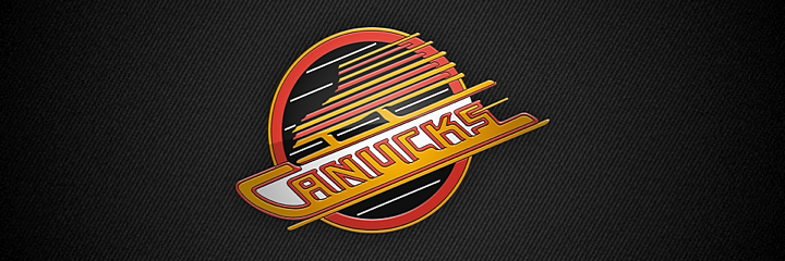
I anticipate my Vancouver friends will fillet me for this one. But I just can't stand it. Why all the lines? The Canucks had a pretty good thing going with the stick-in-the-rink mark. Boring, maybe. But it wasn't terrible. This and the color change in 1978 were just uncalled for. But they kept it around for 20 years until they brought in the orca.
9. Atlanta Thrashers

When this logo debuted in 1999, I was impressed. The colors were new and unique and I thought the bird looked pretty cool. But the perspective that only time can bring showed me the error of my ways. For one thing, the hockey stick was completely unnecessary. This logo would be instantly improved if they lost that. But then they were trying to get people to watch hockey in Atlanta. And not to pile on, but after someone once described this logo to me as a bird stirring itself into a pot of soup, I've never been able to look at it the same way. Still, I was sorry to see them move. And that brings us to...
10. Winnipeg Jets

This logo is so bad that when it was first leaked online, I refused to believe it was legitimate. It looks like an exploding airplane. Not a great visual. And while I appreciate the symbolism of the compass pointing "True North," I still only ever see a detonating jet. And that's not the icon that should represent a hockey franchise.
I'm anticipating a lot of disagreement so I'm curious to see what you guys have to say about this particular list. But get your complaints in quick. Don't forget the world is ending soon.
And if it doesn't, well let's do the world's largest hockey logo ranking project in 2013! It'll be a big endeavor but I think it would be hugely entertaining to learn about what makes a hockey logo popular or not. And at the same time, it'll be free market research for the next team that wants to do a rebrand. What do you guys say?


Reader Comments (64)
For next year's ranking project, every single jersey crest ever used in the NHL, including those used by Montreal in the NHA.
You are out of your mind having the Jets logo on this list. It embodies the organization and the hockey club perfectly. If you need a lesson, a "Jet", is a fighter Jet. Exactly what is portrayed in their logo. Also the compass represents the ownership "True North", and to sum it all up the Canadian flag leaks out from behind which gives such a badass finish. Winnipeg killed it on this logo!
The Canucks and Thrashers logos on this list are EASILY top 10 all-time, along with the 90's Jets, Nordiques, Blackhawks, Oilers, Blues, Canadiens, Leafs and Red Wings.
You missed Edmonton's mechanical sperm, Burger King, the Mooterus and Calgary's horse head atrocity among others.
Personally, I have always liked the Thrashers logo, but agree about the stick. If the stick was gone, it makes my top-10 list. With the stick, it's just sort of in the middle. As an aside, they should have ran with those browns in the logo as their primary colors instead of focusing on the reds and that ice blue.
And I have to disagree with those who mention the Kings current logo. I am a Kings fan, and I think the new logo is crisp, clean, and iconic. And although it has a special place in my heart, I would put the old "Chevy bowtie" flying Kings (Gretzky era) logo in the 10 worst.
Agreed with most of the list. Though the Jets logo should NOT be on there. It has great meaning to the local air force community and I think it's a great logo for what it is.
The Dallas Stars' horrendous bull logo (the "mooterus") should definitely be on there though.
...but I loved those Jets, Thrashers, Coyotes and Lightning logos. The old Canucks logo looks weird but stuck with me I don't know why. Anyway, yeah I loved those old logos they were different the Jets logo and its simplicity and national pride, the Thrashers with its cool name and bird back hand, Coyotes with it's faux regional design, and the Lightning with it's action movie stylings. Strangely, I have jerseys for all those teams because of their and uniqueness.
I agree with this list, but want to want to point something out/pose a question about the Bruins bear: The first time I saw it, I thought it was a tribute to Gary Cheevers "stitches" goalie mask. Granted, the shapes on the bear logo aren't stitches, but it has the same feel, and I thought that was kind of interesting if that was the intent.
I like that Bruins shoulder patch. What's wrong with a bear that does cocaine?
While you've nailed a couple of NHL atrocities, the new Jets one is not great, but not one of the worst. I quite like the buffa-slug, and 3-D Senator too. After reading some of these comments I was painfully reminded of some truly horrid designs. my bottom ten:
1. Anaheim Mighty Ducks (Icecrasher)
2. NY Islanders (Captain Highliner)
3. Washigton Capitals (original)
4. Dallas Stars
5. Phoenix Coyotes (Picasso)
6. Tampa Bay Lightning
7. Carolina Hurricanes (the name should also have been the Carolina Hurricane)
8. Columbus Blue Jackets (any of them)
9. Vancouver Canucks (stick in rink) - it's truly terrible people
10. Toronto Maple Leafs
The last one pains me too as I am a true blue Leafs fan, but the current logo is bland, bland, bland. They should adopt their third jersey ( & old school logo) as their primary logo again.
The Hurricanes logo should be on toilet bowl cleaner--definitely the worst logo ever.
The Ducks name and logos aren't the ugliest, but they're among the lamest. Do their fans really wanrt to be connected to a (crappy) Disney theme forever? Why? Could you see the NBA doing this (the Goofies?). Good grief.
You can also add the Calgary Flames to this same category. Atlanta Flames at least had a historical reference. What the hell do flames have to do with Calgary? Dumb. And the flaming C is also ugly, although their "heritage" Ronald McDonald jersey takes the ugly cake, and the flaming snot donkey 3rd jersey is also atrocious.
I'm surprised you didn't have the alternate Dallas logo, last used in the 05-06 season. It was a star constellation forming a bull's head. Pretty cool, except for the fact that it looked like a uterus, causing people to nickname it the "mooterus." http://ak.buy.com/PI/0/500/200803791.jpg
Looks like you completely missed the symbolism of both the Coyotes and Jets. First of all, "Picasso desert dog"!? The Coyotes logo is based off of Native American artwork, specifically Pueblo spirit beings. Very apt for an Arizona team, and sorely one-of-a-kind in professional sports. If the Yotes had history, a rabid fanbase and they had won a cup, you'd put it in the same tier as Pittsburgh's skating penguin as an icon of NHL history. As it is, the scions of blandness won out, and now they have a painfully generic coyote head and the blandest color scheme known to man to go with their empty rink. Another reminder of Native Americans' impact on culture and history, lost.
Secondly, it seems like you completely missed the point of the Jets roundel. That's based off of Royal Canadian Air Force insignia - that "explosion" is a maple leaf. Winnipeg is known for its Air Force base, and the military is both a huge employer and part of the city's history.
http://www.lambtonshield.com/wp-content/uploads/2012/03/22-Mar-2012-Canada-Forces-jet-at-Germain-Park-Gail-White.jpg
You hit all the obvious notes, but I'm disappointed in the more-controversial picks.
I personally disagree with your last 2. The Thrashers were my favourite identity of all time (jerseys, logos, and all) and the new Jets one is in my top 3 current logos. I mostly agree with the others except I like the Islanders Fisherman.
Only thing I want to say is that if only Buffalo had used their red/black era buffalo logo w. the "buffaslug" colors, then a lot of people would not have had as big of a problem with the switch from the classic buffalo & sabres logo. Anyhoo...