


Top 10 Worst NHL Logos of All Time
 64 Comments
Guess this is it. The final 24 hours of existence. The end of everything. You know, or not. But let's just say armageddon is coming. Might as well finish tallying up the best and worst logos in history of North American pro hockey.
We began with the Top 10 NHL logos. It only makes sense that we'd bookend the week with the worst. So here they are. In my estimation, these are the 10 worst logos the NHL has ever seen.
1. Columbus Blue Jackets

In 2000, when the Columbus Blue Jackets took the ice for the very first time, they were wearing this dreadful thing on their shoulders. You'd think I was making that up. But I'm not. In those days, electric green and powder blue were part of the club's color scheme. And this funny-looking bug was originally meant to be part of their primary logo. It's a relief they wised up. Their current primary logo would definitely be in my Top 15.
2. Buffalo Sabres

The No. 1 spot was a toss-up between the Blue Jackets bug and the Buffaslug. (But come on, the green bug, obviously!) The yellow buffalo got a lot of stick during its brief lifespan. All warranted. Someone earlier this week told me to separate the people and events surrounding these logos from my judgment of the actual design itself. As if this were an objective exercise. That's impossible. If these logos were standalone pieces of artwork, they would mean nothing and would therefore be impossible to rank. Part of what gives a logo its personality is what it represents. But even if I could separate things, I'd still consider this to be an awful design.
3. Boston Bruins

Need to add one more shoulder patch to the worst logos list. This logo and its successor (often nicknamed Winnie-the-Pooh) shows us why the Boston Bruins should stick to their classic spoked-B and stop trying to put actual bears in their logos. That said, they did get it right with the new shoulder patch in 2007. I will say, though, that this logo is good for one thing. You know those "guess how many" contests? We held one at my workplace recently. How many marshmallows are in this huge jar? Closest guess wins. You could do a similar contest counting the number of sharp points in this logo. But then someone would have to actually sit there and count them all.
4. Tampa Bay Lightning

Here. Proof I checked my homerism at the door. I love Phil Esposito to death, but that man should've hired a logo designer instead of scrawling something on a napkin way back when. He is credited with designing the Tampa Bay Lightning's original logo which debuted in 1992. And that's too bad. It was sort of a relief to me when they updated it in 2007 with a better looking bolt. But why leave Tampa Bay at the top? They finally fixed it last year. It just missed my Top 10 and I am sad about that.
5. New York Islanders

We mock it every chance we get. The New York Islanders introduced this spray-tanned fisherman in 1995 for no apparent reason. They already had their perfect logo. And it only took the team two and a half years to realize and correct their mistake. And that was before social media! Guess fans protested well enough back then with their wallets.
6. Phoenix Coyotes

This one is a controversial pick. I get the feeling there are just as many of you that love this logo as hate it. But it does seem to be one of those marks that elicits a strong reaction. Nobody just says "meh" when they see it. You either love it for having a distinctive style. Or you hate it for being weird. Personally, I love it. But I will always consider the Picasso desert dog one of the worst logos in NHL history and something never to be repeated.
7. Ottawa Senators

The Ottawa Senators had a perfectly good logo when they debuted in 1992. Then they came up with their first third jersey in 1997. And it had this multi-colored mark on the front. And we all asked, "why?" Turning the guy's head to make the logo more three-dimensional takes the logo to a weird place. And it just looks bad. The Sens thought they fixed the problem in 2007 by adding bolder lines and sharper corners. But they didn't. Long live the 2D head.
8. Vancouver Canucks
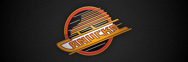
I anticipate my Vancouver friends will fillet me for this one. But I just can't stand it. Why all the lines? The Canucks had a pretty good thing going with the stick-in-the-rink mark. Boring, maybe. But it wasn't terrible. This and the color change in 1978 were just uncalled for. But they kept it around for 20 years until they brought in the orca.
9. Atlanta Thrashers

When this logo debuted in 1999, I was impressed. The colors were new and unique and I thought the bird looked pretty cool. But the perspective that only time can bring showed me the error of my ways. For one thing, the hockey stick was completely unnecessary. This logo would be instantly improved if they lost that. But then they were trying to get people to watch hockey in Atlanta. And not to pile on, but after someone once described this logo to me as a bird stirring itself into a pot of soup, I've never been able to look at it the same way. Still, I was sorry to see them move. And that brings us to...
10. Winnipeg Jets

This logo is so bad that when it was first leaked online, I refused to believe it was legitimate. It looks like an exploding airplane. Not a great visual. And while I appreciate the symbolism of the compass pointing "True North," I still only ever see a detonating jet. And that's not the icon that should represent a hockey franchise.
I'm anticipating a lot of disagreement so I'm curious to see what you guys have to say about this particular list. But get your complaints in quick. Don't forget the world is ending soon.
And if it doesn't, well let's do the world's largest hockey logo ranking project in 2013! It'll be a big endeavor but I think it would be hugely entertaining to learn about what makes a hockey logo popular or not. And at the same time, it'll be free market research for the next team that wants to do a rebrand. What do you guys say?

Reader Comments (64)
I mostly agree with the list. I have always thought the Coyotes logo was "meh." So, I'm the person who neither loves it or hates it. :-)
When I look at the Jets logo, I see a jet firing missiles that happens to look like a maple leaf. I didn't think of it exploding, because the jet is still intact. I don't think a jet airplane is a bad representation of a hockey team (or any sports team), particularly since the NHA had the 228th Battalion as a team during WWI. With that being said, they should have gone with a logo based on the original Jets logo.
As for the #1. Ugh. What a terrible idea.
I never looked at the Jets logo that way before, but now that you mention it. yeesh. However I think some of the best logos in hockey are on shoulder patches. The Weagle in washington, and the jets shoulder patch are great. What are the designers looking at!
What about the Mooterus?
You've definitely got the quintessential bad ones in there. I totally understand the hatred of the Buffa-slug that the fans of the team had and why it's terrible from a design standpoint, but I've never personally hated it. I honestly think their previous logo, the angry buffalo head with the departure from the yellow and blue color scheme, was worse. I'm only iffy on the two that you predicted would be polarizing. I've always like the shaman Coyote and I think the Jets logo is pretty classy (even though I can't unsee the exploding plane). The Thrasher stirring itself is also hilarious.
The flyers 2002 - 2007 alternate logo should be close to the top.
How can you justify having the Phoenix Coyotes, Vancouver Canucks, and Winnipeg Jets on this list when you left out the Dallas Stars Mooterus and the Anaheim Ducks Wild Wing logos and the Canucks Halloween 'V' is way worse then the flying skate.
I would replace the Jets logo with the 3D Pred head from the Preds mustard 3rd jersey. Actually, I might place that one at the top, and I say that as a Preds fan. It was horrendous. It looked like it was designed by someone who was a big fan of anime.
I agree with most of those picks for sure. Although, I like the Buffaslug! I always have and I always will. I don't see a slug as much as a cool looking buffalo getting ready to charge.
I don't hate the Jets logo, but I am not a huge fan. For the big reason that I feel that the Jet is stuck. It doesn't seem like I Jet to me. It should be open, not in a circle. I try to see it as exploding, but I can't I can always see the maple leaf and Jet separate. That being said, I love the colours of it. I really like the colours of the new Jets jerseys, logos, everything. I just wish that Jet would get of out the circle!!!!
I hate the Jets logo - it looks like someone pasted some clip art together in Microsoft Word.
I am a Canucks fan. And I agree with you. Always hated that logo and the colour scheme that came with it.
i thought this was all about primary logos. if you're going to include shoulder patches and alternate logos on the list, that changes everything. i can't actually complain much about your choices. i just think there are a few worse ones out there.
1. Nashville Predators alternate 01-07 (http://content.sportslogos.net/logos/1/17/full/nb5l36gf0u8m4un19masjg5aw.gif)
2. Phoenix Coyotes primary 96-03
3. Boston Bruins crazy electrocuted bear 76-95
4. Tampa Bay Lightning primary 01-07
5. Carolina Hurricanes current primary
6. California Seals primary 67/68
7. Anaheim Ducks current primary
8. San Jose Sharks primary 91-07
9. Atlanta Thrashers alternate (http://content.sportslogos.net/logos/1/2/full/14.gif)
10. Vancouver Canucks primary 92-97
Love your clean designs and treatment of making glossy logos, but it seems a tad odd to have a reflective Bruins Bear head with embroidery detail to be shiny and reflective.
Love the site!
I actually love the Columbus, Tampa Bay, Winnipeg, and Vancouver logos. Wish Vancouver and Tampa Bay would go back to that era and Columbus would at least keep Stinger as a shoulder patch
Re: Winnipeg Jets Logo
If they replaced the silver with gold, the logo is dramatically better. The silver/grey is just too bland. The gold gives it some spice and is a nod to the original franchises roots with the Golden Jet.
No mention of the California Golden Seals?! Come on! http://upload.wikimedia.org/wikipedia/en/thumb/1/17/California_Golden_Seals_Logo.svg/200px-California_Golden_Seals_Logo.svg.png
Poor list. Vancouver "V", all ducks logos, kings LA logo all suck but not on list. Unfair to judge Jets logo after 1 year - IMO outside the original 6 classics., Jets 2.0 is one of the best and I couldn't imagine anything could replace the Jets 1.0 logo.
To me the Carolina Tropical Storm logo will always be the worst logo ever because it is factually incorrect. It would be like if the Maple Leafs used a silhouette of an oak leaf on their logo.
I agree with the majority of the list, however I always liked the Bolts original logos the best and for some reason I've always seen the old coyotes logo as unique. I agree with a couple others the mooterus and flyers alternate from the early 00's are up there on my list. I also do not like the Ducks current script and Tampa's current " the flash" logo.
im sorry but i have to disagree with the jets logo being on this list, i love it! the colours, concept (RAF logo incoraprated) and everything works well. Other then that i have to agree with the rest of your list
Chris Wilson, I don't see the Vancouver V jersey as having a logo at all. It only had design elements and to call it a logo would be like considering the Canadiens stripe part of their logo.
I kinda feel that same way about the wild wing jerseys but I could understand considering it a logo (and a terrible one at that),
I really like the Islanders, Canucks, Thrashers, and Jets logos. That Canucks logo would actually be near the top of my Top 10 list. One of the most attractive logo and jersey sets ever made in my opinion!
How could you possibly miss the King's infamous 1996 third sweater? The famous "Burger King". The team was 23rd out of 26 teams, had just traded away Wayne Gretzky, Daryl Sidor, and other fan favorites leaving Kelly Hrudy pretty much out there on his own and then the foisted this off on the public. That was a bad year capped off by a quintessential bad sweater.
The Blues trumpet shoulder patch from 1995 to 1998 should be on a list like this one. Especially since the trumpet is more of a jazz instrument than a blues instrument.
I miss the Flying Skate logo/jerseys.
You get that the Vancouver logo is a Judas Priest reference, right?
http://www.guitarworld.com/files/imagecache/futureus_imagegallery_fullsize/gallery/judas%20priest.png
Also... did you see this Stars alternate logo? The worst.
http://www.sportslogos.net/logos/view/rxch0ptf7dahvfb49tgvemhf2/Dallas_Stars/2004/Alternate_Logo
Lol, this is the first time I've actually noticed the bird on the Thrasher uniform. I always thought it was supposed to be a hockey stick coming out of a cyclone or twister.
I have no major umbrage with 19 of 20 picks on the composite "best" and "worst" lists, but I couldn't disagree more with including the Jets' logo on this list. I think it's a home run; my son likes it so much he started rooting for the team just so he could legitimately wear Jets apparel. There's no accounting for style, but it's curious that we agree on 19 but can be so far apart on this one.
I also respect that you didn't give in to homerism and listed the Bolts here. I'll reciprocate and recommend replacing the Jets with the flushing toilet of my beloved 'Canes.
Re: Winnipeg Jets logo
I feel like that logo belongs on the bottle neck of a Canadian brewed pilsner.
If the Jets logo has any failing, it's that it's just not very iconic. It's all the necessary pieces put just where they belong. There's nothing terribly unique about it. And while Chris has never liked this logo for a number of reasons, this is the first I've read anything about the "exploding jet" issue. To me it seems like Chris was really looking forward to something exciting or interesting, but got something very stock instead, so he's looking for reasons to hate it.
I'm in the love-it Coyotes camp. That's an iconic, original logo that's immediately recognizable. It's a little busy and has a few too many colors, but if they let it live and the franchise was healthy for 30 years, that would be a logo that fans would look at like we do the Blackhawks, Red Wings, and Flyers. Their current logo could be the logo for any number of high school or college teams with a Coyote mascot. It's stock clip-art, uninspired hackery.
I don't think the Columbus Blue Jackets or Bruins logos really count as they were never used as primary crests, so at least for my list, they're out.
Anaheim is definitely missing from this list. They webbed "D" is ugly, the color scheme is terrible to represent their location (and just boring and ugly anyhow), and it all just looks like a knee-jerk 180 degree reaction to the cartoony crest and color scheme they had before. The webbed "D" doesn't even call to mind webbedness. It looks like a speeding bullet.
For my list, I tried to stick to only primary logos or logos that were in use for more than just a few years. So, no Mooterus, no fisherman, no Burger King. My list looks like this, in not necessarily any particular order:
1. Anaheim Ducks (Everything since they ditched the "Mighty". At least with the duck mask, they had something iconic and sort of clever, even if it was childish and screamed Disney.)
2. Tampa Bay Lightning (The one pictured in the post as well as their current DC comics Flash ripoff logo.)
3. Atlanta Thrashers
4. Ottawa Senators (3D logo pictured in the post.)
5. Calgary Flames (Those flames are a mess, don't scale well, and feel pasted on.)
6. Vancouver Canucks (Orca. Commercialized. Doesn't represent the team or the fans they play for. It's an advertisement posing as a crest. The skate and the giant V were awful too.)
7. Colorado Rockies (Primary color scheme. Image is too on-the-nose.)
8. Columbus Blue Jackets (Their original logo with the hockey stick. Don't like sticks, pucks, etc in logos. The C and B initials are the first stop for all inexperienced and uninspired logo designers and worse yet, the stars in the ribbon? make it difficult to read or scale down. The whole thing just looks like it was put together by a kid in design school.)
9. California Golden Seals (What is that thing? It looks like a parakeet, if anything, but certainly not a seal.)
10. Kansas City Scouts (Even at a decent size, that statue image is hard to read. There's nothing cohesive about the design elements. The statue, KC, and circle are all fighting with each other.)
what about the calgary flaming horse head? it's so bad everyone has blocked it from their memories?!!? truly an abomination. should have been top 5 in this list probably...
Right on about Ottawa and Winnipeg. I completely agree. Not only was the old logo better, but Ottawa's original jerseys are so much better than their current "practice-jersey" look. I know Winny wanted a new logo and new identity, but man they had a good thing in both of their old logos and took miles of steps backwards with the new look. Even if it was my city and I got a new team back after two decades, I wouldn't have bought any of their merchandise. But they were number 1 in league sales last year, so I've read.
I agree with the reader comment too that the list should have stuck with primary logos.
My defining memory of the Thrashers logo is Elston's cartoon in The Hockey News after Dan Snyder's death: the bird wing hugging his number 37. That was poignant. I can't put that bird on any 'worst logo" list after that. Wish I had saved that, can't find the image online now.
Vancouver doesn't belong there. Why not try Anaheim, Carolina or the King's Burger King logo?
The Winnipeg Jets logo is a jet superimposed on a Canadian Maple Leaf. Most Canadians would see the logo, and understand the ties to the Avro Arrow which the US borrowed it's early jet designs from.
I personally really like the jets logo for all the symbolism they put in.
Cheers.
The worst logo is probably the lizard shoulder patch from the Coyotes' green alternate
I've always liked the Thrashers logo and the Buffalo Sabres logo. Simple, but original. The Fisherman logo was just plain awful that thank god I wasn't born when that was released. As an Islander fan myself, I kind of want a game with a "Throwback" against like the Wild or something.
I thought the title said ''worst'' logos...weird because to me half of those are the nicest logos the league has seen i.m.o (Jackets, Thrashers, Islanders, Senators and Coyotes). I guess to each his own...
I can't believe the Carolina Hurricanes primary logo of an upside down puck being flushed down a toilet didn't make this list.
I do agree with most of it, especially the Canucks ultra-busy, hard to look at, difficult to read logo that looks like it's going through a paper shredder.
I agree with all of them, however Tampa should be 10 or later in fact i'd put the Canes toilet swirl and the Ducks primary logo (not the D) ahead of it. Not to mention black blue and silver is just a great color scheme.
The only two I can truly disagree with are the Senators and (especially) the Canucks. The original Ducks logo is worse, for example. Like others, I wouldn't have included shoulder patches. But you hit the nail on the head with some of the rest. The Buffalo slug and the Isles fisherman stand out as the big ones, and the Lightning logo is too boring and the Coyotes logo is too busy. I like the symbolism in the Jets logo, but it's just too bland with that color scheme...needs more color to make it work.
I'm all for doing a massive hockey logo ranking. Would it be of currant logos, all North American leagues, Europe included...???
I enjoy and appreciate the work here but personally I wish you didn't do the "embossing" on the logos. It's distracting and makes it difficult to evaluate the logos on their artistic merits.
I've always thought the Coyotes should have #1 at any "worst logo" list. I would also like to see the Panthers on this list, being a fan I loved when they were moving to the logo with the blue unis, but now they moved back......just not "classic hockey" in my opinion. Another thing, I've never hated the Sabers "slug" logo, maybe it could be on the list around #8ish. One more, Dallas Stars, cause it doesn't make any sense, give Minnesnowta their name back!
P.S. happy end of the world day!
I am not even Canadian and I know that the Jets logo is a Royal Canadian Airforce logo that they put a jet over. With a bit of background (no pun intended) on the logo, it is kind of cool.
While I will leave the placement to others I have to agree with the inclusion of those god-awful logos, except #10. It's not iconic like the Blackshawks or the Red Wings, but it's not as bad as you make it out to be.
Agree with this list - especially the Sens...Had great logo/jersey combo when they entered the league back in 1992; not sure what the hell they were thinking when they made changes...What they have today just sucks - although their multi-stripped 3rd jersey is nice.
I too, mostly agree with this list. I've actually always been a fan of the Buffaslug. I think that logo got a bad wrap. The Sens 3D logo is horrible. Their 2D version is much better. That Jets logo is pretty bad too. There was a logo contest I found online that had MANY better options than what True North came up with.
http://www.sportslogos.net/logos/view/b7m8cfbq2tize0w1othu/Mighty_Ducks_of_Anaheim/1996/Jersey_Logo
Worst. Logo. Ever.
Can't really argue, these are all crappy logos. I could never narrow it to 10, there's just too many to choose from. Although I would definitely include the original Ottawa text logo where the two t's were shaped into the house of parliament....don't think it ever made it to a jersey though. Still bad either way.
I just don't get the hate for that Islanders logo. It's well designed and executed. Perhaps the colours could be tweaked a bit, but it's nowhere near one of the worst ones in league history. The original/current Islanders logo on the other hand is one of the worst in pro sports history. And how the ugliness that was the Nordiques logo doesn't make the list is beyond me.
I agree with most of this list, but I definitely don't think those Tampa or Vancouver logos should be on there. The "V" is the one that should be on here instead of the skate. I also wouldn't put the Thrashers logo on here either. The stars, kings, and ducks to name a few, have had far worse logos I'd say.