Anaheim Preps Throwback Night
 Friday · Oct 11 · 2013 | 1:28 PM PDT
  30 Comments
 Mighty Ducks jerseys will see action again this Sunday
It's been seven years since we last saw them take the ice. But in just two days, the Anaheim Ducks will revive the Mighty Ducks for one game this weekend. On Sunday, the Ducks will host Throwback Night against the Ottawa Senators.
 Photo from Brad Kirchhofer
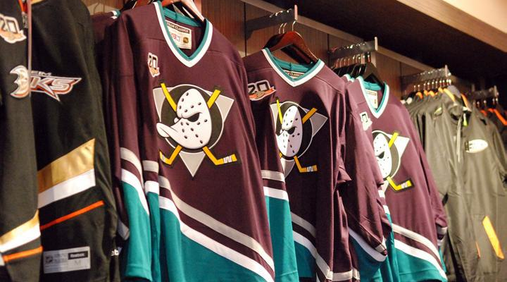
Last month, Ducks season ticket holder Brad Kirchhofer sent in this photo of the game ticket, which features the classic Mighty Ducks logo. He also pointed out a couple of other ways the throwback logo was being used as part of the team's 20th anniversary promotions.
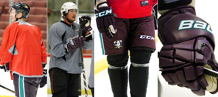
This week, the old eggplant and jade starting showing up at Ducks practices so players could break in their new gear before Sunday. We got a glimpse and gloves and pants on Tuesday and Wednesday. (There are plenty more photos at those two links if you're interested.)
It's my understanding, however, that the team will be wear Reebok Edge versions of the old Mighty Ducks jerseys, meaning we should see an updated collar and cut. But otherwise, it should be the spitting image of the old eggplant jersey.
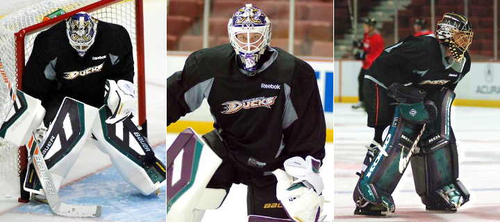
The goalies got to test out their new equipment as well. The shots on the left and center are Viktor Fasth, who modeled his mask after Guy Hebert's. On the right, you can see Jonas Hiller in his throwback pads. The Ducks tweeted a photo of Hiller in his mask earlier today.
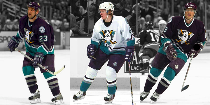
If all this has you feeling nostalgic, I dug up some photos of current Ducks players in the classic threads.

That's Francois Beauchemin, Corey Perry — as No. 61! — and Teemu Selanne as No. 13. Think of this as a sneak peek of what's to come on Sunday — only pre-Edge. Hopefully it won't look too much different.
Lastly, for non-Ducks fans, how about a look at a few familiar faces who you perhaps didn't know — or forgot — once donned the eggplant and jade?

That's Joffrey Lupul, Chris Kunitz and Sergei Fedorov. Truth be told, before I found that photo, I didn't know Lupul had played for Anaheim. But he did for a couple seasons a decade ago.
So who's excited for Sunday?!
 Chris
Chris
TV station gives first glimpse of Edge version of Mighty jersey
On Friday morning, we got to see the Reebok Edge version of the Mighty Ducks jersey for the first time. Good Day LA reporter Mar Yvette wore it for a feature during the morning show. As expected, it looks the same as before but with the updated Reebok collar and cut.
It was cool seeing the jersey, but Yvette's interview with Sheldon Souray is not worth watching. She starts by talking about the Dodgers shirt she's wearing under the jersey and goes on to make up the term "puckshot" since she doesn't know what a "slapshot" is. I get you're a feature reporter, but does that absolve you from doing a little research before you head out the door?
Anyway, here's another shot that shows the full jersey.
Some commented that it looks practically transparent, but I'm not sure it's any more than usual with the latest round of Reebok Edge jerseys. And it may also be just an optical illusion because of how it's worn on her. One thing I can't tell is whether the stripes are sublimated. None of the Edge templates lend themselves well to the diagonal stripe from the old Mighty Ducks jerseys.
We'll get to see them in all their game day glory tomorrow afternoon!


Reader Comments (30)
you guys know my opinion on this. it's good for the nostalgia effect (no era looked as great as the late-'90s and early'00s did)... but other than that, the colors are just terrible. I could do without ever having to see them again.
It's absolutely baffling that anyone could think their current set is better than the classic eggplant and teal. I get that they wanted to move away from the Disney image, and dropping the "Mighty" is fine (though I still don't like it) but these throwbacks should be the permanent Anaheim look. The diagonal lines may be a little bit 90's so update them if you need to but the logo and colors are perfect.
As a Wild fan with no ties to Anaheim at all, if you think I wouldn't order a customized Charlie Conway or Adam Banks jersey once these were permanent you're crazy.
Can't believe you forgot to post a pic of Paul Kariya! That's the guy I always think of when I see those jerseys!
Lupul had two different stints in Anaheim and they drafted him seventh overall... how could you not know he played there? lol
I never forgot Lupul was a Duck. Or, rather, a Mighty Duck. But I didn't remember Fedorov being one. With him coming out of retirement to play for his KHL team, maybe Selanne will put off retiring for another season if he can convince Feds to come back to the NHL for one more season in Anaheim. On a side note, I really hope Cam Fowler plays his entire career as a Duck. Name's just too perfect! Anyhoo...
OMG Those throwback Koho pads just gave me the biggest hard on omgggggggggg They look so legit its unreal .
The Anaheim Ducks website is donned in the old logo and colors, pretty cool should check it out
Do those jerseys not have the NHL crest at the front of the collar? I guess that's NOT gonna happen with the jerseys that get worn on Sunday? Either way, I am sure they will look terrific. And, not to nitpick, but the Sharks were, are, and always will be the only teal team in the NHL. This colour scheme and these uniforms were referred to as Eggplant and Jade, I believe.
Also, I have to echo the sentiment that this article is lacking one important element, one Paul Kariya.
So are those the jersey's they are going to wear? The throwbacks are actually made by CCM not Reebok? Or you think that is just old ass stock they threw the anniversary logo on? I was about to say if Reebok could produce jersey's like that then why the hell aren't teams completely ditching the current stitching and going with that style.
As a huge fan of this kind of thing, this is the best thing to happen to me in a while. First off, the Mighty Ducks jerseys and merchandise are going to sell a ton.
I really love the fact that we're going to see these on the ice again, I'm going to definitely watch that game, as well as try to pick up some newly-sold Mighty Ducks merch for myself. I wish I could be at that game, it's going to be great.
You know what I hope? I hope that the sales of the throwback merchandise and general reception to bringing back the old uniform are so well that they convince the owner and his wife to change the identity and bring back the old Mighty Ducks 100%. That would make me extremely happy.
Also, I notice the shoulder patch they wore from 1996-2006 isn't there. Oh well...I really liked that logo.
Fedorov's time in Anaheim was forgettable. He had a decent year statistically but that team was in shambles after Kariya's stunt. IIRC he was one of the first players to be moved once the new owners and management took over.
I can't wait for Sunday! Although I like their home and aways (I'm definitely in the minority here) I never really cared for that new alternate. I really hope they ditch that in favour of the throwback and then eventually make it their primary with an away sweater to match.
Looks as if they pulled the old CCM jerseys out of storage and heat pressed the 20th Anniversary logo onto them. They're old CCM tags with the old NHL logo. Good way to clean out the back closet.
The Ducks should have never gotten rid of the Mighty Duck colours. Anybody can wear black but who else can wear eggplant and jade? Even the traditional block font is far superior to the font that is currently used.
I may be a Sharks fan, but the Mighty Ducks look has always been one of my favorites based on that nostalgia factor. I'm very excited to see its comeback!!!
I'm siked, I absolutely loved this look and may be biased since I grew up during their Mighty days but the pics of the players rocking their retro gear has me so anxious to see them in action tomorrow. Hopefully the only change to the edge collar is simply placing the NHL shield on it. Really hope the jerseys and other anniversary gear go on sale online. The stuff in their shop looks awesome.
The Mighty Ducks look is a breath of fresh air. Even though I think that it is awesome that more teams are going with traditional looks, (Even though teams like Carolina and Tampa Bay should actually try to be creative while doing so.) to see a few teams go with something different is great too and the Mighty Ducks throwback give us something original. Even though it isn't a traditional look and is a 90's look, the colors, the logo, and the uniforms have such a unique look. I understand why the Ducks changed to their current look to make it clear that they aren't Mighty anymore but I think it is amazing that even for just one game, this look is coming back. All three teams in California have a black jersey. It would be nice if the Ducks could break that permanently, even if it means an entirely new look.
Too bad they couldn't fit it into the reebok edge cut. Would have been cool
They switched over their website to the old Mighty Ducks logo and color scheme..
I have a feeling that the actual on ice jersey will be just the actual CCM jersey from 2000-2006, minus the shoulder logos, but with an Edge collar. There have been non-Edge jerseys worn in the NHL since 2007. For the Canadiens 100 year celebrations, they wore their vintage white jerseys that they'd worn periodically since 2003 without change, and their infamous 1912 barberpole jersey was NOT an Edge cut jersey, it was CCM cut, but with a Reebok Edge collar. That is what it looks like they did with the Mighty Ducks jersey here.
Wow exactly what I was hoping for all they did was put the slight cut on the hem and place the shield on the collar without messing it up. A+ Can't wait to watch this game!
Any idea if the RBK versions will be sold anywhere? I'd love to get my hands on one.
The jerseys being sold in the team store are CCM but they are not from an old stock like some are saying. I was in the team store yesterday and the tag says CCM classic, which is why the nhl logo is the old one. I am curious why they are selling these as compared to the reebok edge version. My guess is the fit. When I tried on a medium, which is the size I have for the regular Reebok edge Ducks jersey, it fit like an old hockey jersey. It was loose and baggy as compared to the tighter Reebok Edge jersys. I think they wanted fans to be able to purchase a jersey more similar to the ones worn in the 90s and early to mid 2000s as compared to the ones the team will actually wear on sunday.
Why is this called a throwback night? They wore these jerseys SIX YEARS AGO!
I'm a Ducks fan headed to the game tonight. Does anyone know if the Senators are wearing "throwbacks" or their usual jerseys? I'm curious.
@Kevin Y
you my friend obviously know nothing about jerseys. you actually think that colour scheme was terrible? so you honestly prefer a lame "ducks" wordmark and a cheesy "D" with a rip off of Pittsburgh's colours as their jersey? they never should have go rid of the original colour scheme, and name for that matter. hopefully the people running the team see a good response and reaction from the Anaheim fan base and bring back the original jersey as a permanent home/away or even as just a alternate to wear occasionally.
THIS is fantastic to see. I would love if they brought these back full time and got rid of the current set. The current jerseys just seem very empty and sort of boring to me (as they have been for the past 7yrs or so). There's something to be said about those jerseys of the early 90's - they may be viewed as ugly now but then they were MIGHTY radical (dude) then. It's so refreshing to see something old school make a return even if it's for one night or for limited dates.
I have tos ay - I wish the patch was a bit larger on the jersey. It seems so small.
Watching the Ducks play the Sens tonight. I wish Ottawa were wearing retro white 1993 2d logo to go along with retro night.
Beautiful uniforms, especially the whites. All three California teams wear black. It looks good, but is so unimaginative and lazy. This Mighty Ducks look is original and unique. You just know they're going to sell a ton of these, so hopefully the demand forces them to use them on a regular basis.
haha nice touch Chris switching the site colours over to the Mighty Ducks colours!
I'm guessing they will wear the white version in their stadium series game, and if they play as "mighty" as they did in these I could see them wearing them more often!