Nike Unveils Czech Olympic Jerseys
 Monday · Oct 7 · 2013 | 6:04 PM PDT
  28 Comments
 Manufacturer's run of unconventional designs continues
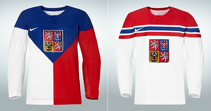
Earlier today, Nike unveiled the Czech Republic's new uniform set for the 2014 Olympics in Sochi. They're another example of unorthodox sweater designs from the jersey maker. It's the fourth national team we've gotten a look at in the past six weeks.
In August, Nike showed us the jerseys for the U.S. and Russia. Then last month, the Canadian jerseys leaked — though they're scheduled to be unveiled officially on Tuesday.
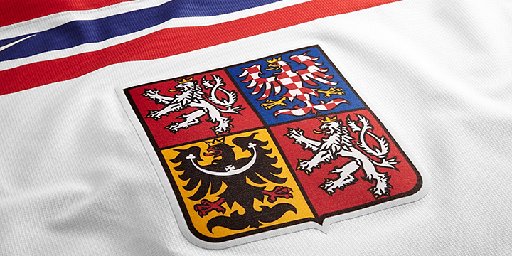
But back to the Czechs. They'll essentially be draped in their national flag throughout the Olympic hockey tournament this winter. That gives us a primary jersey made up of three colors instead of one. The white jersey is a bit simpler. Front and center on both is the classic coat of arms.
Worth noting is the lack of applique features on the shoulders like we've seen with the U.S., Russia and Canada. But the Czechs still share the faux lace-up collar. Like it or not — and most people seem to hate it — that seems to be a feature of all Nike jerseys going forward.
Speaking of which, based on the four we've seen so far, what are you expecting for some of the other national teams like Sweden, Finland and even Germany (since they didn't qualify, how about Switzerland)? What's next from Nike?


Reader Comments (28)
I know I'll be in the minority here, but I love the flag "dark" jersey.
Suddenly these reebok jerseys are looking pretty good.
Given Germany didn't make it.... Awwww. Sorry any German readers.
Nike keeps outdoing themselves with each jersey unveiling. Just not in a good way.
I'm excited to see what Slovenia, Latvia and Austria come up with, especially Slovenia, since they aren't usually in the Olympics, so they might make something crazy to be memorable, cause it probably wont happen on the ice.
So, if The Czech Republic and Russia meet outside of group play they have the potential to play in the least aesthetically appealing hockey game ever. Czech darks vs Russian whites. So gaudy!
Has there been any pictures of these (meaning any olympic jerseys) pulled over some equipment? They have such a long sleeve t-shirt look to them that I imagine they will look very awkward with pads filling them out.
Count me also as someone enjoying the Flag jersey.
It's official, Sochi 2014 will have the ugliest hockey jerseys of any olympics.
I'm in complete agreement with March, that the NHL jerseys are lookin' good. I'll take Carolina's new set over this crap any day of the week!!!!!!
@Tyler J: Oops, didn't check to see who qualified. Just assumed Germany had.
These are going to be the ugliest Olympics ever. Of all time.
The white jerseys look like the torso is wearing a giant toque.
The tri-colour home flag is an interesting look, especially with either sleeve being a different colour. I like the risk Nike is at least taking; besides, it's just for two weeks!
Keeping with that, I wonder what Team Canada would look like with two red sleeves, a white body, and the middle maple leaf...
Oh man! This is gonna be confusing! Why go with so much white on the home threads? I think it will be hard to separate them from Russia's away kit, we'll just have to hope they never face each other I guess. One other thing, is it really OK according to IIHF rules?
I think they should have gone with a completely red bottom, with a white stripe (like a Cannuck V) separating the blue from the red. A home sweater should be dark, a road sweater should be white/bright, not something in between. End of story.
Interesting jerseys, but really bad in praktical way.... imagine Czech republic in dark jerseys play for example against Russia in white.. it would be really hard to distinguish the players, since the "flag" jersey has half white....
What's wrong with Nike's designers? This is HOCKEY, not FIGURE SKATING!!
I know most of you don't, but I like EVERY olympic jersey realeased so far!
It will be interesting to see what these look like when the sleeve (TV) numbers are added as the placement will certainly make or break these particular jerseys. Although I can't say I like any of them, it's a 2 week tournament where you are trying to gather as much attention as possible.....I think allot of people in Europe where traditional kits and jerseys are not what they are say here in Canada, they will eat these up.
TOM18 stole my thunder about being able to teall the Czechs apart from the other team if they are wearing red or whote.. Other than that, I really like both of these jerseys.
I've not liked some of these Olympic sweaters at all but I like the direction Nike is doing. Its so much different as in why do we need matching waist stripes and arm stripes on every single one. Some of them have been fails but Canada and these Czech jerseys I really don't mind... I know they aren't the first design team to try to make a new, classic hockey sweater but I'd take this over Rebook trying to design Olympic sweaters.
What does the back of the Flag jersey look like? Because if the back is half and half too, it could get very tricky for players to realize who is on which team in a red vs white game.
When viewed from the side, the Czech home will have white arm/side and blue shoulder. Just like the american away jersey. I think the Czechs were blue pants as well to make things worse. (Aside... Will they have a white sock and a red sock to match the sleeves?)
At least when they play Russia, Russia wear read pants.
(P.S. Canada officially released the uniforms and the socks make things worse. Instead of a stripe around the shin/calf, they decided to change the colours of the knees. Always thought, that makes it look like their socks are too long like on 6 year old hockey players.)
so, are these the new olympic soccer jerseys?? as they just dont look like hockey jerseys to me!!
The flag jersey is kinda neat. But I hate how they insist on leaving the arms and hem blank. Throw that red-blue-red striping pattern on the arms and hem of the white one and it'd look great.
I also love the flag jersey. I think it makes more sense as a concept though then an actually game use sweater. As previously stated by someone else, these are really going to look a lot like a white sweater when viewed from the left peripheral. This might be pretty confusing on the ice.
I have an old Peterborough Pete's jersey that the boys wont even let me use as a dark jersey for shinny because it has thick white stripes that runs down the arms that makes it look like a white jersey from the side. Ha!
I'm really like all the Olympic jerseys so far, they're fresh and unique. Haters gonna hate.
While somewhat unique - that flag jersey with all that white on the one side is going to stink for the players in an actual game trying to decipher which team to pass the friggin puck to! Nike really bombed on these Olympic sweaters. ugh.
If Team Sweden's (aka The Three Crowns or Tre Kronor in swedish ) jerseys will undergo the same drastic change as the other nations jerets, it will seriously ruin the olympics for me. Sweden has ALWAYS had pretty much the same design on their jerseys. Nike - DO NOT TOUCH!
I fear the worst.