NHL Announces 2014 Winter Classic
 Sunday · Apr 7 · 2013 | 12:04 PM PDT
  18 Comments
Outdoor game in Ann Arbor, Mich. officially rescheduled
The NHL announced Sunday morning that the Detroit Red Wings and Toronto Maple Leafs will meet in Ann Arbor, Mich. on Jan. 1 for the next Winter Classic. I'm starting to sound like a broken record. This same game was announced last year for 2013 but was canceled due to the lockout. It will now take place in 2014.
Better than the announcement of the big game was the unveiling of all the jerseys that will be used at the event next January. So we'll have a lot of pictures in this post. Enjoy.

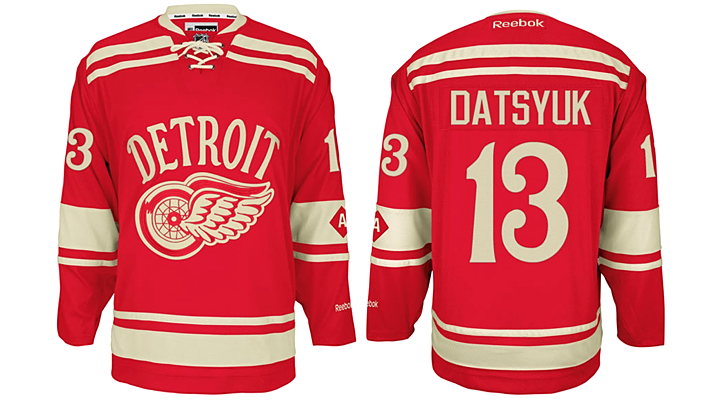
We'll start with the host team. The Red Wings who, according to the press release, "will be wearing iconic red and antique white uniforms featuring a striping pattern and arch Detroit wordmark inspired by the late-1920s Detroit Cougars. The front crest on the jersey will feature an early iteration of the winged wheel from the late 1930s Red Wings."
 Photo from Detroit Red Wings official website
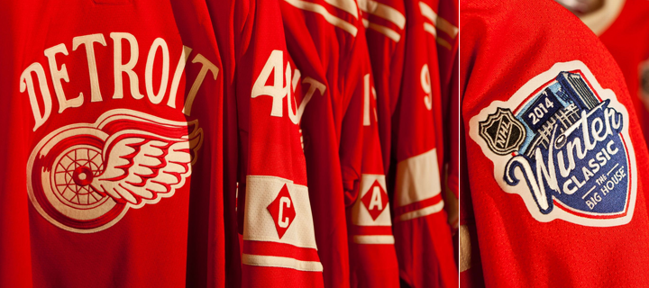
Perhaps the most fascinating detail of this jersey is the captains' letters being worn on the left sleeve. Above, you see the "A" on Pavel Datsyuk's sweater, and below, the "C" on Henrik Zetterberg's. I think this may be the first time we've ever seen the captains marked anywhere but the chest.
 Photos from Detroit Red Wings official website
Here are a few more looks at the jersey and some the details.

Now let's switch gears to their opponent.

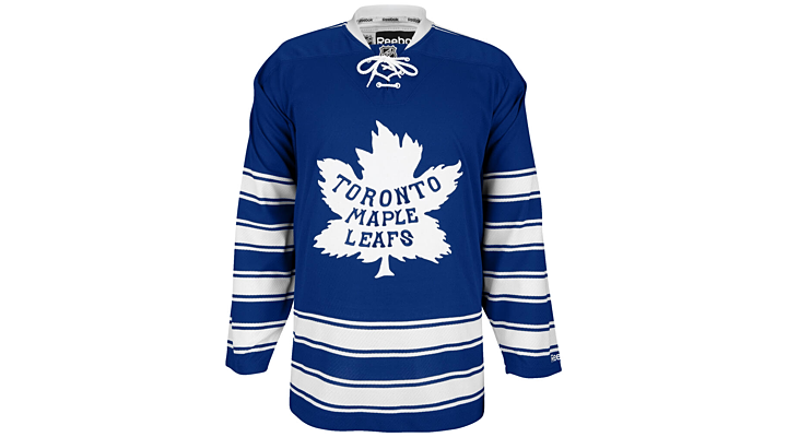
The Maple Leafs are going back to 1927 for their Winter Classic uniform — a design they actually resurrected briefly back in the 90s.
 Photo from Schuyler Baehman via Twitter
Here's what the team says about the jersey on their website's current splash page.
The Toronto Maple Leafs 2014 NHL Winter Classic sweater speaks to our storied beginnings and evokes memories of Hall of Famers nicknamed "Busher" Jackson, "Ace" Bailey, "King" Clancy and "Gentleman" Joe Primeau.
The name and crest were born on a train ride home from Michigan in 1927, with Toronto leaving Detroit as the St. Pats and pulling into Old Union Station as the Toronto Maple Leafs. Our blue and white colours were chosen by team founder Conn Smythe to reflect is alma mater the University of Toronto.
An unabashed patriot, Smythe wanted to adopt Canada's national emblem, the maple leaf, for his new hockey team, stating: "The Maple Leaf, to us, was the badge of courage, the badge that meant home... We chose it hoping [it would be] worn with honour and pride and courage, the way it had been worn by the soldiers of the first Great War in the Canadian Army."
Don't you love the Detroit tie-in to that story?
 Photo from Toronto Maple Leafs via Facebook
Now I'd love to show you some more pictures of that Leafs jersey here, but — unlike the Red Wings — the Leafs haven't put a whole lot out there yet. So we'll just skip to the next bit.
 Photo from Detroit Red Wings via Facebook
The sweaters for the alumni game were also unveiled today. The Wings will basically wear the opposite of their 2009 Winter Classic jersey — red with a white stripe and "D" on the chest. The Leafs will sport their 1970s uniform.
Here are some other notes from the day:
- HBO's 24/7 series will be back to chronicle the season leading up to the Winter Classic. It's worth noting that realignment puts Detroit and Toronto in the same division next season which will make things even more interesting.
- There's been a lot of talk about multiple outdoor games in 2014. Perhaps another Heritage Classic featuring the Montreal Canadiens and, say, the Vancouver Canucks in their Millionaires jersey? I only say Montreal because they've played every Heritage game so far. But maybe the Ottawa Senators in a white version of their Heritage jerseys could take on the Millionaires-clad Canucks? That way everybody gets a turn at playing on a pond.
- And finally... BLUE VERSUS RED!!
What are you excited about most when it comes to the 2014 NHL Winter Classic?


Reader Comments (18)
I say Oilers in next Heritage Classic......Montreal was in it twice so now it Oilers turn to be in it twice
I'd love to see the Canucks play the Blackhawks in the WC but an HC would be good to. I also think the Millionaires jersey should have been saved for an outdoor game. Maybe next time, they try black skate jersey instead?
Will the Leafs jerseys have shoulder yolk like in the alumni photo? As a Wings fan I can't wait to get ahold of a Micky Redmond alumni jersey! (and I hope Larry Murphy will don one)
Enough with the vintage white already, I hate that this trend of making jerseys look like dirty socks is still 'in'.
The Wings' shirts are a little bit all over the place with regards to historical references and put together it doesn't quite work. The old winged wheel and the wordmark are old-time 20s/30s and the C/A patches on the arm are another nice vintage-looking touch (I honestly don't know if it's an actual reference to something from the Cougars years or what), and even the number font looks suitably old even if it's actually much more recent. But the striping looks more like something from the 70s or 80s, put together and it clashes a bit. Frustrating, if they just simplified the stripes or even just got rid of the ones across the shoulders it'd be fantastic. Their alumni shirts are pretty sharp though, might end up getting one of those instead.
TO's look pretty great with the 20s logo, the sleeves are a bit nutty-looking though. In any case I'm glad they've gone with colour-vs-colour this time around, there's really no reason why they shouldn't be able to do that for a one-off every WC. For a special-edition jersey I'd definitely want something in my team's own colours instead of white.
Heritage Classic.....gotta be in the peg!! Jets vs oilers
Luongo did have the "C" on his mask when he was captain, but that's really only because he wasn't allowed to wear it on his jersey...
Hah! Lanny McDonald gets to play in both the Heritage Classic in Calgary and now Winter Classic.
"Tell 'em Lanny sent ya!"
Corbeaunoir, my new term for that "vintage"/"antique" shade is "Coffee Piss", because it looks like it's been soaked in coffee, cat piss, or a combination thereof. I mean, it's a modern jersey, there's no wool to speak of, and the fascination with faux-aging crap like this just escapes me.
That said, CP notwithstanding, I think the Wings' WC jersey is a bit gimmicky. Either do a city name or a logo on the front; doing both is neither elegant nor charming. Personally, I'd have gone with more striping (possibly a modified red version of the Falcons jersey), with either a "DETROIT" wordmark on the front with the winged wheel on the shoulders, or a vintage winged wheel on the front. Also, I don't see any real reason the captain's letter needs to be on the sleeve stripe, all the way down at the elbow. There looks to be more than enough room on the chest, especially considering the WC patch is relegated to the shoulder. I don't mind the number font, based on the 1982-83 unis (the first year Ilitch owned the team).
The Leafs, meanwhile (aside from sticking with Real White), look like they've shrunk the stripes down a little bit, to make room for sleeve numbers. The design worn from 1930-34 had the shoulder stripes nearly touching the top sleeve stripes. (Incidentally, the 1997 throwback was based on the 1927-30 jersey, without the shoulder stripes.) Overall, I like the design (though I'm still not a fan of lace-ups).
As for the alumni unis, the Wings' inverted 09 WC jerseys look nice (I almost wish they were wearing these for the actual Classic, and maybe a pre-1956 inspired white-sleeved jersey for the alumni game). I've also always liked the Leafs' 70-92 design. I've always found it funny, though, that their socks during that era had two stripes, which would seem to be a better match for the two-stripe pre-67 or post-92 unis compared to the 3-sets-of-3-stripes socks they've worn from 30-70 and 92-present.
any idea why both teams are wearing 'home' colors?? shouldn't the leafs be wearing white with blue and not blue with white??
it looks like the twitter pic that you're using for the leafs jersey is incorrect, chris.
the twitpic lacks the shoulder yokes that are shown clearly in the alumni pic
(wendel and lanny are wearing them, darryl is wearing the alumni classic jersey.)
in addition, you can see the shoulder yoke on this pic posted to facebook from the nhl featuring
both teams' sleeves.
https://www.facebook.com/photo.php?fbid=10151339531952466&set=a.382312857465.166241.61652252465&type=1&theater
anyone catch the piping on the Wings jersey is the same as the Rangers' WC sweater?
Die-hard Wings fan- love the jersey, HATE THE VINTAGE WHITE. Our jersey would look so much better without the cream/yellow/beige or whatever you want to call it.
So the wings went with the same striping as the Wild alternate (but inverted)... Or did the Wild use an inverted Cougars striping?
Look at these pictures it looks like both teams are using felt numbers and crests just like the Canucks did with the Millionaires jerseys. In my opinion its a really neat touch to the vintage jerseys. I'm not sure how true to the past it is but it does have a cool feel.
Blue vs Red, I am a HUGE fan of this move. I can't wait to get my Lupul jersey.
The Detroit C's and A's are dumb and should be on the chest, as should the Winter Classic logo for both teams that makes way more sense than the shoulder.
Montreal should definitely not be in the next Heritage Classic, give the other teams a chance. I think Winnipeg's new Football Stadium will be ready so why not the Jets? I'd love to see won in Ottawa especially if its Battle of Ontario. I would say Battle of Alberta but both Heritage Classics were in Alberta so no dice.
That WC uniform that the Leafs will be wearing for the WC is one hell of an awesome jersey. I'm not as big of a fan of the Red Wings. I know Detroit really didn't have too many options to chose from but they should have at least worn the ones their alumni will be wearing. One thing that bugs me about the Wings' uniform is that the stripes on the arms and the waist are pretty much the exact same besides the reversed stripe on the waist as the Minnesota Wild's green jersey. I also don't care for the wordmark on the logo. The winged wheel looks way better on its own. Besides that, I can't wait to see them on ice.
justaguy, the shoulder stripes are on the jersey in that Leafs pic - the thin stripe is barely visible near the collar, because of the way the jersey is seated.
Dave C, it's definitely not Cougars striping, as the team didn't use waistline stripes until they were the Falcons.
For Detroit's jerseys they look like they used part of the striping pattern from the 1927-1928 Cougars jersey. It's similar to what Philadelphia did last year, they didn't copy a whole jersey they just used a simple striping pattern to base the jersey off of. I love it. Toronto looks great too; this Winter Classic will be awesome!