Tuesday
May142013
2013 Stanley Cup Playoff Logos
 Tuesday · May 14 · 2013 | 2:07 AM PDT
  13 Comments
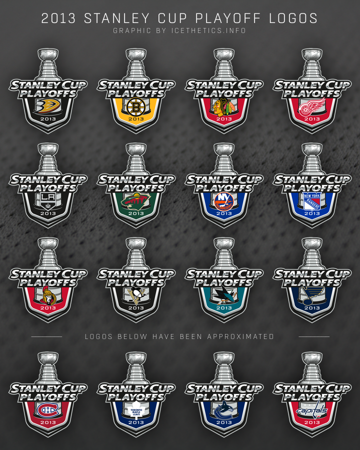
Here's something fun to look at. Last month when the AHL's Calder Cup Playoffs began, we saw each individual team's version of the 2013 Calder Cup logo. Little did we know the NHL would be doing the same thing for the 2013 Stanley Cup Playoffs.
These are the 16 individual team logos in use this postseason*.

*As you can see, for the bottom four I had to guess at the design as I couldn't find them anywhere on the web. If you've seen them, let me know so I can update this graphic. Unfortunately, all four teams have been eliminated so it's unlikely they'll turn up if they haven't already.
Meantime, I hope you're enjoying the playoffs as the Conference Semifinals get underway!


Reader Comments (13)
Yeish... The white Maple Leaf looks weird..
I woulda thought the Leafs would use their 3rd jersey logo
Should have used Blue for the Leafs logo.
The Capitals one is correct. Not sure about the others...
XORDOK don't worry they wont be needing that logo anymore after last night
That Boston logo sticks out like a sore thumb
I agree with Xordok, Xordok, Xordok and Xordok. Leaf should be blue.
I like how the main logo is the same color scheme as the Kings. That'll make for a smooth transition when the they win the cup again. ;-)
I saw the Vancouver one last week, as far as I can remember it looks right.
The Caps one had the alternate logo instead of the primary last year. Not sure about this year.
These look nice, I'm glad they actually used the team colors in these instead of bland blue for all of them like last year.
How did you know that those teams would be knocked out in the first round?
At Bill B. The teams have already been knocked out.
i don't like the designs. they seem unbalance, as if the top and bottom halves were from two different logos that were then stitched together.
when you look at the ahl logos and they are solid. sure the team logos are tacked on at the bottom but the rest of the logo looks complete with a window for individual teams to fill.
with the nhl logo, i don't feel as if the lower half of the cup reads as part of the cup and not just a neutral background while the top half should have an extension of the sheild-esque shape from the bottom portion.
but that's just my two cents.