


Does Isles' Black Era End Today?
TV broadcaster says 2011 third jersey is done
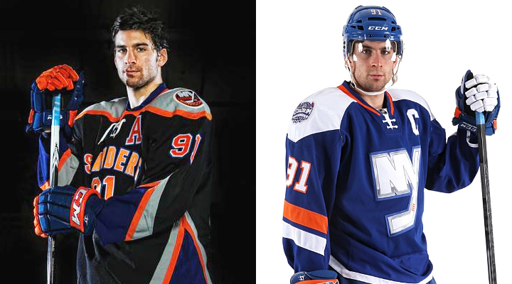
Interesting jersey developments came today during the New York Islanders telecast. During the first period of their game against the Blues, play-by-play announcer Howie Rose said this match-up may be the final hurrah for the widely despised black third jersey.
For the video-impaired, here's the transcript:
Howie Rose: It may well be that the fans are getting some good news today. This could be the last time that the Islanders wear these sartorial atrocities known as the black alternate jerseys.
These schmattas might finally go away for good once the Islanders unveil their nifty Stadium Series jersey for the game against the Rangers Wednesday night at Yankee Stadium.
And you know, you can even hear… there's a discernible groan when the Islanders hit the ice either for warm-ups or before the game wearing these things. I know some of the fans have bought them.
Butch Goring: And they don't win either, Howie.
HR: 7-12-4, says Eric Hornick in these things that thankfully may well be consigned to the scrap heap in just a couple of hours.
One thing to note. Rose seems to suggest the Isles' Stadium Series jersey has not been unveiled yet. Of course we know it was back on Nov. 26. But this news jibes with what Chris Botta said recently.
That's now two sources saying the Stadium jersey will replace the black as the Isles' alternate uniform. Botta said by 2015, but Rose made it sound like the change could happen sooner.
Thanks to Layton O'Neil for the Twitter tip!
 Chris
Chris
But wait! There's more!
Another Twitter tip from Dave C. pointed out that the jersey will be worn for additional regular season games after its Stadium Series debut this week. Coming back from the last commercial break of the first period, Rose talked specifically about the new sweater.
Again, if you can't watch the video, check out the transcript:
HR: Now that is a great looking alternate jersey. The Islanders are going to wear those for the first time at Yankee Stadium this week. And we'll be seeing them — so we understand — a few times throughout the rest of this regular season.
That's a third jersey I think the fans are really going to take to. So [we'll be] seeing a lot more of that.
What do you think? Do you prefer the blue or black? (I think I can probably guess.)
Chris
Another update, this time in the form of a Chris Botta tweet:
NHL exec: #Isles have approval to wear Stadium Series jersey at Coliseum. Will probably wear for 2 games before end of season.
— Chris Botta (@ChrisBottaNHL) January 26, 2014The more, the merrier, I say.

Reader Comments (34)
Only one word describes this news, YES!!!!
Kinda surprised that even the regular fans didn't like it either.
So Mr. Rose, tell us how you REALLY feel about those jerseys.
I actually think they wouldn't be that bad if they had a logo on the front. I was never a fan of the high school name and number look for NHL teams (yet another reason to love Dallas' new look over the bland practice jerseys they wore since the Edge era began).
I don't like the metallic logo or the angular shoulder yokes, but despite those stumbles the blue alts are way better than the black ones.
I like the Islanders' Stadium Series threads. Yes, the angled sleeve numbers and strangely-large back numbers are odd and the "metallic" (screen-printed) crests are cheap-looking, but if you're talking about making the alternate jersey a unique and modern look to go with their classic set, I very much like it. Just, please, if you're going to use it as a full-time alternate, make the crest out of the traditional material and shrink those back numbers a touch.
I like the Islanders' Stadium Series threads. Yes, the angled sleeve numbers and strangely-large back numbers are odd and the "metallic" (screen-printed) crests are cheap-looking, but if you're talking about making the alternate jersey a unique and modern look to go with their classic set, I very much like it. Just, please, if you're going to use it as a full-time alternate, make the crest out of the traditional material and shrink those back numbers a touch.
What a fitting game to end the black jersey
I'm so happy. I've despised that jersey since they've started wearing it. Also, for the last couple of weekday games, they've been marking the black jersey's down 30% in the team store, soo......
thank god and baby god
I think that the commentator in the first video said "Schmatta" which is a yiddish word for rag, not "schmacka"
To quote my fellow Isles fans in Section 329 (Blue and Orange Army): YES! YES! YES! YES! YES! YES! YES! YES!
The word in Howie Rose's second paragraph is Schmatta. It's a widely used Yiddish phrase (especially around NYC). It means rag, but also is used to refer to beat up or ugly or cheap clothing.
So yes, the Islanders third is an ugly schmatta.
I'm ok with the Isles changing shirts, it'll be neat the see the blue one in action, but, if they're going to wear these on more occasions, maybe put some regular sized numbers on the back. I'm not a fan of the stretched out numbers. They look goofy.
That video does those Stadium Series jerseys justice. Best of the bunch.
"Shmattas", I believe.
It's Yiddish for "rags".
There both horrible!
die black jersey's, die! back in blue!
Personally, I like both. I own the black one. The real question is does this mean no black and white for Brooklyn? Where does this fall under the NHL's 3 year alternate rule?
Surprisingly, I love them both. I bought the black alternate and I'm planning on getting the stadium series jersey too (I'm not an Isles fan btw).
Thanks to those who pointed out the word "schmattas." Wasn't a word I was familiar with but I figured somebody here would be able to help out.
Awesome, I love the new jersey, and I honestly think this is what SHOULD of been there dark jersey back in the mid 90's rather then the fisherman jersey. It's a got a nice modern touch to it.
But the Islanders jersey's should forever be left alone and never messed with again, maybe have the Home jersey's look like how they did back in the 80's for there what was then the Road jersey's. http://nhluniforms.com/Islanders/Islanders05.html
Other then that. Awesome. :D
Am I the only person in the world who wants the Gorton fisherman back. I love those hated uniforms. I would at least like it to be the third jersey.
Neither. Both jerseys are terrible excuses for a hockey sweater. The blue is marginally better than the black. If they ditched the Coors Light chrome outline, it may be tolerable. Personally, I want to see an orange third. Keep the same layout as the home/away jerseys but make the primary color orange with blue and white stripes.
I'd even go as far as to suggest that bringing back the Fishermen would be an improvement over both the black third and the stadium jerseys. Enough time has passed that it would be cool to see an updated Fishermen on the ice and bring back some 90's flair.
I'm gonna be in the minority, but I like the blacks better than the blues. The chrome logo doesn't work on hockey jerseys, no matter how nice the rest of the jerseys is. Although, I'd prefer an orange alternate to both blue or black.
Not sure why people don't like the black third. I love it, as it fits in with the mets an Knicks. It's not like it came out of no where.
Actually, I don't get why the black jersey is so hated. I actually half love it. But I like the change, as the SS jersey is AMAZING!
Colour in that crest and everything will be fine!
I hated the black jersey because it was too busy. There are five colors on the thing - black, white, orange, blue, gray. Stripes are going up down left right. The pants share the same weird pattern. The gray was a nice touch, as it's not used often on pro uniforms, but the overall uniform was just too busy. It reminds me of The Oatmeal comic about web design (not sure if I can link but .. http://theoatmeal.com/comics/design_hell ) where management gets involved and the entire thing goes from nice to an absolute atrocity.
Mickey - Both the Knicks and the Mets have dropped the black from their uniforms in the past year or so.
I think the Islanders' black jersey should have been a basketball jersey and not a hockey jersey. I'm glad to see it go. It is a terrible hockey jersey. The Stadium Series jersey is significantly better than the black jersey. I think it should be the new third jersey for a while and then they could try another black jersey in Brooklyn, if they really want to.
When he said "unveil" I think he meant "wearing in a game for the first time."
By all means, reverse the nameplate back to normal, straighten out the arm numbers and it's a perfect update for a team who has been looking for a nice update. Granted I liked the Fisherman jerseys.
Bring back Gorton's Fish Sticks!
I hope they fix the numbers though. Did anyone go to any of the games and notice that the elongated numbers helped?
I too think they should update the fisherman jerseys! I own one and I love the lighthouse patch!