Entries in tampa bay lightning (24)

Sunday
Feb062011

New Bolts Logo Already All Over

The Tampa Bay Lightning are wasting no time in getting their new branding out there. It started with the arena, of course. From what I understand, as of Friday, you can barely find the old logo in the St. Pete Times Forum anymore, including center ice.

Despite that, the team cannot wear their new uniforms and logo until next season. They also can't sell jerseys until after this season ends. But that's not stopping the marketing machine. And they've already got FOX Sports building brand new broadcast graphics.

Today's Super Sunday game against the Blues was not televised by Sun Sports today, so I had to watch on FOX Sports Midwest. And they already had the new logo built into everything but the animated wipes.

New Lightning logo already built into TV broadcasts / FOX Sports Midwest

It looks great, but why not use the version without the TAMPA BAY text? Isn't the point of the new logo to be an iconic symbol on its own? Guess that'll take a little time.

Now I don't know if this is a new development or if the new logo was in use on Friday night when the Lightning faced the Capitals. It was blacked out on GameCenter Live because NHL Network carried coverage. I won't be able to take a look until later tonight.

Meantime, here's a look at another graphic. You can also see here that the new logo is painted at center ice and even on dasher board advertising. So there's no turning back now.

And lastly, here it is on the FOX Sports scoreboard graphic. It features a darker blue than we saw on the uniforms when they were unveiled.

The Lightning wore their blue third jerseys for today's 4-3 OT win in Tampa. According to the team CEO Tod Leiweke, the BOLTS sweater will be retained next season. He didn't get into specifics as to whether they'll keep the black and gray, but I assume they'll at least put the new primary logo on the shoulders.

By the way, I realize NHL marketing rules prevent the team from changing uniforms midseason, but there's actually a precedent for NHL teams unveiling a new logo before summer. Graham Y. wrote in with this:

I was in Minnesota during the final days of the North Stars and remember an issue they had while changing their logo and uniform scheme.

With some obvious foresight to the move to Dallas, then owner Norm Green commissioned a new logo with just "Stars" across the front. They announced the new identity late in the season before the change just like the Lightning did.

Late that season the training staff on the bench began wearing windbreaker jackets with the new logo and the team was notified by the league that they would have to wait until the next season to begin using the new logo. I am not entirely positive but I think they were even fined for the early use.

Neither Graham nor I could track down any confirmation for the story, so I wondered if anyone else knows anything about it. The logo changed for the 1991-92 season, so presumably this all went down during 1990-91. I'm sure Icethetics readers would love any additional information.

Lightning rebrand web presence / TBL.comBy the way, I mentioned on Twitter last week that the Lightning have already started the brand transformation of their online presence.

Their website now features the new colors and logo as well as this background image (right) of Steven Stamkos and Marty St. Louis in the new sweaters.

Presumably, those photos were taken on Monday when the jerseys were unveiled. The players skated around in them a little bit.

The new marks can also be found on the club's Facebook and Twitter accounts.

So they're going all out here — or "all in," you could say — and certainly committing to the new brand. It's just surprising to see that commitment coming so soon.

This should be the last Lightning post for a little while — unless they get permission to change uniforms midseason too. At this point, I think we get it.

And the February update to NHL JerseyWatch 2011 should be coming in the next day or two.

Monday
Jan312011

Lightning Unveil New Logo, Uniforms!

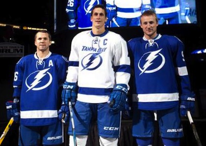
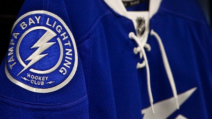
St. Louis, Lecavalier and Stamkos model the jerseys / TBL.comThe Tampa Bay Lightning officially unveiled their new logo and uniforms at a press conference today.

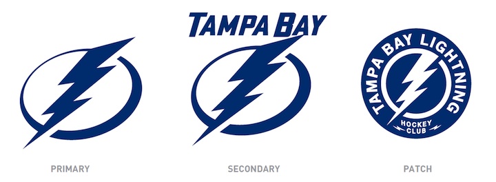
The new logo is one color... white on the blue home jerseys and blue on the white road jerseys, which includes the TAMPA BAY wordmark.

While it's a not a huge departure from the basic idea — a lightning bolt in a circle — it has been stripped down to its simplest elements.

We have a clean, iconic symbol here which is exactly what the new management was going for.

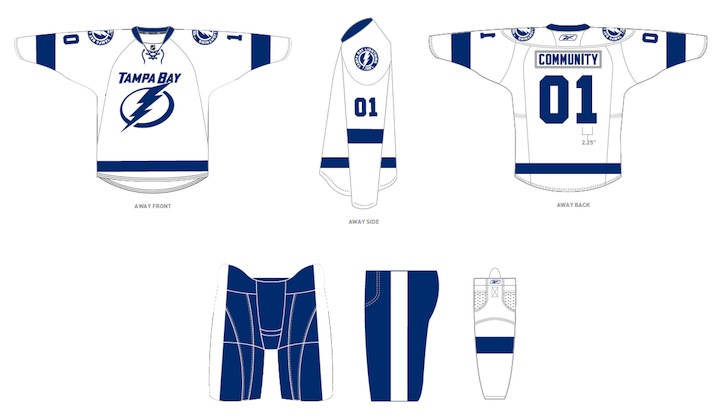
The uniforms are blue and white, and I hate to say it, but the striping is awfully derivative of the Detroit Red Wings'. It's understandable as it's a classic look but it's the one spot where the new brand fails to meet its goal of individuality and being unique. Outside of that, it's a traditional look that stands apart.

And it looks nothing like the Toronto Maple Leafs, as some worried. Unless, of course, you don't have your glasses on and every shade of blue looks the same to you.

At the press conference, we heard from owner Jeff Vinik and CEO Tod Leiweke. Even core players Vinny Lecavalier, Marty St. Louis and Steven Stamkos were on hand to discuss it. And they loved the new look, which will take over starting in 2011-12 season.

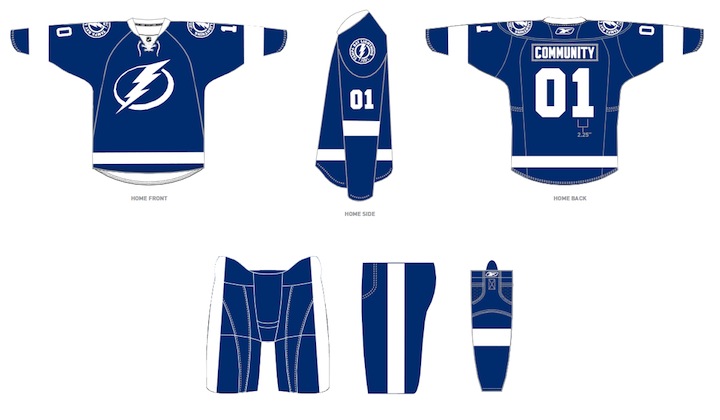
Here are the renderings of the new logos and uniforms as displayed on the Lightning's website:

As a Lightning fan, my first impression is very good. I love the simplicity of the logo. We always talk about how a good logo is one you'd find a kid doodling on his notebook. This one's easy to draw. I've thought for a long time the Lightning should have a blue home sweater — and just more blue in their uniforms in general. They certainly have that now.

But there are some things I don't like. The lightning bolts on the pants were always a unique element that's now disappeared. The "championship stripes" underneath the arms were used by no other teams and don't appear on these jerseys. Neither of these elements would've taken away from the simplicity of the design. Instead, the character they added is gone.

New logos, uniforms unveiled / Tampa Bay LightningThat said, I already know what the reaction is going to be from most readers: You don't like it. It's change and many of you are averse to that as a rule, no matter what the end result. You'll come around. And unlike the last few uniform designs, I can see this one being around for decades to come. Vinik, Leiweke and Yzerman have done a tremendous job rebranding this franchise.

The team said the jerseys will not go on sale "for a while" but that they wanted to be the ones to reveal them, rather than seeing it leaked before the summer. And I think that is awesome. Also noteworthy, only the home and road jerseys will change. The alternate BOLTS jersey will be retained next season, according to CEO Tod Leiweke — presumably with the black and gray elements.

Wednesday
Jan262011

Sunshine State Branding Updates

Both of Florida's professional hockey franchises are planning makeovers for 2011. And new information is trickling out bit by bit. Obviously, we have to start with my team.

The Tampa Bay Lightning initially planned to unveil new logos and uniforms for the 2011-12 season on Monday. They wisely put those plans on the back burner, however, when two local police officers were killed. Now they're gearing up to try again next week.

On Sunday, the St. Petersburg Times was the first to report on details of the coming changes. Specifically, the Bolts will drop black and silver as part of their color scheme, which has been unchanged since the club's inception in 1992.

Times writer Damian Cristodero explained that the new home sweaters would be blue with nothing but a big white bolt of lightning on the front. In a blog update posted Tuesday, he clarified, saying the logo will still have a circular background. The road jersey will incorporate a TAMPA BAY wordmark.

Now the Tampa Tribune is getting in on the action. Tony Fabrizio reports that there will be a "series of announcements next week" in which the new branding efforts will be revealed as well as plans for improvements to the St. Pete Times Forum.

Fabrizio says the Lightning will unveil a revised logo, going on to write:

Based on what employees have been told, here's at least part of what the Lightning have planned:

New blue and white uniforms with blue rather than black home jerseys (similar to the current blue alternate jerseys). There's an updated lightning bolt, and the name Tampa Bay will only appear on the white road jerseys. The jerseys will have ties at the front of the collars.

I'm jealous of Lightning employees right now. For so many reasons, really, but this is just the latest.

They just updated the logo and uniforms in 2007, which wasn't a huge deviation from what they've worn since 1992. I'm not sure how much you can change the logo so it sounds like the color scheme will be the biggest shock to the system. That might take some time to get used to.

"The Panther" / NHL.comAs for the Florida Panthers,  I'm irked to say that the useless NHL Guardian Project may be newsworthy today.

Don't worry, it's still entirely useless, but it does indicate to us that the Cats are probably counting on keeping out the red moving forward.

As you can see, "The Panther" is all about the blue and gold and he's wearing Florida's third jersey crest rather than the leaping cat primary mark — which is clearly not long for this earth. It's being replaced all over.

I want to thank Carlos for pointing this out to me — as I'm trying desperately to ignore the "guardians" at all costs. Also a tip of the hat to Joseph for always being the first to email in anything Lightning-related.

I should express a concern regarding the color changes that appear to be taking place in Tampa and Sunrise. It sounds as if the originality these clubs have had from the beginning is about to go by the wayside.

Yes, the NHL already has a blue/white team in the Maple Leafs. And they have two blue/gold teams in the Sabres and Blues. Before the Florida teams arrived, nobody was black-blue-silver or red-blue-gold (since the '70s, anyway — and the Blues don't count).

Anyway, that's just the tip of the iceberg on the blue and gold. We've been hearing unsettling things about the Predators' changes for 2011-12. But I'll save that for later.

In the meantime, enjoy the All-Star events this weekend and brace yourself for what's to come next week.

Monday
Jan242011

Lightning Postpone Unveiling

Before I even had a chance to mention that the Tampa Bay Lightning scheduled a press conference for this afternoon to unveil new uniforms, some pathetic excuse for a human forced the team to postpone it.

Just yesterday, the St. Pete Times reported that the Bolts had submitted paperwork with the league to change their uniforms. Then last night, the team had already called a press conference regarding a "major announcement concerning the organization's complete brand and business transformation."

I was really looking forward to that.

Unfortunately, a weasel hiding in his attic shot and killed two police officers this morning in St. Petersburg. By the way, if that's not enough to convince us that guns really aren't cool, just yesterday two officers were shot by a lunatic outside Seattle. And four in Detroit.

But that's a discussion for a different kind of blog. Here's what the Lightning said on their website:

The Tampa Bay Lightning’s press conference scheduled for this afternoon at the St. Pete Times Forum has been postponed indefinitely. Out of respect for those involved in an ongoing emergency situation in St. Petersburg today, the Lightning has elected not to move forward as previously scheduled.

More information will be available later today. Thank you for your consideration.

Good for them. We can wait. This isn't news today.

I'll keep on eye on future updates regarding the rescheduling of the press conference, which will probably be sooner than later. Despite no longer living in Tampa, I'm very excited to see what my team is up to.

By the way, when the Times mentioned the postponement on its website, the headline specifically said that new uniforms would be unveiled as this news conference. The team has not officially confirmed this yet.

Sunday
Jan232011

Classic Look on Tap for Lightning

We recently learned from Reebok that the Tampa Bay Lightning will be one of a number of teams getting new uniforms in 2011. But according to a St. Petersburg Times article, maybe we should be expecting a complete rebrand!

In this morning's paper, Bolts beat writer Damian Cristodero confirmed that the team has submitted paperwork to start the ball rolling on uniform changes for the 2011-12 season.

Also today, in his Lightning Strikes blog, Cristodero revealed new details and speculation about the upcoming changes, including dropping black from the color scheme and the possibility of a new logo. But rather then paraphrasing, I'll let him tell you:

Here is what you might expect when the uniforms are unveiled, perhaps as soon as this week:

The primary colors apparently will be blue (close to what is used now with the third jersey) and white. Sounds as if the color black, which has been the team's prominent color, and the silver trim will be gone. The logo on the home jerseys is expected to be just a prominent lightning bolt without the words Tampa Bay that are used now.

The road jerseys are expected to have the lightning bolt and the words Tampa Bay, though no immediate word on how the design will look. It is believed there also will be the classic strings at the front of the collar.

It also is unclear whether the third jersey will be retained as its color is believed to be so close to that of the home, dark jersey. Anyway, sounds as if GM Steve Yzerman had a lot of input into the details or at least into the idea of trying to create a classic look that will endure for a long time.

I completely agree with that assessment. It indeed sounds as if Yzerman is trying to make the Lightning look like the Red Wings — only blue instead of red. Not that I have a problem with that. One thing the team has never had is a look that will "endure for a long time."

As a Lightning fan, I'm skeptical about the idea of dropping the black and silver. I know the Wings have gotten away with nothing more than red and white for decades, but I'm not sure a monochrome look is the best thing for the Bolts. But I trust in Stevie Y.

I know it's all conjecture, but I'm a fan of almost everything Cristodero has written. The simple design, the lace-up collar, and the idea of dumping the "BOLTS" third jersey. I'm also eager to see a crest that doesn't have any text on it for the first time in 19 years — though I'm happy for the road jersey to still say Tampa Bay (as long as we steer clear of the Stars' look).

However, what shocked me about this article is where Cristodero says that the new uniforms could be unveiled as early as this week! As we know, teams usually wait until the summer to launch new sweaters, if for no other reason than to keep selling current inventory.

And this is also worth pointing out:

Neither the NHL nor the Lightning, which last changed its logo before the 2007-08 season and added a third jersey for 2008-09, would confirm changes are coming. But it makes sense a new ownership group, with principal Jeff Vinik and minority owner and CEO Tod Leiweke, would want to rebrand the franchise.

Announcements from the team are expected soon, perhaps as early as this week, concerning business and fan initiatives and what is believed a renovation of the St. Pete Times Forum.

Sounds like things are getting exciting in Tampa! Obviously, I'll be keeping a close eye on all this. But I think I may have picked the wrong year to leave Florida.