


Lightning Unveil New Logo, Uniforms!
 226 Comments
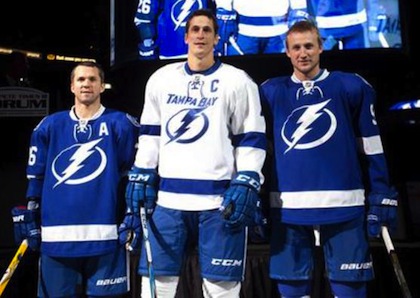 St. Louis, Lecavalier and Stamkos model the jerseys / TBL.comThe Tampa Bay Lightning officially unveiled their new logo and uniforms at a press conference today.
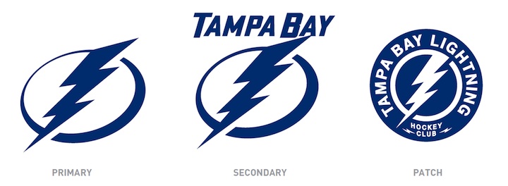
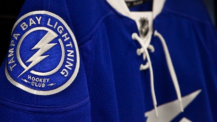
The new logo is one color... white on the blue home jerseys and blue on the white road jerseys, which includes the TAMPA BAY wordmark.
While it's a not a huge departure from the basic idea — a lightning bolt in a circle — it has been stripped down to its simplest elements.
We have a clean, iconic symbol here which is exactly what the new management was going for.
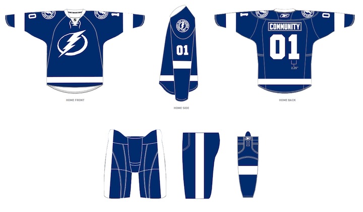
The uniforms are blue and white, and I hate to say it, but the striping is awfully derivative of the Detroit Red Wings'. It's understandable as it's a classic look but it's the one spot where the new brand fails to meet its goal of individuality and being unique. Outside of that, it's a traditional look that stands apart.
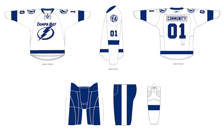
And it looks nothing like the Toronto Maple Leafs, as some worried. Unless, of course, you don't have your glasses on and every shade of blue looks the same to you.
At the press conference, we heard from owner Jeff Vinik and CEO Tod Leiweke. Even core players Vinny Lecavalier, Marty St. Louis and Steven Stamkos were on hand to discuss it. And they loved the new look, which will take over starting in 2011-12 season.
Here are the renderings of the new logos and uniforms as displayed on the Lightning's website:
As a Lightning fan, my first impression is very good. I love the simplicity of the logo. We always talk about how a good logo is one you'd find a kid doodling on his notebook. This one's easy to draw. I've thought for a long time the Lightning should have a blue home sweater — and just more blue in their uniforms in general. They certainly have that now.
But there are some things I don't like. The lightning bolts on the pants were always a unique element that's now disappeared. The "championship stripes" underneath the arms were used by no other teams and don't appear on these jerseys. Neither of these elements would've taken away from the simplicity of the design. Instead, the character they added is gone.
 New logos, uniforms unveiled / Tampa Bay LightningThat said, I already know what the reaction is going to be from most readers: You don't like it. It's change and many of you are averse to that as a rule, no matter what the end result. You'll come around. And unlike the last few uniform designs, I can see this one being around for decades to come. Vinik, Leiweke and Yzerman have done a tremendous job rebranding this franchise.
The team said the jerseys will not go on sale "for a while" but that they wanted to be the ones to reveal them, rather than seeing it leaked before the summer. And I think that is awesome. Also noteworthy, only the home and road jerseys will change. The alternate BOLTS jersey will be retained next season, according to CEO Tod Leiweke — presumably with the black and gray elements.

Reader Comments (226)
Hmmm...from just looking at that logo...I like it too.
Personally I think they're ugly. I thought the current jerseys were pretty slick. These jerseys look like they're trying to imitate "retro" but failed.
These look like they were made in NHL 11.
I'm really disappointed in the logo.
It's simple, yes, but incredibly boring and cartoonish to me.
The Tampa Bay Maple Leafs?
SHAZAM!!!!
Hmm... my first impression was that it's a bit like clip art - like someone's idea to make a non-trademark-infringing knockoff of the Flash's chest emblem... but it's starting to grow on me. The "Tampa Bay" does look tacked on, though.
To simple should have kept a little black or silver or both. The third jerseys now need to be black, thats a no brainer.
All this for clip art??
These look absolutely awful in my opinion.
No creativity whatsoever.
The only interesting thing is the STH promotion where their jerseys will have a chip in them to receive discounts.
The logo and jerseys look like something that would be worn in a men's league. Extremely forgettable. We'll see new Lighting uniforms within 5 years.
I like the jerseys, I think they look quite sharp, but they're just too similar to the Leafs. I would have liked to see another colour (silver?) to just distinguish them a little from the Leafs. Nothing over the top, but if the striping pattern was silver-white-silver on the home jerseys, I think that would look pretty cool.
On the bright side, if you're a huge fan on the Leafs and The Flash, you'll love these.
Overall, I give them an 8, then subtract 1 for un-originality.
It looks like they have gone too simple. I always liked the lighting bolt on the pants too and that's gone.
I hope the blue turns out to be a little brighter like the blue they use now.
Don't know for the others, but for me, I find it too simplistic. There's a lack of details in the logo on the jersey. Love the color, but once again, blue is SO overused in the NHL. In overall, I do not like it, personally.
So Boring.
This is by far, the worst thing I've ever seen. To complete ruin our traditions, and our identity by creating this farce is simply embarrassing. Stevie Y has failed miserably here, and I for one refuse to shell out a single penny for this crap.
FLASH!!! Aaahh aaaaahh...
While an improvement over their current jerseys, and since I will get one, I would still like to know if I can take option c)
None of the above.
Man, they're awful.
While this doesn't look terrible by any means, it looks like the Lightning did everything they could to blend in with this one. Nothing defining, nothing that pops. It's just there, which is disappointing considering how iconic you can make a lightning bolt.
These are the Blue Wings...same stripes as Detroit. I agree with some of the comments that a silver accent color would really set them off.
They look like a super hero costume. I personally like what they have now over these.
How much did Gatorade pay for the product placement?
I can't wait to get a Little Stevie Wonder jersey-tshirt with the new logo. Gotta love Hockey Town South. Go Bolts! Go Wings!
Doesnt seem to me that they listened to anyone. Only thing i like is the shoulder patch. Retro is cool but so is originality.
Needs a little black, to add a little detail. Not much but a little as they are too simple now. They look like the jerseys we had when I first started playing hockey at 4 years old (and that was a loooong time ago.) We had those jerseys because it was the cheapest thing they could find. Look as all the supplier catalogues and their basic jerseys look like that.
A simple thin black outline of the crest and numbers and adding a thin black stripe (Reebok love piping) at the top of the hem and arm stripes would keep it simple and add a lot of visual contrast with this lighter shade of blue. Of course, the victory armpits and bolts on the pants should have been retained as well.
Disappointed personally. I loved the black jersey's with the lightning bolt on the pant.
Haha! Really guys? The Flash, Gatorade? The logo is and always has been a lightning bolt. Nothing's changed in that regard. Why the sudden silly comparisons?
Now that we have more, I've got more...
The overall design, with the single stripes, reminds me of the pre-1956 Detroit Red Wings, before they adopted the red sleeves on the white jersey. And considering the GM, I suppose it should be no surprise that the design would come off as much Red Wings as it does Maple Leafs. In fact, the blue, the shoulder patches, and the laces are about the only Leafish elements. (I say the laces because the Red Wings avoided using them in their history until their 2009 Winter Classic jersey.)
I do like the incorporation of what appears to be the original 1992-style bolt into the shoulder emblem, but the font for the text is about as bland as can be.
And yes, Tampa Bay players should have a lightning bolt running down their pants. But who knows? Maybe that'll get fixed between now and late September... if we're lucky.
To answer Chris's question (maybe he can merge this into my most recent post as it's pending as I type this) - the original and Edge logos always had the Tampa Bay element integral to it - creating a standalone version makes it a little more susceptible to the comparisons. And like I said earlier, I'm warming up to the new logo.
After seeing the jersey's now...I'm a big fan. I love the colors, the general simplicity of the uniform, and I'm a huge sucker for that patch. I don't think they had to dump the black or the silver entirely, but I like what they got instead.
"And it looks nothing like the Toronto Maple Leafs, as some worried."
I'm sorry...I think it looks EXACTLY like the Leafs jerseys. Right down to the shade of blue.
Sadly, I find the primary crest to be a bit boring, and it somehow manages to top the Anaheim Ducks wordmark as the most boring primary logo in the NHL. Also reminds me of Intel.
Throw some silver in there, change the thirds to black then i can live with it.
They certainly aren't the worst things I have seen, but I don't think the franchise is old enough to chase an iconic simple look. It needs just a little more 'busy', maybe a dark grey outline, a sublte third color in the mix and I agree the lighting integrated in the pants will be missed.
Another important question...with the lack of word mark on the Blues, does this mean the NHL is going to keep the dark set as the home sweater for the forseeable future??
It's kind of close, but luckily they avoid being called the Tampa Bay Maple Bolts.
I like the colors and look, but i feel like the shoulder patch and the main "Logo" should be switched. The Shoulder patch looks much more like a finished logo, and would look a lot better as the main logo. Overall its an improvement but i also feel like it was a missed opportunity.
Hate it... REALLY disappointed that they really took out silver and black, also, no Lightning on the pants ?!? ...Come on now the new look is beer league quality at best !
I'm not a lightning fan, but I think the new design is fantastic.
Not the least bit fond of them. Go with blue full time, awesome, I'm sick of black jerseys. But I agree with the earlier comments, it's like they took some clip art, threw it in MS Paint and used a fill tool. There's nothing to be excited about here, and to be honest I'm really dissapointed by the sheer blandness of the logo.
@ Chris,
Really? You don't get the 'sudden silly comparisons'?
I wonder if it has something to do with it being your team. With every other jersey that's come out, your articles tear them apart because of any minor detail. Suddenly its your team, and despite some fairly obvious shortcomings in the design, you are confident that everyone will love them.
A shoudler yoke, maybe a second stripe, anything to add some contrast would be fantastic. But I'll say the same about this as I did about Canada's red Olympic jersey, too much of one colour, and you get a jersey that just looks washed out.
Sorry Tampa, go back to the drawing board, this is a major mistake.
An absolute joke. The lightning used on the shoulder patches is better than the distorted one one the chest, but both together have no consistency whatsoever. I understand they were trying to go for a timeless look, which in my opinion is a hard thing to achieve with a lightning bold for a logo, but they completely missed the mark.
The logo is absolutely horrendous, bland and poorly designed (why make it wider than it is long???). The shoulder patches are just okay, but while the team was aiming for "timeless", they just so happen to use the logo-in-a-circle formula that's been over used the past few years.
As for the colours, or colour, I get that they wanted to go with a simplified, monochromatic look, à la Red Wings or Maple Leafs, but what they failed to realize is that those uniforms are iconic because they have been used for may, many years, have aged well and are a part of a rich history. These (the TB uniforms) are the equivalent of a fake vintage t-shirt from Old Navy.
There is absolutely nothing enchanting or appealing about those uniforms in my opinion, and shame on SME branding for releasing such an uninspired product. Their job is to listen to the clients needs and interpret them in a creative and aesthetically pleasing result. They have failed to do so on so many levels.
Sorry for saying this Chris, just my critic as a designer. I love all the change and excitement coming out of Tampa this year, and things are looking way up, but it stops at the new uniforms.
disappointed... though I like the blue jersey, I agree that the logo is WAY too simplistic. I do, however, like the patch on the shoulders. It's different and looks GREAT in it's physical execution. I am hoping they will change up the third to a black jersey as well... having your primary and third jersey be basically the same color is WAY too much blue.
I'm pretty sure a toddler drew the primary crest.
I'm gonna chime back in and say that I do like it. Thank goodness the shoulder patch wasn't used as the primary mark. Too many teams are going for that type of look as their primary crest.
Aside from the pants missing the bolt, and some subtle black, grey trim, This indeed is a uniform that will grow on me.
I want it to be known that these jerseys are amazing. It's bright colours, which we don't see too often in this league these days. Yes, they could've kept the lightning bolts on the pants, as well as the "victory stripes" at the armpits (the two things that always separated them from the other 29 teams), but this is good. They wanted to step away from their black jerseys, and have done so quite well.
In terms of the jersey's striping looking like Detroit's.....did everyone forget who the Bolts' GM is? Stevie Y has done a fantastic job with this. This jersey is up near the top of my favourites list, and is going on the wishlist as well.
Need i say .... Bud Light? , Why would they do this?
I get it its simple but come on they had a decent look what was SO bad about Blue silver white black? they didn't need to take black and silver out they just needed to use a different primary color.
I like the simplicity, but agree with most that an accent color like the black or silver on the trim would've gone a long way. And yes, losing the bolts on the pants is definitely a shame.
It's the Flash, halloween dressed like a Smurf, but it's an excellent design. Missing the stripes under the arms and the lightning bolt on the pants tough.
Ian, yeah they're my team so I'm naturally inclined to like whatever they do. But I pointed out the shortcomings. I think the logo and colors are great. And honestly, how many times do I "tear apart" new uniforms? I did it to the Whale, yes. But more often than not I'm complimentary.
And seriously, who can't tell the difference between Lightning blue and Maple Leaf blue? That's a case of seeing what you want to see there. Finally, the Lightning are wearing bright colors after years in black! It's a refreshing thing to see.
As I said, I understand you guys are mostly averse to change. And the majority of people who comment on blogs do so to disagree with the writer. It's understandable. Give it time to sink in. It's really a great look.
They should've made the patch the logo. Then I'd like them more. I like plain, but the main logo is TOO plain.
The old Bolts logo had dimensions to the lightning bolt and wording and as soon as I saw it, I didn't think it was The Flash's logo. It wasn't just a lightning bolt in a circle, which is exactly what The Flash's logo is, a lightning bolt in a circle. I don't think it's a terrible logo at all, I just wonder if they received clearance from DC Comics or if there's going to be a lawsuit filed sooner or later.
I really like them! Anything to get away from the overly-busy current jerseys of the NHL. People might be "bored" by them now but I would argue that some of the other great jerseys from the league are boring as well (DET, TOR, even CLS and PHO). I do think that the management team has accomplished their goal of creating a uniform set that will stand the test of time. It might not be the coolest or trendiest but it has much more staying power than a lot of other current NHL jerseys, IMO.
It's not a question of being averse to change though. WHY was this even necessary? Black is not just a tradition, its an identity. Its who we are! Can you imagine the ire that would be drawn if the Red Wings switched from Red to... green? Do you really think Toronto or the Rangers would even consider making a change like this? No. Its an identity, that not only represents the team, but the city and its residents.
I wouldn't be averse to change, if it was change that MADE sense, or at least had a sliver of creativity. This deletes all the little nuances that made our uniform unique (champions stripes under the arms, bolts on the pants, etc), and in return looks to Detroit and simply copies the design, hires a toddler to draw a goofy logo, and then stands back and says "TAH DAH!"
Will I get over this? Of course. I love my Bolts too much not to. Will I waste my hard earned dollars on this piece of toilet paper? Hell no.
Chris, I don't think we're averse to change, lots of changes have been welcomed and embraced, think Calgary's vintage 3rds, Minnesotta's etc., but this is just, for most it seems, an uninspired effort.
I understand your point about people not making the difference between Leafs and Bolts and I'm with you on that, as some jerseys are bound to have some ressemblance to something that's been done before, I just think Ian was pointing out the fact that, for example, you weren't exactly stoked about Columbus' recycled logo in a circle formula as it had been done, the same way Tampa's new uniforms borrow from Toronto and Detroit.
Again, I think some uniforms are bound to look similar, but there's nothing wrong with pointing it out.
Cheers!