


Quebec Armada Identity Tweaked
 12 Comments
I'm really bummed to have to write another one of these posts, but it must be done. Last week, the Mariners logos had to be changed when it was revealed the trident was identical to the one found on the national flag of Barbados.
Shortly after that, it was brought to my attention we have a similar issue with the identity of the Quebec Armada. As you can see in the graphic below, the fleur-de-lis featured in the secondary marks was pulled directly from a clipart design.

Unlike the Mariners situation, the "borrowed" artwork is not the basis for the Armada's primary logo, nor either of the secondary logos. So the overall identity of the team will not be changed. However, any use of this fleur-de-lis in team branding must be removed. Therefore we'll abandon the logo marked "left shoulder" above and keep the "right shoulder" mark without the violating symbol.
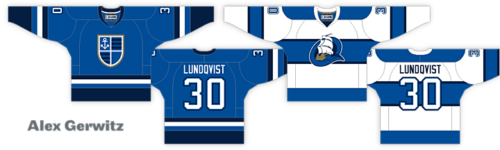 Updated jersey designs for Armada; original design by Alex Gerwitz
The fleur-de-lis also appeared on the jersey in a fashion not dissimilar from how it was used on the old Quebec Nordiques jersey. For that reason alone, I'm more than happy to have it removed from the jerseys. What you see above is the official, updated look of the Quebec Armada uniforms.
I've been unable to contact the designer of the Armada's logos, Craig Wheeler, for a few years now, so I've had to make these changes without consulting him in any way.
On a personal note, I'm glad to see this symbol removed. While I don't deny the significance of the fleur-de-lis to Quebec (it's all over the provincial flag for one thing), it always felt to me like a furtive effort to tie the Armada's identity to that of the Nordiques. And as I've said repeatedly, I really do not want any connections between the IceHL and NHL. That would sort of defeat the purpose.
Finally, there's the question of the next RinkGear jersey. With the Mariners possibly out due to the forced rebrand, we were looking to the runner-up, the Armada. I'm calling it the Second Jersey Curse. The universe is conspiring to keep a second IceHL/RinkGear jersey from happening.
Moving forward, I'll be in touch with RinkGear to see how they'd like to proceed. We may pick one of these two. We may hold another series of polls. Or RinkGear may just want to pick another IceHL jersey design all on their own. I wouldn't be opposed to that.
I'll keep you all posted on what's decided. But for now, of course, that second jersey is in limbo.

Reader Comments (12)
I'm perfectly fine with removing the fleur-de-lis, but I think you have to put something into the bottom right corner of the logo.
I agree with Jon W. The jersey looks fine without the fleur-de-lis, but the logo seems a bit too lopsided now with the piece missing. Something should be placed there, or just use the primary logo for both and eliminate the secondary mark all together
I would have to agree that the updated secondary mark does look a bit lopsided, but just simply adding a different size anchor to the bottom right corner wouldn't really fix that problem, either. I do like NRB's idea of making the primary logo the crest for both, but I wouldn't do away with the secondary completely.
As for the next jersey to be produced, maybe just a re-do of the final 4 votes now that the top 2 have changed?
After these two incidents, I will finally chime in. First, I commend Eric on handling the decision on the Mariners very will. Second, I commend Chris because rules are certainly rules, and a rule was broken and the correct decisions were made.
With that being said, I will express my opinion that I'm sure most will disagree with. I can't fully come to find these moves totally justified. The Quebec issue I get because the fleur-de-lis a direct copy. With that issue being brought up, I can help but think the fleur-de-lis in the St. Louis secondary logo was taken from somewhere too. There are so many designs out there, I can't imagine it isn't simply a "change" from an existing one, which is exactly what made us change the Mariners identity all together.
I guess I just feel that changing things like this can open a whole can of worms. First the Mariners logo because it is an altered version of part of a national flag. Then the Quebec logo (which needs to be "completed" with another piece in that lower corner by the way) because it is from a clip art package (which I understand more because it was not altered besides color). I suggest searching for one like the fleur-de-lis that is in the St. Louis secondary logo. The Houston Hellcats logo is almost surely inspired by the Houston Aeros. The "Portland Pioneers" are a team in Franchise Mode of NHL Hitz Pro.
I guess I am just a tad confused as to where exactly the line is being drawn between "altering" and "inspired by" and other things. Not a cut at anyone involved here at all and no disrespect meant because I love how this has gone and how it is done. It is purely brilliant Chris.
Ouch, and I was hoping that would put the Armada in for Rinkgear, oh well.
I'm OK with keeping the quadrant on the shield empty, but make the shield the shoulder patch on both jerseys. As the focus point on the blue jersey, the Q mark would look just as good.
Regardless, the other teams out there make small changes to outfits all the time, having small changes to some of the clubs not up for rebranding/locating, helps increase the realism of this league. I feel crappy that you have to make these changes but who's to say that nothing good can come from it, and tweak a couple other teams each year to not only keep things fresh but to give the yearbooks something extra for those paying attention to details like this.
Danny: I appreciate your input. The line is actually pretty clear as far as I'm concerned. If you can place the designs in question on top of each other and they line up perfectly, the logo is clearly taken from somewhere else. This was clearly the case with the Mariners and Armada logos.
Regarding the teams you questioned, the Archers logos were designed by a guy named Slavomir Kiss whose work I know well and who is extremely talented. I have no trouble whatsoever believing he designed that fleur-de-lis himself. And on the Pioneers, I don't know what "Franchise Mode in NHL Hitz Pro" is. I'm guessing a video game of some kind? Regardless, I doubt voters intended to mimic it when the name was chosen back in 2008. I don't even recall it being brought up at the time. (And for what it's worth, if true, it still wouldn't be against the rules of the project.)
On the Hellcats, it's possible the designer was "inspired" by the Aeros, I can't say, but show me any line that the two logos share. They share colors (sort of) and a concept in that both feature war planes but the two designs are completely different. Completely. Color me surprised it's even been brought up.
I'm always happy to answer any questions anyone has regarding the IceHL. So if there's anything else you guys are curious about, please ask.
As I went to type a response, I found myself rambling and getting deeper into things than I wish to do because I don't want to sound disrespectful at all because I certainly have a ton of respect for everyone hear. Chris, perhaps if you'd like to hear more about what I have to say (and a few things I did not mention), feel free to contact me and I will gladly better explain what it is I have on my mind, as I think maybe I did not word things the best way to the point where I may have been misunderstood. Thanks for taking the time to address what I have said though. Glad to know you take the time to read and respond to your followers!
All these changes alter what people voted for. Some sort of do-over on the second jersey should be done. Final Four? Sounds good enough.
I hope you can fill in that "empty" field, replacing the fleur-de-lis with an anchor. Other than that, sad you had to change it, but I'm glad you're letting it be known that the rules apply in all cases.
why actually not ask some of the designers to come up with a new fleur-de-lis to replace the old one on the jersey and the logo?
I'm glad the fleur de lis issue didn't affect the Armada's primary logo. That's the best logo in the IceHL imo.
IMO I personally would prefer the primary logo replace the secondary logo as the crest on the dark Armada jersey.