


Winning Jersey Designs Unveiled!
 34 Comments
These last 13 weeks have been quite a ride for the IceHL Project. Eleven teams got rebranded and today I'm announcing the winners of the jersey design contest, the final phase of 13 Weeks of R&R.
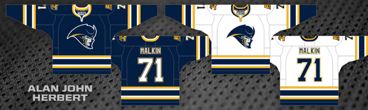
With 39% of the three-way vote, Alan John Herbert had the winning design for the Boston Colonials. He's a regular concept contributor but this is his first IceHL jersey win.
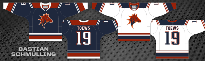
As previously reported, Bastian Schmülling's design will continue to represent the Calgary club, now known as the Calgary Stallions. A second-round vote was unnecessary as Bastian's design was the only one to receive a net positive rating during the first round.
In the end, this team's name was changed but the logos and jerseys remained the same as before. The one thing that will change, of course, is the wordmark. You can get a peek at it on the Stallions' Twitter page. It will be officially unveiled in the yearbook this fall.
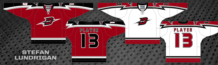
Stefan Lundrigan added another winning IceHL jersey to his portfolio as his Detroit Chargers entry garnered 65% of the two-way vote. Stefan created the winning looks for the Kodiaks and Gators last year.
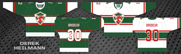
Derek Heilmann became a first time contest winner. His Halifax Dragons jersey picked up 58% of a three-way vote. The Dragons now join the Hitmen, Lagers, Narwhals, Armada and Aviators with Canadiens-style chest striping. As commissioner, I don't mind saying I'm somewhat disappointed.
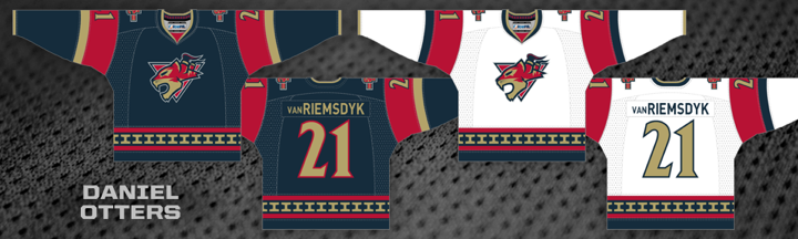
The winning Hamilton Steelcats jersey design is from newcomer Daniel Otters. It grabbed 38% in the three-way vote. In his submission, Daniel explain a key element of his striping design. He said the unique design is meant to be the "front view of a steel girder," also known as an I-beam. It also appears in the collar, emulating Reebok's "hanger effect." Daniel points out that if you rotate the I-beam it can be seen as an "H" for Hamiton. Very clever design.
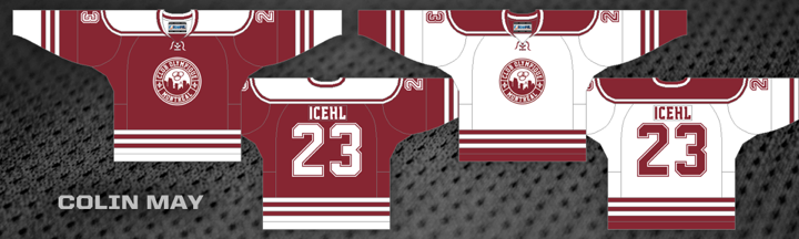
Colin May has entered a lot of designs in the IceHL's jersey contests, but this year he finally enters the winners' circle with his Montreal Olympiques efforts. He won with 36% of a four-way vote.
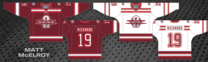
With 40% of a three-way vote of Philadelphia Aces jerseys, Matt McElroy became the first designer to create the winning uniform of a team for which he designed the winning logos. Matt made his foray into the IceHL Project last year, creating the winning jersey for the Narwhals.
Now if you look at those last two jerseys, you realize we may need to do some tweaking to the final designs for Montreal and Philadelphia. Because of their color schemes, they're awfully similar. More to come on that.
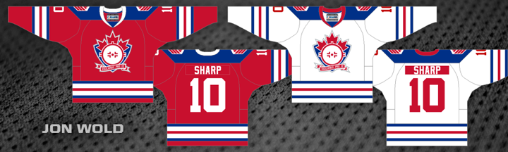
Jon Wold may have been unseated as the designer of the Olympiques' jerseys, but he's back on top with the Saskatchewan Snipers. His work garnered 37% of the three-way vote.
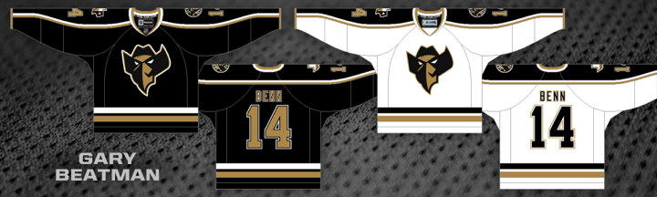
Also unseated from the team he originally designed for was Gary Beatman. His Renegades jerseys were replaced when the team relocated but he's back with the winning design for the Texas Outlaws — and interestingly, another black jersey. He got the edge with 53% of the two-way vote.
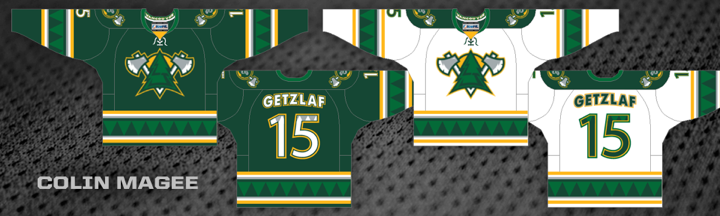
Another newcomer joins the fray as Coin Magee had the winning design for the Vancouver Lumberjacks. His submission earned 45% of the three-way vote.
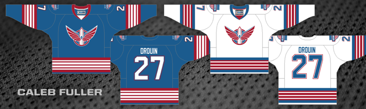
And finally, Caleb Fuller took a slim 35% margin in a three-way vote to be declared the top jersey designer for the Washington Sentinels. He's also a first time winner.
That gives us six first time winners out of a possible 11 jersey designs this year. Herbert, Heilmann, Otters, May, Magee and Fuller are now part of the IceHL's brotherhood of designers. Congrats to them!
Unfortunately, these guys managed to remove a handful of artists from that group. Kevin Dallatore designed the original Colonials jerseys. Mike Szalay did the original Outlaws. And Ryan Hawkes created last year's Steelcats jerseys.
Justin Nahhas, the previous leader in winning jersey designs with four, dropped to three when he lost the Lumberjacks. He's now tied with Stefan Lundrigan and Brendan Nashman, all with three apiece. But the designer who'll be taking the rebrands the hardest is Ricky Hajduk. He had two winning designs last year for the Motorheads and Arsenal. Both of those teams got rebranded this year.
13 Third Jerseys project on hold
All right, I've been saving the bad news for the end. After seeing how the jersey voting went for these rebranded teams, I'm not eager to start on a third jersey project using the same format. I think middle-of-the-road designs aren't bad for primary uniforms, but they don't work as alternates. And I'm afraid that's what we'll get by using this format again.
I'm currently working up new ideas for this project. I'm also considering whether to scrap it altogether. Before you panic, let me explain.
First, a new format could save this project. I'm open to new ideas. The original format had three of the teams being assigned an artist rather than using an open competition format. This would allow one person to really get behind their vision. Would we want to do something like that with all 13 teams?
Others have suggested a voting committee. I could perhaps gather 100 IceHL diehards and designers to put together a handful of designs then choose the best amongst themselves. But that breaks away from the original goal of the IceHL Project — a crowd-sourced league where the decisions are made by the community.
However, if these community votes aren't yielding the best winning designs, maybe that premise needs some rethinking. I don't know. Like I said, I'm open to new ideas. Feel free to share yours.
The other option would be to cancel the third jersey project altogether and replace it with something else. A while back someone suggested the idea of teams having a primary jersey and a contrasting, or "clash," jersey not unlike what you see in the world of soccer.
That idea has really stuck with me. And my thinking is that maybe we drop the third jersey idea in favor of changing the entire format of IceHL uniforms next spring. It would be another big project involving all 32 teams. We could start by selecting a primary jersey from the existing designs. Dark or light, doesn't matter. Then we'd do a competition to create clashing designs. Of course we'd still have to revisit the voting format, but later on down the road.
So let me know what you guys are thinking. I'm eager to figure out what's next for the IceHL, as I'm sure you are as well.

Reader Comments (34)
First off: Thanks to Chris for all his work on these projects. If he feels we need a break (or he does), I'm all for it.
Clash jerseys. A great scenario is Toronto vs Tampa Bay. White with blue vs blue with white. The clash would be for the visiting team to wear...red and white? green and yellow? Orange and grey? I'm tempted to do some NHL concepts of these right now.
As for "creativity" and "originality" with jersey designs, I don't really see it in the NHL - meaning you could take any current jersey, change the colors and throw on another team's crest and it would be acceptable (Carolina using Vancouver's striping). There are not a lot of NHL jersey designs that are team-specific.
Some that were: Canucks' Flying V jersey, Avalanche mountain trim, Buffalo's black and white jerseys with the swords coming from the waist up onto the sleeves.
You did see it in the early FOX-era third jerseys: Dallas with the large star, Tampa Bay with the bolts on the sleeve/storm pattern on the jersey, Penguins with the chest stripe coming from the logo.
That is what the third jersey contest should be: a unique team-specific design that could not be used by another club. Hamilton's I-beam trim, Vancouver's trees and Detroit's Bolt-sleeves - more of those.
Congrats to all winning designers, I think you're getting a bad rap here to an extent. You clearly understand what this audience wants in a jersey and tailored your designs accordingly. I think the perceived lack of creativity is a reflection of current style tastes of society as a whole. Peoples' tastes in fashion are trending toward more safe and traditional looks, much like hockey fans prefer a classic look in a hockey sweater right now. Give it about three years and everything will change and you might get drastically different results in polls like this. At any rate, all the designs were more creative than anything I could cough up, so well done folks.
I'd like to congratulate all of the winning artists for a job well done - I could easily imagine all of these jerseys on the ice and would even like to possibly own one or two of them.With that said, I was sad to see that some of the more unique designs didn't quite make it into the finalists.
I will second Ben M's suggestion to go to a two tiered system of voting: first tier chosen by Chris or committee (either the "100 fans/etc" or whatnot) second tier being a vote of the top 3. OR have the committee chose the top 2 or 3, have the rest up to vote from the community at large and have and have a vote between the committee choice and the winning choice from the rest - this would ensure variety but still allow for a largely crowd-sourced choice.
As far as clash kits - it doesn't bother me either way, I have always thought that having two colored jerseys would make more sense for some NHL teams, so why not put it up to a crowd-sourced vote?
And Thirds, I'd put it on hold until you figure out the clash kits - who needs a 3rd when you have two that are unique to begin with?
Why not follow the EPL model of uniform design? Teams have a standard primary jersey that follows a traditional pattern year over year, but has slight tweaks. Then have a change uniform that consists of colors that do not match the main colors of the home uniform and changes year over year. This way you have your standard jersey designs that look traditional, and have the ability to have crazy away uniforms. Take a look at Liverpool's home/away/third set up this year (http://www.historicalkits.co.uk/English_Football_League/season/2013-2014/Premier-League.html). Thus you would have a chance to have a lot of crazy uniforms and also have the traditional's as well. I'm sure it's been suggested before, but I'm adding it here for those like me who may be new to this project and haven't considered it before.
Thus uniform rules would look like this:
Home uniforms can be anything you like. No restriction as to white/dark etc.
Second uniforms must be a contrasting color (ie, you can't have a red home and a maroon second) but again, is not tied to white/dark etc and is only worn when needed.
Third uniform is only needed if your home and second match another teams home/second combo and thus would only be used when necessary.
It's radical from a hockey perspective, but allows for lots of different designs to be used. It also allows for tradition on the primary uniform while allowing for crazy change on the away. Limit the design contest to the home uniform and then allow the winning designer to design a radical second uniform.
Congrats to the winners! I wasn't to pleased with the way this contest turned out either, my submissions included. At the end of the day it seems like we've been unable to give each team a unique identity (through the sweaters), but rather try and grasp tradition.
So I'm with you on this one Chris, scrap the third-jersey idea for the time being. Hopefully we can find a better way to vote, and I personally like the idea of a committee. That way we can control any discrepancy and we can actually discuss the jerseys further as a team.
Looking at past and current third jerseys in the NHL, I found some interesting things.
38% of teams used a new never before scene logo
38% of teams used their current logo
14% of teams used a wordmark
10% of teams used a current alternative logo
With this third jersey competition, it would probably be best to not use new logos, which is 62% of the third jerseys so not bad.
67% of teams used an alternative color in their color palette
12% of teams used a different shade
11% of teams used the same color of an existing jersey
Again, probably avoiding using a different shade or even the same color would be preferred.
46% of the third jerseys would fall under the conditions above.
These should be simple enough of rules to start.
When looking at the creativity of the jerseys, which seemed to be an issue from these past few weeks,
52% of teams had traditional style striping or the same jersey just with a swap of primary colors
48% of teams went out on a limb and created something new
When taking the new logo jerseys out of the picture, traditional styles jump up to 63%
Not that the NHL has a problem with non creative jerseys, but it seems to be a trend when it comes to third jerseys.
I like the initial idea of having a few teams "buy" one single designer to come up with the idea. There are a lot of established designers from this site it should go over well (and if their third design stinks, drop it like the NHL does).
For the rest of the teams, I think a committee would be the best approach to sort threw the jerseys first. I like the idea of team owners having input and then also you Chris to have a final vote of which jerseys to allow for public voting (It worked with the steelcats)
Anyway, I hope this helps out in deciding whether to have a competition or not.
My $0.02 on voting and 3rd Jerseys:
1. Chris, you can choose (depending on the number of designers needed) a designer, that has been very useful to this project and that you have been a big of. So if 15 teams need 3rd jerseys, pick 15 designers.
2. Then, either A) assign them yourself to a team OR B) do a draft, like the ones on Skype, quick and simple to see who picks and gets which team.
3. After that, get the designer to make 6 concepts. This will enable designers to make 3 "traditional" concepts and 3 "original" designs.
For first round of voting, get the IceHL fan base to vote between the "TRADITIONAL" group of 3 concepts and the "ORIGINAL" group of 3 concepts. If we end up with 15 "TRADITIONAL" winning groups of 3, then the IceHL culture is non-original and that's nothing that you can change and that's nothing designers can change, unless you pick your favourite design and there isn't any voting (something you're completely against, I know). Once we have either "TRADITIONAL" or "ORIGINAL" chosen, we can then vote individually on the 3 first round winning designs. This idea wont completely get rid of traditional uniforms, heck 15 "TRADITIONAL" first round voting groups may win, but at least it forces designers to go non-traditional.
Some random thoughts from a designer who tossed in some logos early on.
Colonials - It's not bad. Kind of surprised none of the concepts with stars made it up to vote, and would have enjoyed seeing a bit of debate between a concept like that and a more traditional one.
Stallions - Good jersey, not the strongest field to pick from. Colin May had a daring concept, but this is a good mix of solid and creative.
Chargers - I like what's going on here design-wise, but it bothers me to no end that it doesn't seem to fit on the stitching pattern of the actual jersey. I kind of wish I could enjoy it more.
Dragons - A casualty of the up-down voting process. As much as Chris doesn't like having another Montreal sash, out of the 3 that made it, this was the only one that COULD win. The shield logo NEEDS a sash of some kind, and the safest type of sash went through to final voting. Christian Ryder had the best one, but any rugby/soccer inspired version would have been fine. The other jerseys up for vote would have been flat out wrong.
Steelcats - This is great.
Olympiques - This cried out for a simple design, and it got one. Wouldn't have been my first choice, but I approve.
Aces - The collar stripes frame the design really well.
Snipers - Probably the best way to go on this one.
Outlaws - For whatever reason, this whole design just doesn't pique anything in me. It's good...but...
Lumberjacks - A+. There was also a really cool away jersey by Colin May (again with the Montreal sash, whatever), but the darks in the set went ALL plaid and looked like something from the ECHL. It didn't come up for vote. The right one won.
Sentinels - It's ok. Derek Heilman had a simpler AND more creative look that didn't come up for voting.
"The Dragons now join the Hitmen, Lagers, Narwhals, Armada and Aviators with Canadiens-style chest striping. As commissioner, I don't mind saying I'm somewhat disappointed."
But, the Olympiques lost their chest stripes. So it's the same number of teams.
Also, the Aviatars and Armada only use the stripe on one of their jerseys.
And, the Narwhals do have a chest stripe, but I certainly wouldn't call it Canadiens-style.
It's a solid look, that's underused at the NHL level. For the IceHL, I don't think it's THAT big of a problem. It's 10 jerseys out of 64.
I have to say I'm quite confused about the way the final jerseys put up for vote were decided. Where on Earth was Matt McElroy's Dragons jersey? It had one of the highest positive ratings, higher than Bastian's (which was included in the final three) and was incredibly unique, yet it was omitted from the final vote.
Also, even thought the Steelcats jersey I liked most won, why was Stefan Lundrigan's not included when it had a much higher positive vote percentage in the initial voting than even the winning design? You said that designs were picked based on the percentage of positive ratings, but the numbers show otherwise in some cases...
IMHO I thought the idea of the third jerseys was awesome and was really looking forward to seeing what people came up with for them. I think one way as a community we can make these jerseys more original is to put some guidelines. I think some form of committee for each team would be great for this. Chris, as well as the GM and a select few designers and regular contributors can select guidelines in for each team, since no team just says make me a jersey, they have certain aspects they are looking for. But I think limiting the designing to a select few designers will do more harm then good. If you limit the number of designers making jerseys, like multiple people have suggested, then you'll end up with a league composed by a select few and lose out on creative new minds and the community based aspect of this whole project. I think by having a committee for each team draw out some guidelines than you wont end up with 10 habs or Blackhawk style jerseys and more unique designs like dare I say it, the Ducks Wildwing jersey. I think that doing clash jerseys we'll just end up with two dark colored jerseys for each team, and by all means that could end up just as traditional as anything else. Staying true to hockey history and doing a designated home and away and then adding in a third is where I would personally love to see the IceHL continue on. I believe the IceHL needs to continue being a community project, but set more guidelines for designers to follow and then let their creative juices flow from there. But that is just my opinion and anyone is welcome to disagree.
Lots of great feedback from everybody. I'm still weighing options. Be aware that no decision will be made until early August. I'll be away for the last week of July so there's no point in trying to start right away since I won't be around the site. But keep the comments coming. It's helpful to see where everyone stands.
@Mikey H: You are mistaken. All of the top rated designs were included in the voting along with some extras of my choosing. It wasn't based simply on which designs had the most positive votes. It based on the ratio of positive to negative. In other words, you can have more positive votes than the other guy, but if the other guy has fewer negative votes, he could still beat you.
All that said, I selected the finalists based on what the ratings were at that time, July 6. I can't close ratings, so people have been able to keep voting even though it doesn't matter anymore. In other words, the ratings you see now may not match what they were back then.
I think one of the issues with too many "traditional" jerseys is that too many of the teams have "traditional" names the evoke that type of imagery when you try to come up with a jersey.
Colonials - Literally a team name inspired from the 1700's. I agree that a design with stars on it would have been a way to add creativity, but you were going to get a classic looking jersey.
Stallions - This is one that might be traditional for traditional's sake.
Chargers - That's a pretty non-traditional design if I ever saw one.
Dragons - Like the Colonials, especially considering the logo that one, you were going to get something old-school. Dragons are fantasy, archaic, etc.
Steelcats - Between the Golden-Seal-esque shoulders and the girder hem stripe, pretty non-traditional.
Olympiques - A team called the Montreal Olympiques that only has one color (crimson) is going to have a traditional jersey, there is no way around that.
Aces - Again, a team named with what is arguably an old-timey WWI/WWII term, so it's going to have to look "classic."
Snipers - Between the logo and the fact that the team is from the most Canadian-sounding city there is, there was not going to be anything non-traditional on this uniform.
Texas Outlaws - relatively non-traditional, evokes images of the Dallas Stars jerseys. Suffers from the same "we want to be edgy because we're a non-traditional market, but want to fit in with the traditional markets."
Lumberjacks - A great jersey that is traditional but incorporates non-traditional elements. When you have a contest where you never have to worry about what the jerseys will look like in RL (they'll only ever be seen in vector graphics) you hope for more like these.
Sentinels - Colors are red-white-and-blue, city is a nation's capital, name is old as time. Traditional is as traditional gets.
So as you can see, I don't think it's the fault of the jersey designers or the voters that these jerseys were chosen. Even looking at the NHL it took names like "Golden Seals," "Mighty Ducks," "Avalanche," "Wild," "Predators," to get crazy logos and jersey designs, or being based in placed like Atlanta, Anaheim, or Miami to get crazy colors put in.
If you were to do this again, you may have to go Gary Bettman on us and force teams into non-traditional markets and give them non-traditional names if you want to see non-traditional jerseys.
I hope the 3rd jersey/ Throw back doesn't go by the wayside I've already done over a dozen of the 3rd jerseys for the teams