


Winning Jersey Designs Unveiled!
 34 Comments
These last 13 weeks have been quite a ride for the IceHL Project. Eleven teams got rebranded and today I'm announcing the winners of the jersey design contest, the final phase of 13 Weeks of R&R.
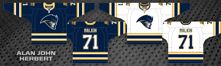
With 39% of the three-way vote, Alan John Herbert had the winning design for the Boston Colonials. He's a regular concept contributor but this is his first IceHL jersey win.
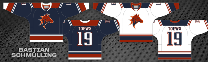
As previously reported, Bastian Schmülling's design will continue to represent the Calgary club, now known as the Calgary Stallions. A second-round vote was unnecessary as Bastian's design was the only one to receive a net positive rating during the first round.
In the end, this team's name was changed but the logos and jerseys remained the same as before. The one thing that will change, of course, is the wordmark. You can get a peek at it on the Stallions' Twitter page. It will be officially unveiled in the yearbook this fall.
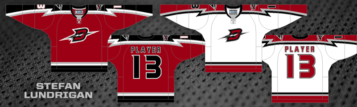
Stefan Lundrigan added another winning IceHL jersey to his portfolio as his Detroit Chargers entry garnered 65% of the two-way vote. Stefan created the winning looks for the Kodiaks and Gators last year.
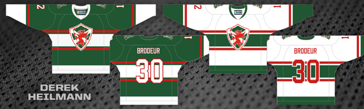
Derek Heilmann became a first time contest winner. His Halifax Dragons jersey picked up 58% of a three-way vote. The Dragons now join the Hitmen, Lagers, Narwhals, Armada and Aviators with Canadiens-style chest striping. As commissioner, I don't mind saying I'm somewhat disappointed.
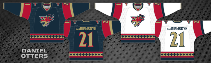
The winning Hamilton Steelcats jersey design is from newcomer Daniel Otters. It grabbed 38% in the three-way vote. In his submission, Daniel explain a key element of his striping design. He said the unique design is meant to be the "front view of a steel girder," also known as an I-beam. It also appears in the collar, emulating Reebok's "hanger effect." Daniel points out that if you rotate the I-beam it can be seen as an "H" for Hamiton. Very clever design.
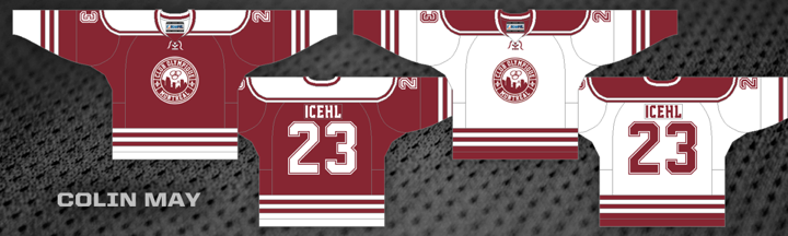
Colin May has entered a lot of designs in the IceHL's jersey contests, but this year he finally enters the winners' circle with his Montreal Olympiques efforts. He won with 36% of a four-way vote.
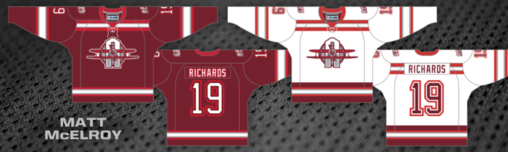
With 40% of a three-way vote of Philadelphia Aces jerseys, Matt McElroy became the first designer to create the winning uniform of a team for which he designed the winning logos. Matt made his foray into the IceHL Project last year, creating the winning jersey for the Narwhals.
Now if you look at those last two jerseys, you realize we may need to do some tweaking to the final designs for Montreal and Philadelphia. Because of their color schemes, they're awfully similar. More to come on that.
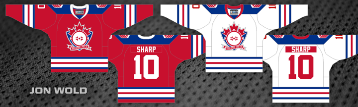
Jon Wold may have been unseated as the designer of the Olympiques' jerseys, but he's back on top with the Saskatchewan Snipers. His work garnered 37% of the three-way vote.
Also unseated from the team he originally designed for was Gary Beatman. His Renegades jerseys were replaced when the team relocated but he's back with the winning design for the Texas Outlaws — and interestingly, another black jersey. He got the edge with 53% of the two-way vote.
Another newcomer joins the fray as Coin Magee had the winning design for the Vancouver Lumberjacks. His submission earned 45% of the three-way vote.
And finally, Caleb Fuller took a slim 35% margin in a three-way vote to be declared the top jersey designer for the Washington Sentinels. He's also a first time winner.
That gives us six first time winners out of a possible 11 jersey designs this year. Herbert, Heilmann, Otters, May, Magee and Fuller are now part of the IceHL's brotherhood of designers. Congrats to them!
Unfortunately, these guys managed to remove a handful of artists from that group. Kevin Dallatore designed the original Colonials jerseys. Mike Szalay did the original Outlaws. And Ryan Hawkes created last year's Steelcats jerseys.
Justin Nahhas, the previous leader in winning jersey designs with four, dropped to three when he lost the Lumberjacks. He's now tied with Stefan Lundrigan and Brendan Nashman, all with three apiece. But the designer who'll be taking the rebrands the hardest is Ricky Hajduk. He had two winning designs last year for the Motorheads and Arsenal. Both of those teams got rebranded this year.
13 Third Jerseys project on hold
All right, I've been saving the bad news for the end. After seeing how the jersey voting went for these rebranded teams, I'm not eager to start on a third jersey project using the same format. I think middle-of-the-road designs aren't bad for primary uniforms, but they don't work as alternates. And I'm afraid that's what we'll get by using this format again.
I'm currently working up new ideas for this project. I'm also considering whether to scrap it altogether. Before you panic, let me explain.
First, a new format could save this project. I'm open to new ideas. The original format had three of the teams being assigned an artist rather than using an open competition format. This would allow one person to really get behind their vision. Would we want to do something like that with all 13 teams?
Others have suggested a voting committee. I could perhaps gather 100 IceHL diehards and designers to put together a handful of designs then choose the best amongst themselves. But that breaks away from the original goal of the IceHL Project — a crowd-sourced league where the decisions are made by the community.
However, if these community votes aren't yielding the best winning designs, maybe that premise needs some rethinking. I don't know. Like I said, I'm open to new ideas. Feel free to share yours.
The other option would be to cancel the third jersey project altogether and replace it with something else. A while back someone suggested the idea of teams having a primary jersey and a contrasting, or "clash," jersey not unlike what you see in the world of soccer.
That idea has really stuck with me. And my thinking is that maybe we drop the third jersey idea in favor of changing the entire format of IceHL uniforms next spring. It would be another big project involving all 32 teams. We could start by selecting a primary jersey from the existing designs. Dark or light, doesn't matter. Then we'd do a competition to create clashing designs. Of course we'd still have to revisit the voting format, but later on down the road.
So let me know what you guys are thinking. I'm eager to figure out what's next for the IceHL, as I'm sure you are as well.

Reader Comments (34)
I personally am not a huge fan of the clash idea. I think that voters may be a little more open to some more out there ideas for third jerseys as opposed to primaries. I'd still really like to see the third jersey project go along as expected. Its kind of a hard position, but I wouldn't just give up on the viewers just yet. I'm sure the third jerseys would bring some extra creativity to the mix.
Great stuff would love to see them be made all of them awesome!!!
Third Jerseys seem to be out there for creativity by design, I would hope the submissions would reflect the same. I like the idea of a committee, maybe of ICEHL owners, past winners of logo and jersey designs to have the initial vote, basically to decide whether the concept is good to go or not, then have the community vote to decide the winner.
Creativity took a beating in the initial 2 days of voting and the ones that survived into the final voting did a lot better there once it was realized what had happened.
Also if there is going to be a third jersey competition, there should be specific rules, to lead the designers.
im pretty disappointed; these uniforms are largely interchangeable. The groups penchant hard-on for shoulder yokes and sleeve striping is pedantic and bland. The results have shown that the group should lose its voice as that voice is monotonous and hackneyed. Select a few die hards to make interesting and novel choices. This is why we shouldn't get to have nice things.
The winners on here tend to be traditional to the point of being boring... Maybe have a traditional and a creative category for each team? Might move some people out of the box a bit...
I wouldn't be opposed to introducing clash jerseys. But no matter what, I think there's going to need to be some executive level intervention during the design submission process, such as a committee that screens the initial submissions to select finalists (just note that everyone's submissions should get a chance to get displayed on the site). Otherwise, we might end up with 32 sweaters with Hab-stripes.
Alternatively, restrictions or requirements could be imposed on design submissions to include or ban certain elements, i.e. banning Hab-stripes.
@alex hackert
also they seems to have two types of third jerseys out there - Throwbacks and new designs - no throwbacks should also be a rule
In fairness, aren't 95% of the designs submitted either basic elbow-and-waist stripes, the same with a shoulder yoke, Hab-stripe or top-of-the-sleeve stripes in one form or another? There's the occasional sash or full-on horizontally or vertically striped design, with nary a V to be seen (a basic rugby/Australian rules design element), and even the best and most consistent designers usually seem to try admittedly clever or striking variants on the same four basic templates. Why not keep giving the people what they apparently like?
Also, as a one-time winning designer who only occasionally dabbles in this sort of thing, I'd find it tremendously off-putting to find you, Chris, were disappointed my design got up, especially when it garnered a clear majority of the vote. Is pure design more important than a community that appreciates design at all?
(At the same time, you do a terrific job with this comp and the site - keep up the hard work.)
First off, congrats to all the designers who participated in this. There were some really awesome designs across the board, and I am honoured and ecstatic to have a design selected (FINALLY!) from such a formidable field of entries, from some fine designers.
Secondly I'm going to add my piece to this discussion.
As it stands there is clearly problem with how this group votes (I feel a bit strange saying this as a winning designer), only 2 or 3 of the winning designs (NOT including mine) this time around were truly creative, original, unique, or stood out (objectives set by Chris at the beginning of this design process). My submission for the olympiques is a good design, but it is more of a classic, tried and true, SAFE design, rather than a pushing the creative enveloppe design. I have submitted pushing the enveloppe designs before (including for other teams during this round of rebranding), but the reality is that these designs are risky, and often not liked by the general public (see my Lumberjacks design this time around... my favourite design I have submitted, clearly not the favourite of many others).
As a designer trying to WIN a competition, I always do my best and try to be creative, but there is also the temptation to play it safe for the middle of the road voters. I don't want to accuse anyone of doing this, because I know first hand how difficult it is to make a good design, and that some logos and colour schemes (eg. the olympiques 2 tone scheme, and simple logos) lend themselves more to a classic look, BUT if the competitive element were removed (eg. in the proposed 3rd jersey design with teams selecting designers) it would allow the creativity to flow a bit more.
Obviously removing the competitive aspect entirely is not the way any of us want to go, so instead a new way of evaluating needs to be considered. I think the main problem with the process we used this time is that the question with which we approached the preliminary round of jersey voting was likely something like "do I like this jersey?" , "Is this good design?" , or "could I see that on the ice?". Those are important questions to ask, but maybe not the right question to START the evaluation process with.
Instead of jumping directly into a thumbs up/thumbs down subjective vote, how about start with an empirical evaluation of the design. Perhaps asking these questions "Is this unique in the IceHL?", "is this an original hockey sweater?", or "is there any reason why this shouldn't be an IceHL sweater?". In this first round allow the general public to essentially disqualify a design which they see as not original enough, and provide a write in reason why they think it isn't original enough. For instance if I were to do this evaluation with my winning Olympiques entry, I might tick the "not creative enough box" and give my reason as "reminds me too much of the Oiler's sweaters", or "these jerseys are a bit to similar to the Salt Lake City Scorpions current sweaters". If a trend is with a particular sweater then it should be removed from the voting. Adding this first step would get rid of generic looking sweaters, and voting could continue from there with unique, creative designs, which would then be evaluated on how good they are, or how much we like them.
I realize that this process would take longer, and would be more work, but it would also provide us with a more creative final product.
Sorry for being long-winded, thanks for voting for me :)
@CLIB542
What can the IceHL throw back too? I think Vintage designs can be creative, and unique both in the IceHL, and the real world if done right.
I have an idea taken right from the original inspiration for the IceHL: the IHA. For those who don't remember the IHA basically it was another logo design competition for a fantasy league like this one except that out of all the submissions for each team, Chris would choose three finalist logo sets, while the rest were put into a pool of "non-finalists".
If we were to try this for IceHL jerseys, a small commitee could choose the three finalists, while the rest of the submissions could be displayed seperately. There would be a voting option for the top three while the non-finalists would require a comment vote. I believe this would draw special attention to the best and most creative designs, while still including everybody in the process. Also if people felt strongly enough about a non-finalist to make the effort to comment, it would still have a chance.
Just an idea.
Personally I used the how would it look on the ice/ would I wear it template when voting. Maybe this was the wrong way to think about the new jerseys. I am kind of a traditionalist when it comes to primary sets. There may be more people out there who think this way than you thought.
I think a third jersey is were you can let the creativity flow. They are meant to be different and creative. I think if you opened up the voting to everyone for a third jersey concept the results could surprise you.
Congratulations to all the winners. I'm not a designer and really appreciate all the thought and hard work they put in. Thanks guys.
As for 3rd jerseys or clash kits, simple. Put it to a vote.
Maybe you should only accept submissions that meet a set definition of "creative".
You can't leave the voting in our hands if you want a different result
Other than being disappointed that none of my designs won, I'm mostly satisfied with the winning jersey designs. Though I completely agree with Chris that the Canadiens-style chest striping is way over used in concepts in this day and age, and it's a fad that I've long gotten tired of.
Also would like to congratulate Stefan Lundrigan for beating my Detroit Chargers design in the final vote. His design is top notch.
@Peregrine: I'm sorry if it's off-putting but I'm being honest when I say I'm not necessarily a fan of a lot of the winning IceHL jersey designs. It's great that you and other have had designs that are popular with the community at large, but it doesn't necessarily mean everyone will like them. Anyway, you guys aren't designing for me, you're designing for a larger audience.
And to your point, I'm not sure the community at large appreciates good design. Or at the very least, there's a hidden desire for every team to look the same. That's the tricky part of all this. Yes, I want to voice of the voters to make these decisions, but I think the problem we find is with so many voices, it turns into noise.
But let me be clear, since I haven't been. I don't think any of the winning designs above are bad. They're not. They just lack the creativity I hoped for when the contest began. And because I didn't feel right leaving anybody out, I had to allow in all the designs that followed the rules. So there were a lot to choose from.
And for what it's worth, I'm a big fan of your Aviators jerseys. What you did is the definition of creative.
First, I'll say that Colin Magee's Lumberjacks jersey was my favorite for that team from the start and I would definitely buy a stitched up version of that sweater. The Lumberjacks rebranding came pretty far from where it started so that is reassuring to see something original voted in ultimately, but then on a team like the Dragons we end up with a Habs jersey clone so go figure. There certainly wasn't a lack of creative submissions for Halifax.
The voting community seems to be caught up in a broader "chicken or the egg" dilemma that has been plaguing hockey in recent years. Are organizations like Tampa, Carolina, Dallas, etc. choosing "new" rehashed jersey designs because thats what fans have been voting for with their wallets OR are we just accepting of and expecting these blander, unimaginative jerseys because thats what we've been seeing for years now from many of our favorite NHL clubs?? I don't know if an answer to that would resolve anything for our purposes, but the ideas like those of Ben M, Colin May, and others sound like they could really benefit the creative project that is the IceHL.
Thank you to every person that submitted something to the design rounds. It was a heck of a lot of fun to have so many creations to look over, vote on, and discuss.
I'm a big fan of the clash concept, which would allow things like the mtl/phi issue to stand. For what it's worth, I think doing all 32 teams in clash, and have a committee select the "best" and then putting it to a vote may cover all the boxes. Just my opinion of course. Overall, I'm very happy with the rebrand to Detroit, and would like to thank everyone for their contributions, from the designers to the voters, to Chris for spending the time and effort to put it all together. Looking forward to the start of the new season, and the future of the IceHL.
Was anything resolved with the jersey that is able to be bought? Mariners won, but then there was the whole controversy with them and the runner up's logos. Then it wasn't mentioned much afterwards.
@March: Unfortunately, I still haven't heard back from RinkGear, believe it or not. And I've sent a lot of emails over the last several months. So the ball's in their court as far as that goes. That's why it hasn't been talked about. No news.