Monday
Aug032009

Uniform Design Process

The next step in the IceHL project is practically upon us. And I'll try to keep this as brief as possible.

Today, the official logo of the Boston Colonials was unveiled on their team page. (All team pages will be accessible from the sidebar.) Eric Poole's logo designs snuck by with 38% the vote and will now represent this team.

Now that the Colonials have a logo, the next thing will be creating uniforms for them. It's going to mean running two parts of this project at the same time — logo voting and uniform submissions. To ease things on my end while we're still getting the logo voting underway, I won't begin taking submissions just yet.

We need to decide a couple of things as a group first. I'm hoping for your feedback in the comments in order to get some kind of consensus. Take a look at these bullet points and then weigh in below.

  • Jersey Format: Do we use the new Reebok Edge uniforms or stick with the traditional sweaters of the past? I can't decide and I'm open to going either way.
  • Uniform Design: Obviously, NHL templates for teams in the same geographical region should be off limits. Outside of that, what other restrictions might we need to put in place?
  • Uniform Template: We will need a template on which to build these jersey designs so that everything can be voted on uniformly. Point us to some of the better templates out there. Or maybe you've you designed one of your own that you think we should use.

If there's anything else I haven't thought of here, don't hesitate to ask. I'll take suggestions/questions both by comment below and by email.

Monday
Aug032009

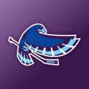
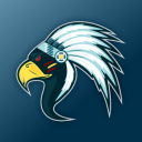
Poll: Winnipeg Winterhawks


Six Zero

Pho3nix & Roccot

Craig C. Wheeler

Click on a logo above to see the complete set to the right. Then vote for the best one below!

All sets include a primary, secondary and corporate mark. Some include an additional tertiary mark if provided by the designer. The identifier at the top of the image is the signature provided by the artist.

Sunday
Aug022009

Spotlight: Ogre39666

The IceHL Artist Spotlight series continues today, filling the gap when we don't have new polls. We're profiling the talented artists whose work is the subject of this project so you can get a better idea of who they are.

Selected at random, our second artist of the series is Steve Pace, working under the pseudonym Ogre39666. Steve submitted artwork for several IceHL teams and his persistence paid off when his Atlanta Arsenal logos, submitted on November 16, were deemed by readers to be among the Top 3 in a group of seven.

I asked Steve to tell us about how he came up with his finalist set. Here's what he told me.

I tried keeping things simple and a bit classic looking. For inspiration, I looked at the Georgia state flag, and decided that the colors and star motif could be nice elements to include in a logo.

Personally, when I hear the word "arsenal" I tend to think of cannon, which in profile, are simple, strong, and easily recognizable. So I decided to use it as the cross-member of the "A" and encircle it with stars Ñ simple-looking, but I think the simplicity gives it a classic feel.

For the secondary, I felt I had strong elements, so all that was needed was some re-arranging. Instead of using the cannon as the cross-member, this time I used a star with an inset cannon to reinforce it and since the points of the star and "A" matched up, it worked well.

For the wordmark, since Atlanta ends with "A" and Arsenal starts with "A", I decided to use just one between the words. This allowed me to use the "A" from the primary and bring some continuity to the set. The use of a single "A" also meant there would be six letters on each side so balance wouldn't be a problem.

If you have a question or comment for Steve, feel free to add it below. Approved comments will appear within 48 hours of submission.

You'll be able to vote on the final Atlanta Arsenal logo on August 28. Tomorrow, we kick off another week of polls with the Winnipeg Winterhawks. Next weekend, we'll look at two more artists in the Spotlight. 

Saturday
Aug012009

Spotlight: Nick Matarese

The IceHL took the day off yesterday but it's back this weekend to kick off the Artist Spotlight series. This series will fill the gap on days when we don't have new polls, profiling the talented artists whose work is the subject of this project. The order of this series has been chosen at random.

We begin with Nick Matarese, whose lone submission came to me on November 13 for the North Carolina Nighthawks of the Southeast Division. The following logos were rated by readers into the Top 3 of a class of 13 logos.

I asked Nick to talk about his artistic background and his inspiration for the Nighthawks logo. Here's what he had to say.

I am a graphic designer for Adidas. I graduated from the University of Delaware with a BFA in advertising/graphic design from the Visual Communications Department. While there I was also a four-year collegiate athlete with their ice hockey team (goalie) to which I am now an assistant coach.

I have designed other sports logos, including the Tatnall School's new hornet logo. I'm working on the Philadelphia Thunder (Junior A hockey team) and I redesigned the uniforms for the University of Delaware's ice hockey team — which the Long Island Gulls are also using as their third jersey this year.

Disappointingly, I got hooked onto Icethetics when the project was halfway over so I only had time to do logos for one team. When choosing the Nighthawks I wanted to design a logo in which the viewer was engulfed by the wings. I drew many designs and had research images of anything from birds to 3D models to X-Men characters to get the flow of the wings they way I wanted.

The tail and head were made as one with the body to give it an almost mythical feel, non-specific to any actual species (hence no feet). I liked having nothing but black and shades of grey to go with that dark mythical feel but it was missing something — that's where I added the lime green to make everything pop. For the secondary logo I wanted to make a profile of the beak and eye, yet still make an N.

mataresedesigns.com

If you have a question or comment for Nick, feel free to add it below. Approved comments will appear within 48 hours of submission.

The top three logos for the North Carolina Nighthawks go up for a vote this Tuesday. Tomorrow, the Spotlight will be on Ogre39666. New polls resume Monday with the Winnipeg Winterhawks.

Thursday
Jul302009

Poll: New York Guardians


tdog

Roccot

Craig C. Wheeler

Click on a logo above to see the complete set to the right. Then vote for the best one below!

All sets include a primary, secondary and corporate mark. Some include an additional tertiary mark if provided by the designer. The identifier at the top of the image is the signature provided by the artist.