Northwest Division Art
 Monday · Oct 15 · 2007 | 2:52 PM PDT
  3 Comments
 Wow. Keeping two blogs is a lot more work than I thought it would be. Hopefully I'll get in the rhythm of it soon so neither one has to suffer. I really apologize for the lack of posts lately. I'll get back in the groove soon enough. In the meantime, I have some concept art for you to gaze upon. And as the title of this posts suggest, these come from the Northwest Division.
I think we all recognize this as the Florida Panthers' uniform with some colors changed. Any takers? No? I can't imagine why.
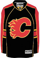
Seriously though, red is definitely the way to go for the Calgary Flames' home sweater. Black makes a nice third jersey, but I don't know, I'm a fan of the black flaming "C," for one thing.
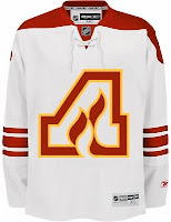
So here's something that hadn't really dawned on me before. When the Flames moved from Atlanta, they didn't really have to change their logo. They could've been named the Alberta Flames and kept the "A."
The two major problems with that would've obviously been that the team wouldn't have been able to create its own unique identity and the Oilers might've taken issue with the club claiming Alberta. Though, to be fair, the Panthers came in after the Lightning and claimed Florida. But I suppose that's different.
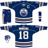
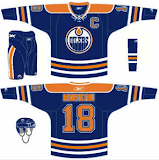
The irony is that today the Flames wear the Albertan flag on their shoulder and the Oilers — do not. Speaking of the Oilers, here are a couple of ideas of how the uniforms could be improved.
Wouldn't take much. Just a little will power. But what do I know, right?
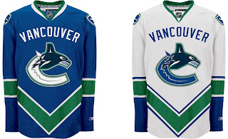
And finally, I just wanted to toss this one in.
Like that "V" across the bottom. That's craziness right there. But hey, there's nothing wrong with adding a little green to the orca, right?



Reader Comments (3)
Damn that Canucks jersey looks sweet!
Great job with the Oilers unis. Take off the armpit/back piping on the first one and it's perfect. The second one would make a great alternate, too. I like the mix of the modern blue with the vintage orange. Very nice! And very depressing to now go back to thinking of what we're currently stuck with.
i think u guys should send that oiler unis concept to the gm kevin lowe and say the current jerseys are hidiously boring with a goog logo and that thouse unis should be introduced for 2008-2009 season