Rbk EDGE Review: Penguins
 Wednesday · Oct 17 · 2007 | 4:10 PM PDT
  10 Comments
 Part 24 of 30. All 30 NHL clubs have unveiled new jerseys under the new Rbk EDGE Uniform System for the 2007-08 season. Here at the NHLToL, we're going to review every one of them. Read up and then rate the new sweaters. We'll do a full ranking after completing all of the reviews.


The Unveiling
Wednesday, September 5. The Penguins unveiled their jerseys to fans at the Galleria at Pittsbrugh Mills. Several players, including Maxime Talbot, were on hand to model the new uniforms.
Home vs. Road
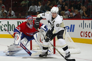
Home: Black. Road: White. The two sweaters are essentially mirror images of each other and both feature a specialty patch on the right shoulder.
The black home jerseys have a gold panel on the elbows. The underside of the sleeves are white extending the length. There is gold side paneling toward the back of the sweater. The collar is black and primary logo serves as the crest.
The white road jerseys have a gold panel on the elbows. The underside of the sleeves are black extending the length. There is gold side paneling toward the back of the sweater. The collar is black and primary logo serves as the crest.
In The Details
The patch on the right shoulder reads "Pittsburgh 250" in honor of the city's 250th anniversary. It will only be worn this season. The numbering and lettering style has been retained.
New & Old
The striping on the new jerseys has been altered significantly. The slanted stripes at the corners of the sweater are gone as well as the stripes on the sleeves. They've been replaced with unique sleeve paneling which meshes with fabric paneling of the sweater itself. Most notably, however, is the elimination of the secondary logo from the shoulders.
Standard FAQ
Numbers on the front? No.
Laces at the collar? No.
NHLToL Editorial by Chris
These are very plain jerseys. I think the Penguins had it right on the money before, but it would seem this is a case where Reebok missed the mark. I'm not saying there was a lot going on with the old jerseys but the design was very appropriate, especially to the logo. That's not really the case anymore. In fact, the striping pattern is almost identical to what the Senators are wearing (more on that later). That being said, it's still a very nice jersey. It doesn't knock my socks off, but it's a solid effort that shouldn't be tossed aside. 3/5


Reader Comments (10)
Not bad, but a big step back from last year's. Damn Reebok and their rigid templates!
best was the triangle penguin i loved that one probably one of my favorite logo in any sport this one sucks looks like a kids team logo and the colours suck
The RBK uniforms @#$%^& SUCK! Enough said! To sjsharks112, the current Pens logo(the skating Penguin) RULES. The Skating Penguin is on the 2 Stanley Cup Banners that hang from Mellon Arena rafters, that godawful PIGEON that they had in the mid/late 90's was not well received by the TRUE/DIEHARD Pens fans....including myself! Get a clue when it comes to the Pens logo!
I really hate that Vegas gold. It just seems to clash with white really bad. It just doesn't stand out as a highlight color when placed near anything white. It just blends right in. They should go back to a yellow/golden hue.
That old uniform was the best. It's not the same las vegas. It was better shiny and more yellow.
They're not bad, they're template-y, they're boring, they're not special. BUT, at least they aren't hideous. So while they look far too much like Ottawa and Tampa Bay (I'm interested to see how those three compare in their ratings), at least there isn't any of that damn piping going through the C and As or any of Reebok's other terrible ideas.
I don't mind the plain look...the whole uni looks good - These are not an over done eyesore like a handful of others - Solid jersey
I agree with you sjsharks112, I really loved the triangle logo. That jersey needed some work though.... too many patterns all over.
it looks like the comic from the offsides artwork (right side of page fashioned his crosby cartoon after the pics from this post, theyre almost identical
You would think that RBK would go the extra mile to outfit their golden boy in a better looking jersey. I guess not.