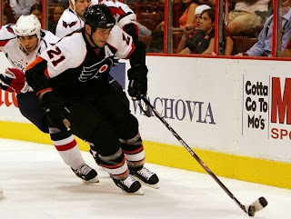
Rbk EDGE Review: Flyers
 Friday · Oct 19 · 2007 | 8:52 PM PDT
  9 Comments
 Part 26 of 30. All 30 NHL clubs have unveiled new jerseys under the new Rbk EDGE Uniform System for the 2007-08 season. Here at the NHLToL, we're going to review every one of them. Read up and then rate the new sweaters. We'll do a full ranking after completing all of the reviews.


The Unveiling
Friday, September 14. The Flyers unveiled their jerseys to fans at Virtua Health Flyers Skate Zone in Philadelphia in a joint event with the Philadelphia Phantoms of the AHL.
Home vs. Road
Home: Black. Road: White. The two sweaters are essentially mirror images of each other.
The black home jerseys feature white a white shoulder yoke with orange trim that extends almost to the elbow. The elbow is wrapped in a panel of orange which tapers to a point above the elbow. Orange piping wraps around the wrists. The collar is black and the primary logo serves as the crest.
The white road jerseys feature white an orange shoulder yoke with black trim that extends almost to the elbow. The elbow is wrapped in a panel of white which tapers to a point above the elbow. Below the elbow, the sleeve is black down to the wrists, which are wrapped in orange piping. The collar is black and the primary logo serves as the crest.
In The Details
The same numbering and lettering style has been retained.
New & Old
The sleeve pattern differs greatly on the new uniforms. The likelihood is that the cut of the Rbk EDGE sweaters isn't conducive to the style the Flyers have worn for 40 years.
Standard FAQ
Numbers on the front? No.
Laces at the collar? No.
NHLToL Editorial by Chris
The Flyers have always had a solid sweater. There really isn't much to complain about. It's one of those classics. Even though the old sleeve pattern didn't seem to work on the EDGE jerseys, I'm not bothered at all by the new style. I will say I like the old one better, but nothing is really taken away here. I'm not entirely sure what they were thinking when it comes to the elbow panel, however. That has me thrown a bit. One thing I have noticed with the lack of horizontal striping, especially on teams wearing black, the jersey and pants tend to run together. I don't know, I guess I'm just used to the contrast. I don't love it. I don't hate it. It just falls somewhere in the middle for me. 3/5


Reader Comments (9)
I certainly don't mind them, they're pretty good. I would like to have seen more orange on the home jersey, which I supposed was achieved in comparison to the old, but I was hoping for a lot more. Next year, I guess.
One moment you're saying a long-unchanged jersey is 'stale', the next you're saying it's 'classic'? Buh?
Not a bad upgrade from the old to new - Took the old style and updated to fit the RBK style and again not bad
i think the same as you, i think they are ok, dont hate them, but in dont love them.(p.s, are you gonna do the freak out? those are awesome lol)
First of all, good point matthew. Maybe I'm a jerk for pointing that out, but I think it had to be said.
Second, I thought the Flyers' biggest problem was not going back to orange, but I was wrong. I didn't like these at first, but after seeing them at the games and hanging on the rack in the fan store, they've grown on me.
With that said, the problem with these jerseys is that the Flyers abandoned the "wing" pattern they had on their sleeves for 40 years. My first thought was also that the old style wouldn't have worked on one of the new EDGE templates, but I think they could have gone with something like Columbus, Washington, or Colorado. Not exactly the same, obviously, but something that would achieve the effect of having the top side of the sleeve a different color than underneath.
I think the Panthers' style would work, with or without the half-stripes. Every time I see Panthers' highlights when they're on the road, at first glance, I think I'm looking at the Flyers until I realize who's playing (I know they use red, but it's a bright red and looks almost orange on my TV).
I'd personally like to see the Flyers make a change next year, though it won't happen, and that's okay, because they could do a lot worse than these. And if they keep playing the way they have been, I won't really care what they're wearing.
pssssh if you ask me they're a 5/5... so nice! love them! heck i bought one haha.
helluva lot better than vancouver...
Now that Ive reviewed what I thought were the 2 best jerseys in the NHL (T.B. & Van)now my reviews will be a string of what I would condsider mediocre jerseys at best starting with the Flyers. The road whites are ok but I cant stand the sleeves and how they end in black, it does not look good against the glove. I cant stand the home blacks, am I the only one who liked the all orange jerseys?? To me it looked a lot better. The black jerseys have too much white on them and I just dont like the combination of orange and black. 2 and half stars out of 5.
a little of topic but i saw a picture with Danny Briere wearing an easton helmet? Anything about that