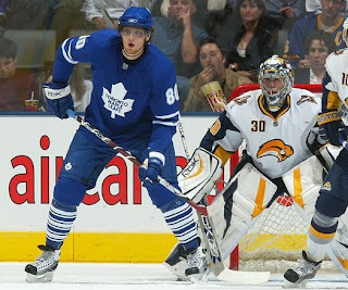
Rbk EDGE Review: Maple Leafs
 Sunday · Oct 21 · 2007 | 5:16 PM PDT
  12 Comments
 Part 28 of 30. All 30 NHL clubs have unveiled new jerseys under the new Rbk EDGE Uniform System for the 2007-08 season. Here at the NHLToL, we're going to review every one of them. Read up and then rate the new sweaters. We'll do a full ranking after completing all of the reviews.


The Unveiling
Wednesday, September 12. The Maple Leafs unveiled their jerseys at a fan event in Toronto. The event was also broadcast live on the web at Leafs TV.
Home vs. Road
Home: Blue. Road: White. The two sweaters are essentially mirror images of each other.
The blue home jerseys feature two white stripes around the elbows and white piping around the wrists. The white version of the primary logo serves as the crest.
The white road jerseys feature two blue stripes around the elbows and blue piping around the wrists. The collar is blue and the blue version of the primary logo serves as the crest.
In The Details
The same numbering and lettering style has been retained.
New & Old
The biggest differences between the new and old sweaters is the lack of horizontal striping across the bottom and the the secondary "TML" logo. Also, the silver in the old jersey is now gone as well. The piping at the wrists is also new.
Standard FAQ
Numbers on the front? No.
Laces at the collar? No.
NHLToL Editorial by Chris
Did somebody order a plain jersey? Oh, yes that would be the Maple Leafs. It's like going to McDonald's and ordering the hamburger without lettuce, cheese, onions, mustard or even ketchup. (Wait, that's what my brother gets.) Off subject. While not saying I dislike this uniform, I have to say it is very plain. What doesn't help is the nine stripes found on each sock, heavily weighing down the overall design of the uniform. Still, I've been trying to stick to jersey commentary here. Thing is, there really isn't anything to say about it. Except that some people call them pajamas. Not me. Can something be "very" average? Because I think this would be. At least before it had a little personality. 3/5


Reader Comments (12)
One word...BORING! OK...three words...CLASSIC LOGO!
VERY boring
To plain
Too boring, but at least they aren't actually bad. Good observation on the socks, it's like they just didn't bother ordering new socks and just used the ones from last year.
Dosen't quite go as far as the Oilers but they look like they're wearing practice jerseys. Even just retaining the shoulder patches or something would have helped it a lot.
I like them a lot. But thats because I am a fan of plain. I like really simple and basic jerseys. And no, I am not a Leafs fan. Quite the opposite actually. I really want to see them lose in the great looking jerseys.
...when I say CLASSIC LOGO...I meant should of used the CLASSIC LOGO instead of the boring one
This jersey is a PRIME example of how RBK probably was BEGGING the Maple Leafs to throw some piping on the jersey to busy it up a bit.
Plane Jane and all, I'm glad the Maple Leafs stuck to their guns and didn't screw up the uniform.
a shoulder patch and a small waist stripe would make me give this a 5 without them it still gets a 4 because although it doesn't have anything special its not screwed up like the flames and the canucks
The socks are the problem. They completely ruin the rest of the uniform.
I give the Leafs credit for telling Reebok what's what, but plain is an understatement here. A simple white hemline or stripe would help the home blues drastically. They look like blue jumpers as is.
The whites you don't notice, as the blue pants break up the solid color flow.
But even still, they're just too plain. 3/5
PLAIN,PLAIN,PLAIN!!!! no shoulder patches.no bottom stripes, no vintage logo,and the collar on the home jersey is blue when the whole damn jersey is blue.