Rbk EDGE Review: Blues
 Thursday · Oct 4 · 2007 | 2:16 PM PDT
  11 Comments
 Part 11 of 30. All 30 NHL clubs have unveiled new jerseys under the new Rbk EDGE Uniform System for the 2007-08 season. Here at the NHLToL, we're going to review every one of them. Read up and then rate the new sweaters. We'll do a full ranking after completing all of the reviews.


The Unveiling
Saturday, September 15. The Blues unveiled their new jerseys to fans at FANfest in St. Louis.
Home vs. Road
Home: Red. Road: White. The two sweaters are essentially mirror images of each other.
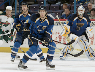
The blue home jerseys feature large dark blue shoulder yokes outlined in yellow piping that extends from the neck, down the front to the bottom of the sweater. Smaller white stripes extend under the piping from the neck to the shoulders. A curved white stripe wraps around the arm, beneath the elbow, bordered by a thinner yellow stripe. The cuff is dark blue from the yellow stripe down to the wrist. The collar is blue with yellow piping on the outside and the primary logo serves as the crest.
The white road jerseys feature large blue shoulder yokes outlined in yellow piping that extends from the neck, down the front to the bottom of the sweater. Smaller dark blue stripes extend under the piping from the neck to the shoulders. A curved blue stripe wraps around the arm, beneath the elbow, bordered by a thinner yellow stripe. The cuff is dark blue from the yellow stripe down to the wrist. The collar is blue with yellow piping on the outside and the primary logo serves as the crest.
In The Details
The same numbering and lettering style has been retained.
New & Old
The biggest difference between the new uniform and the old is that all of the straight and horizontal stripes are gone in favor of stripes and paneling with more curved lines. The yellow piping down the front and back of the sweater is also new. The shoulder yokes are very different between the two uniforms.
Standard FAQ
Numbers on the front? No.
Laces at the collar? No.
NHLToL Editorial by Chris
When I first saw photos of the Blues' new sweaters, my jaw hit the floor. I was almost immediately calling it the best new uniform this season. But if they aren't the best, they certainly are among the best. The striping works beautifully on this jersey and I'd even pose that the new ones are better than the old ones, as crazy as that might sound. With the days of the red trim behind them, the Blues have consistently been one of the best-looking teams in the league, if you ask me. They don't falter here. The shoulder paneling is my favorite part. Definitely a would-buy if I didn't feel it sacrilege to do so. 5/5


Reader Comments (11)
These are the best jerseys in the league IMO, other than the Isles, of course.
Why does everyone love these jerseys so much? They're hardly the worst out there, but stupid Bettman stripes are still stupid Bettman stripes any way you look/rearrange them. There's nothing in them that says anything but 'average' to me.
Well, I think we can go ahead and dismiss the previous comment because anyone ignorant enough to use the term "stupid Bettman stripes" doesn't have any idea what he's talking about.
Yeah Jeff, "piping" sounds so much better than Bettman stripes.
NHL Jeff was paid by RBK to say that, pay no heed to his easily-swayed mind.
I'm not saying I like the new jerseys or the piping, I don't, but Gary Bettman didn't design the jerseys, whether he made the deal with Reebok or not.
one of the best jerseys in the leauge.
Gary Bettman will inevitably take the fall for all things wrong in the NHL. He's the man at the top after all.
So since he's given Reebok carte blanche to slaughter the aesthetics of the NHL, I think the least we as fans can do is name the "piping" after him.
I also don't get why people like these jerseys so much. In fact, out of all the ones voted on so far, these are my least favorite (well maybe tied with Florida).
Oddly, these are the only new jerseys I have seen so far which actually appear to look worse on the ice. Not that I have looked at pics of them all on the ice yet.
Piping takes this down a notch for me but if that was gone this could be one of the nicer new looks of the RBK edge jerseys
The term "Bettman stripes" was used before and though it sounds stupid calling someone ignorant for using what has been said by others is truly ignorant