Center Ice Tournament?
 Sunday · Oct 7 · 2007 | 12:16 PM PDT
  26 Comments
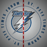
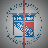
 One of the ideas I mentioned in the Pipeline is a logo tournament dealing in how center ice is painted in each arena. I think that would be a really cool one, but building graphics will require a lot of research and all the help I can get.
What I'd like is some help finding photos of center ice in every NHL rink. If any of you guys would be willing to help me find pictures, I'd be more than grateful and I'd find some way of making sure you get the credit you deserve.
Yesterday, I put together four graphics based on photos I found. See what you guys think and if it's a competition you'd be interested in, let me know.
The above images show what the ice looks like from directly above. But we could also use graphics that show what the ice looks like from the seats. Just an idea.
If you like this idea and want to help find photos, just keep in mind that the bigger and more detailed they are, the better. That detail will come in handy when figuring out the right fonts and logos to use. Plus, I don't know if you know this, but every rink in the league has a different pattern on the red line and I really want to get it as accurate as possible.
All right, so leave a comment and let me know what you guys are thinking. If nobody is interested, then I'll toss the idea aside and stop building graphics. If you want to move forward, I'll keep at it.


Reader Comments (26)
yeah, that's definitely an interesting idea!!!
great idea please, please, please do it it finally gives me another thing to wake up in the morning! (The Blog)
Those look great! It will be real cool if this tournament gets started. Can't wait.
Is the Tampa logo really that off center?
Thanks for supporting the idea guys! I'd be able to start it as soon as I get all the graphics done, so I'll need to start collecting pictures to work.
Is the Tampa logo really that off center?
And, yes, sadly it is. I know they're trying not to cover up any of the letters, but that's just silly looking.
Thanks for the comments!
Great Idea, Which one would u use for the thrashers? The Regular one or the All-Star logo one?
Great Idea, Which one would u use for the thrashers? The Regular one or the All-Star logo one?
That's a good question. I'd want to use whatever's on the ice for the 2007-08 season. So if they've got the all-star logo down there now, that's the one I'll use. Just like Carolina has the 10th anniversary logo, for example.
By the way, I forgot to mention, if you do find photos, you can email me links or the actual photos at nhllogos@gmail.com. Thanks all!
This is a bloody brilliant idea, Chris.
The Canucks have the same ice as last year, recolored Orca, but the redline is teh big change this year, its a plain red line. They havn't had the redline plain since the early '80s back at the Coliseum!
Last year's redline had the Stick logos as the white gaps (the curved rectangle, the stick was red.).
- Jordon
Great Idea! Can't wait to see all teams!
awesome Idea.... love it... let's git'r'done.
Wow I never thought about the red line being different. Since the league seems to be going uniform on the websites (which are rarely up-to-date) and the jerseys being hideous this year, I wonder how long before the red line is the same in all 30 cities? I will try my best to take some killer centre ice pics of the Sharks Saturday.
I love it...another great idea! - It's a big part of watching a hockey game so why not
chris,
Definitely roll with this idea! It looks absolutely brilliant.
This is a really good idea. I think the angled, seat view for this round would be best. You never really see the ice from directly above, except maybe at a face off.
this is great, i love what you are doing. i cannot wait for this one. actual photos of the arena would be nice, since most of use cannot attend every arena...and not every game gets televised. thanks, chris.
go for it!
Wow, great idea! I try to find out some good photos
love the site
get alot of entertainment from it\
thanks
one thing my hockey crazy friends and i talk about is numbers -- how for instance 56 is a bad number, 27 is good, 77 is good but taken by coffey/bourque, 31 is only good for a goalie, etc
suggestion- best/worst number poll, number design poll
ie- i think the lightning finally fixed their numbers-- a shocking number of teams still have unreadable number fonts
anyways, thanks again
jbro
Great idea!!!
awesome idea...you've got to check out the Hurricanes center ice this year...they have the same "X logo" as they have on their sweater patches this year (which i'm not a big fan of) but the red line is pretty cool (say what?!) A lot of teams have a solid red, or a red and white red line. The Hurricanes have a red line with black squares in it, just like around the bottom of their sweater, resembling a hurricane nautical flag...check it out!
Interesting. The name of the arena (and its implementation on the ice) would definitely factor into my ratings.
if you get them all, you need to make a desktop wallpaper of them!
Here's some I have of the new centre ice logo @ Nationwide.
http://flickr.com/photos/bzarcher/1430513638/in/set-72157602126822920/
http://flickr.com/photos/bzarcher/1451044130/in/set-72157602181064884/
Feel free to look at both sets (and hopefully I'll be at another home game soon!) and take anything you can use!
great idea and i would love to see this come to fruition ... i have never even thought about the variety of centre ice logos
go for it
You know you are pretty creative.
I'm from Canada and I love Nhl Logos, but center ice logos, that's pretty cool. I was going to make a CFL(Canadian Football League) Tournament of logos, but it sounds like tons of work. You've done a good job with your blog, keep up the good work