Rbk EDGE Review: Blackhawks
 Tuesday · Oct 9 · 2007 | 3:37 PM PDT
  7 Comments
 Part 16 of 30. All 30 NHL clubs have unveiled new jerseys under the new Rbk EDGE Uniform System for the 2007-08 season. Here at the NHLToL, we're going to review every one of them. Read up and then rate the new sweaters. We'll do a full ranking after completing all of the reviews.


The Unveiling
Friday, September 14. The Blackhawks unveiled their new jerseys at a press conference in Chicago. Martin Havlat, Jonathan Toews, Patrick Kane and Brent Seabrook were on hand to model the uniforms.
Home vs. Road
Home: Red. Road: White. The two sweaters are essentially mirror images of each other with slight differences in striping patterns and feature secondary logo patches on the shoulders.
The red home jerseys feature white-black-white stripes around the elbows and white-black-white-black stripes around the waist with white extending down to the bottom. The collar is white with black trim on the inside and the primary logo serves as the crest.
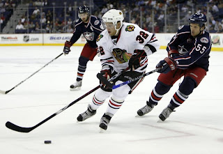
The white road jerseys feature spaced black-red-black stripes around the elbows and the waist with black cuffs extending to the the wrist around the sleeves. The collar is red with black trim on the inside and the primary logo serves as the crest.
In The Details
The colors are different on the shoulder patch between the home and road sweaters. The same numbering and lettering style has been retained.
New & Old
There is hardly a difference at all between the two uniforms. The old design was simply adapted to the new EDGE cut. The one noticeable difference is in the collar, which now, like all new jerseys, features the NHL shield.
Standard FAQ
Numbers on the front? No.
Laces at the collar? No.
NHLToL Editorial by Chris
By now all of you must be aware of my aversion to the Blackhawks' logo and uniforms. It's just a personal preference thing. I don't see what's so special about it and why it's often been called the best uniform in all of sports. I don't think it's ugly by any means, but I don't understand it's allure. One thing is for sure, though. You always know when you're watching a Blackhawks game. But personally, I think you could do just as much better as worse with this one. It's not bad but it's not great either. Now go on, tell me how ridiculous I am for holding such an opinion. 3/5


Reader Comments (7)
"One thing is for sure, though. You always know when you're watching a Blackhawks game"
Isn't that the exact point of a uniform? That statement in and of itself is an explanation as to why the hawks, canadians, bruins, ect are routinely considered the best.
I'd actually go so far as to say that it's one of the least iconic logos of the Original 6. Their decision to leave the jersey unchanged gives it a 4 from me though
Another favorite of mine - I've always liked the Blackhawk and the arm patches - Didn't change at all and with the other Original 6 you can't go to far away from the original look
Chris, you're ridiculous!!! hahahaha...
Thanks for your blog, its great, I go read it everyday!! I pretty much agreed with your ratings up to this one though, this should get at least 4, its a classic. Too back the team stinks.
How anyone could call the Blackhawks jersey "average" is beyond me. Classic stripping (like all hockey jerseys should have), the best shoulder patches out there and the familiar profile of the Sauk war chief makes it the best jersey out there bar none! Any fan with a brain sees that tradition should force an end to the crappy new RBK jerseys. At lease the Hawks haven't given in that much!
I didn't see it mentioned here, so I figured I'd throw it out, I saw on another site it mentioned that the crest is larger on the road jersey than the home jerseys.
I can't believe they only got a 3/5. This is one of the best jerseys in the league. The logo is classic but it's the coolest and most interesting of the the Original 6. I love how the jerseys are classic and traditional, yet interesting. You look at them and you think of the Native American tribes in the 18th and 19th century. But you also think about tradition and a classic hockey uniform. It's hard to do both of those, but they hit it right on the money.