Third Jersey Concepts
 Tuesday · Nov 6 · 2007 | 1:24 PM PST
  16 Comments
 In honor of the new Third Jersey Logo Tournament, I've got a fitting theme for today's concept art post. Check it out.
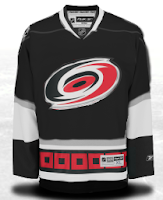
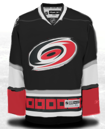
One cool suggestion for a Hurricanes alternate sweater could be achieved by going all black. I say change the black sweater cuffs to red and you've got yourself a winner. As for the Habs, this may not be perfect, but it's pretty damn close. I'm a big fan of this design. I'm curious to see what it would look like on the ice.
But back to black third jerseys, consider these.
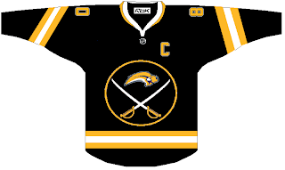
I actually like this. But I was a big fan of the black and red days of the Sabres. They never looked better — especially in those red third jerseys.
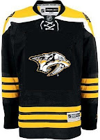
And what about the Predators? Obviously, this design was created entirely based off of the Bruins' new sweaters, but it's not bad. I sort of like the 3D sabre-toothed tiger head, myself. But my preferences have never really been on par with most people. And I'm okay with that.
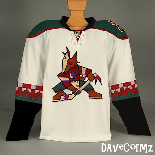
Finally, based off the idea of teams going with a retro look for alternate jerseys, how about something like this for Phoenix?
It's not like I hate the current look of the Coyotes, but I always thought they looked awesome in brick red and green. You have to admit, though, this jersey is pretty sharp looking.
But you probably disagree with me about something. Tell me about it below in the comments.
UPDATE (6:36 PM): Well our lovely designer Michaela got right on it with my suggestion to add red to her Canes concept above. Check it out.
I think it looks great with that small touch. Thoughts on that?



Reader Comments (16)
You just can't do that to the Canadiens jersey. I would prefer an all blue jersey. The half & half look just would not work for me. how about take the look of the old white jersey. witht the strips around the middle. Have the stripes red and white on the blue jersey. I have to agree with you on Buffalo, I too liked the black, white an red look.
Whoa re you kidding with these? They're all terrible, with exception to maybe the throwback Arizona jersey.
Drew, what's wrong with the Canes idea (especially if that extra red is added like Chris suggests)?
"You have to admit, though, this jersey is pretty sharp looking."
Um, no, I really don't have to admit that. Anything with that retarded logo and/or a checkerboard pattern looks horrible.
And for the last time, the Sabres wear blue and gold. During the red and black years, they were just some random NHL team that happened to play in Buffalo.
The Canes I can see working. Red and black is hard to screw up.
The rest... ugh... no.
I kinda like the Preds concept, but like you said, with the Alternate logo rather than the primary.
Not so sure about the Habs, my belief is, if ya got something that works, why change it?
If Montreal uses anything for a third jersey it should be the white one with the blue horizontal stripe under the logo (40s? throwback). Hell, they should have made that their standard away jersey.
That sabres jeresy is horrible... how come all of the sabres concepts on this site suck?
the canes 3rd concept is awsome, exept you need to have the completly unnecessary white shoulder piping.
I think a montreal 3rd should have the red to blue color fade like vancouver did with the orcas.
I think the Canes might look better in black than red. That one's pretty good!
I actually like the Habs jersey except for the color of the collar. The top blue line on the collar should be changed to red.
I echo Dave in Rocha's comment about the Phoenix jerseys. That is one of the worst logos ever. And the checkerboard pattern just puts it into laughable territory.
Is black-and-gold becoming the new red-and-black?
For the Canadiens I think it would be better if it was full blue sweater with a red and white collar and red and white horizontal stripe also i would put and alternate shoulder patch logo with a Red Maple Leafs with a white fleur-de-Lys inside. The fleur-de-lys will have the same height as the maple leaf but since the Fleur-de-Lys is narrower than the Maple Leaf it will fit perfectly.
it seems that teams like to go with black as their third jersey colour.
If they do the Canes jersey in black (which I've been waiting on since they came into the league and took over my hometown's AHL team at the time), they need to put the secondary logo on the front of the jersey.