Canucks Fans Ponder New Logo, Uniforms
 Wednesday · Jul 11 · 2007 | 11:27 AM PDT
  5 Comments
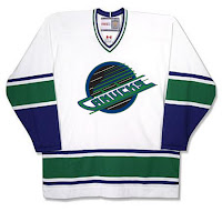
That's pretty interesting, right? There are rumors — likely started by fans — that the new Canucks uniforms will be a version of the orca logo that currently dons their sweaters. This version will revert to the team's original colors of blue and green. Just so you know, these are not actual photos and should be taken with a grain of salt. But I thought they'd be worth posting for anyone who's interested.
But wait, there's more.
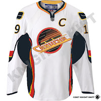
 This funny design comes from someone who wondered what the '80s red, yellow and black logo would look like in the original Canucks colors. Well as you can see, there's nothing that can make that logo look good.
Still, I'm not a fan of the orca logo as it relates to the team. As a logo on its own, it's excellent. I love it. But for a team called the Canucks, its like how the Sabres logo has nothing more than a buffalo in it. I just don't understand these things.
 And then there's this gem. It's basically a what-if similar to the jersey above except that it uses the actual colors for that logo. I'm not really a fan but I am amused by the classic stick-in-rink logo on the shoulder in those colors. Still, no way. It's terrible.
And of course as always, feel free to comment below with your thoughts on this or anything else. I'll have more to come shortly.


Reader Comments (5)
Wow,
Thanks to the person that did the skating Canucks logo in the blue and green vintage colors. Now that is sharp!!. I actually thought about this combination years ago and wondered how it would look together, so now I see. Some may disagree but that would be the coolest Canucks jersey ever!
idk where else i can post this but go to here to see possible pens jerseys http://forums.carolinahurricanes.com/index.php?showtopic=8413&pid=105572&st=100&#entry105572
Thanks for the Penguins (and Red Wings) jersey links. I'll post them tomorrow as future possibilities. You guys are awesome for sending stuff in!
Found new canucks jersey!http://thecanucksreport.blogspot.com/2007/07/possible-new-uniforms.html
is it weird that i like the skate one at the bottom?
i like the circular aspects...