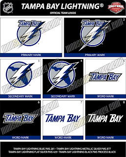
Possible New Lightning Logo?
 Friday · Jul 13 · 2007 | 1:48 PM PDT
  11 Comments
If you thought the San Jose Sharks logo I just posted was bad, you ain't seen nothing yet. This gem was posted on the same web site and I just saw it on Boltsmag and needed to post it here.
It's not the best I've ever seen. The city is still there. See that one there labeled "secondary mark" underneath? Love that one! Put it on the front of the jersey! Anyway, there's no official word from the team yet so this may or may not be the real deal. I suppose we'll find out for sure sometime this summer.
Leave your comments below and let us all know what you think.
UPDATE (6:44 PM): According to Tampa Trib Lightning beat writer Erik Erlendsson, the Lightning will unveil their new logo and uniforms at a "fan festival" on August 25. This is the first I'm hearing of an actual date. Incidentally, Erik wrote that he knows of the leaked logos I posted earlier and seems to believe they are in fact the real deal. When asked, the Lightning would neither confirm nor deny their veracity. Regardless, we should know for sure 43 days from now.


Reader Comments (11)
The new lightning logo is an atrocity and unfortunately, real. Our ad agency took a stab at one and submitted it to them for free. Too late I am afraid; but you can check it out here:
http://web.mac.com/rosenes/iWeb/Site/Welcome.html
Very cool, James! Speaking as a lifelong Lightning fan, I'm not sure how that would stand up as a primary logo, but I could totally see that as an awesome shoulder patch. Well done! That image will get its own post later today. Thanks!
Hey Chris,
We did another lightning logo. Take a look:
http://web.mac.com/rosenes/iWeb/Site/Welcome%202.html
it was time for tampa to update the logo. but all i can think aboot when i see this is "the flash".
TAMPA BAY FLASH! to be exact.
everyone says the sabres logo is a "sea slug" but 2 me it looks like a limp penis with jaundice.
I remember when the Lightning and Mighty Ducks entered the league together. Disney's top notch graphic design showed how you could make something cool out of a wimpy name, while the Lightning showed how, well...yuck. The Lightning have one of the best names in sports when it comes to designing a logo, eventually someone in TB's mangement will realize that and make millions selling merchandise. But, if this is their "new" logo, it's obviuos they still haven't figured that out. Yuck Part Deux.
I'm a life-long Lightning fan and I think the organization has squandered a real opportunity here. First, it's hardly that different from the previous logo. Second, it doesn't get to the ferocity of lightning itself--in other words, it's a bit cartoon-ish. Pitiful, and a waste of money for the organization.
Actually the Lightning came in with the Ottawa Senators.
Tony the Lightning entered the League with Ottawa, not Anaheim. As for my thoughts on the Bolts logo, I love it. Not saying it was a time for change, but they didn't screw it up at all. If everyone wants to piss and moan about it, well I don't believe anyone will put a gun to their head to buy any of the merchandise. And if they want to complain this much, then I wonder if they like the team for the team, or the team for the look. Herb brooks once said that you play for the name on the front, not the back. Well, he didn't mean the logo. He meant the team.
Here is a pic of a hat of what may be the new Lightning logo. It appears to be the one that was leaked so long ago.
http://img341.imageshack.us/img341/144/94026291gq5.jpg
Got it on CCSLC.
i think they wanted to stick with the sam look just a bit updated, and thats what they did.
I must say as a lightning fan it would be nice to see a re-design but I dont think thats what they had in mind.
We just got new owners though and who knows this logo may only last a year or two
The Leaf logo you said looks familiar resembles the current Jets logo.