Wednesday
Jul252007
Possible New Penguins Uniforms?
 Wednesday · Jul 25 · 2007 | 10:48 AM PDT
  35 Comments
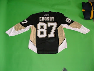
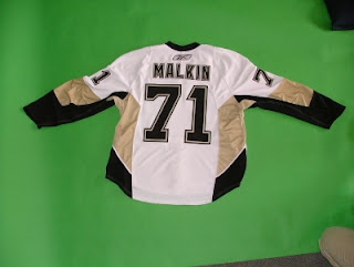
 This is my big news of the day! It would appear that the new Rbk EDGE uniforms of the Pittsburgh Penguins have leaked. We seem to be looking at actual photos of the home and road jerseys of the Pens.
I wish I knew who took them, but that person would probably have hell to pay if anyone knew who it was. The home jersey appears to be Sidney Crosby's while Evgeni Malkin's is the road sweater.
What do you think? Real? Not real? Good? Bad?


Reader Comments (35)
I have heard from a reputable source that the Pens jersey will be made public on September 4th
Bring back the black and gold jerseys from the late eighties or the early 90's when they won the cups!!! they'd look classy plus they wouldn't fall into the trap that too many teams already have with these new jerseys.
I want to see the front because i think those are going to look sick!
i like the jerseys...i know someone that works for the pens and they confirmed that these are the real jerseys.
I wish the Penguins would go back to the yellow instead of that lame flat brownish-gold color. Yellow stands out much better and as the Bruins showed with their new RBK Edge jersey, black and yellow can make a very nice-looking combination. The gold just looks gaudy to me. I don't like the penguin logo either, maybe they will get rid of it? The old Mario-period jerseys were so much sweeter than these newer-generation sweaters. I wouldn't buy one for myself.
I don't like the new changes either, with the added white and gold. I like the current jerseys, and it's a shame they're coming out with new ones because of the greedy pen pushers at RBK. The only new ones that I do like, really are Boston's. I wouldn't mind Pittsburgh going back to the original black and gold, keeping the same logo, and spicing uo the striping of the jersey. I wouldn't mind seeing this coming back as a 3rd jersey, either... Talk about cool, with MAF's pads....
http://cgi.ebay.com/MARIO-LEMIEUX-Pittsburgh-Penguins-1985-Vintage-Jersey_W0QQitemZ110163485027QQihZ001QQcategoryZ25001QQssPageNameZWDVWQQrdZ1QQcmdZViewItem#ebayphotohosting
It'd be sweet of they used the older gold jerseys and added a small touch of red in the logo (like the Buccos just did with their Red jerseys)...(maybe text, if tyhey used the older logo with the circle and "PITTSBURGH" around the Penguin. I like the Old school canucks color combo...
If these are the real deal, then I'm bummed out. The vegas gold was acceptable because it brought back the skaiting pengiun logo....but these new duds are hideous! Whoever designed the sweaters probably never watched a hockey game...there's no tradition...no soul...it just stinks!
Its sure does look real, but maybe they turned it backwards on purpous, to cover the fact that it isn't a RBK edge jersey (coverin the neck line).
a year ago we werent even sure we were going to have a team so they can wear pink and i wont care.... there always has to be something to complain about