Wednesday
Jul252007
Possible New Penguins Uniforms?
 Wednesday · Jul 25 · 2007 | 10:48 AM PDT
  35 Comments
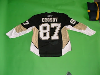
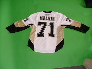
 This is my big news of the day! It would appear that the new Rbk EDGE uniforms of the Pittsburgh Penguins have leaked. We seem to be looking at actual photos of the home and road jerseys of the Pens.
I wish I knew who took them, but that person would probably have hell to pay if anyone knew who it was. The home jersey appears to be Sidney Crosby's while Evgeni Malkin's is the road sweater.
What do you think? Real? Not real? Good? Bad?


Reader Comments (35)
These definitely look like the real deal to me...to be honest with you i was really surprise that i found this...there okay..a little too much gold i think...im liking the home jersey tho...thats going to be a team to look out for this year, eh!!!
Tom
I've heard about these, and finally a look at the scan that the Pens had the original schmuck take down.
I imagine that these were originally posted on the Pens boards, but again have since been removed. Glad you could find them and share them with us.
No problem. I know most of these teams would rather not have this stuff posted on sites they own, but if it's out there, I think a lot of fans would be interested in seeing pictures of the new uniforms. Glad to hear you guys are enjoying the blog!
Unbelievable site, man.
Nothing is more gratifying than finding exactly what you're looking for when you do a google search.
FYI -- searched "RBK edge jerseys"
I hate dropping our blog in your comments.
I wouldn't have done so, but I couldn't find your e-mail address.
We're hyping your site big-time on our Penguin blog tonight.
We may come off dissing you a bit because you let our Penguin get annihilated in every matchup.
C'est la vie. Peace.
P.S.
The Penguins were named so because of alliteration and PENguins/PENnsylvania.
Apologies on that score, brother. I don't mean anything by it but I guess you know that. It's not that I believe it to be a terrible logo — though you wouldn't know it based on those write-ups.
I'll be making the tournament interactive soon, so get all your people to vote and put us all in our place.
Anyhow, I thoroughly appreciate the shoutout, and for your favor, I'll post a link to your blog here.
where did you find these logos?
the colored backgrounds and the glazed look?
thanks.
Find them? Ha! Fella, I made them!
No, but seriously, props to http://www.chriscreamer.com/index.php" REL="nofollow">Chris Creamer's Sports Logos web site for the original artwork. I just sized them and added some effects. Nothing much, really. I'm glad you like them!
can we have your permission to use them?
with full props, of course.
Please do! I'd be more than flattered.
I notice the lack of the new penguin logo on the shoulders...
Maybe they will remove it?
These ones looks like real things. I'd be very upset to own a pittsburgh jersey if these ones are real.
By the way this site is becoming a real blast. I was thinking last night, tired of visiting all the teams sites day after day searching for annoncements of new jerseys, that a counter or a site with all the info concerning the change in uniforms would be so great.
And the next day I found that site with the exactly same counter, and all the new info on it! Even a logo tournament! KUDOS.
And when a complete uniform tournament? What about vintage?
First of all, thanks for the kind words and dude, I'm way ahead of you. Once this marathon "introductory" tournament is over with on August 10, we're just gonna go nuts with it and you guys are going to be able to pick your favorites in so many different categories. Uniforms, vintage, you name it. In fact, if you think of something I haven't thought of, we'll do that too.
I'm really happy people like yourself are enjoying this blog. I was just going to make it for me since I didn't think anybody else cared about this stuff. Thanks for making it worthwhile!
P.S. - You can leave the web searching to me. I'm all over it.
disgusting make the new material with the same design as last year. ridiculous. way too much gold if they wear these then there onna look like vegas showgirls on ice
Seems like most of you don't care for the Vegas gold. Did you guys like the yellow better? Would you like to see the Pens return to that color scheme?
For me the Las Vegas gold was a welcome addition. When I look closely at the evolution of the Pittsburgh Penguins, I see this change like a good one.
I don't want a return in time for them. Sid the kid is for me bound to this gold. Like Mario was bound to the old yellow.
Pittsburgh seems to have a lot of problems dealing with their uniforms. Not in the same league of Vancouver, but still.
These new, bright colors appears to be aimed to a new audience. Look at Nashville, Ducks, Wild, etc.
A logo is one thing, the jersey is another, and the uniform is another. Sometime a little nuance can do evething.
I want to see them go back to the old gold. I like it better as a color, and obviously it fits in with the color schemes of the other Pgh. sports teams and the city crest. And vegas gold is a trendy color. Not nearly as overdone as teal or purple, but getting there. Plus, when the Penguins flirted with Vegas to get Rendell to cough up the dough, I was briefly worried the color name was a prediction of their future.
Great blog.
I don't like the new designs. This new reebok edge crap isn't even a hockey jersey anymore. It looks like a long-sleeve soccer jersey to me.
God, all of these new uniforms are awful (except for Boston's). As a Penguin fan, I'm going to need to down a bottle of Pepto before watching each game - these things are atrocious... if they're real.
I think it's funny how everyone loves the retro/vintage looks right up until we get to the jerseys. I don't think Bobby Orr's jersey was ever as loose on him as what players have been wearing the past couple decades. And style is cyclical and change inevitable.
What's interesting about this sweeping change the league is going with is how fan reaction has been so mixed. Some hate it. Some love it. Some are indifferent. Personally, I like it.
Thanks for the comments, guys!
the fan reaction is really mixed right now but once we see all the jerseys and get some games in with them the fans will start to get use to them and not hate them or be so against em as they are now but who knows some my be so ugly that the fans attitude dosnt change
I don't get it why the Penguins cannot just leave their jersey alone. Last year's was just fine as it is. The lettering and numbering... good. The crest logo... good. Using the previous primary logo on the shoulders... good, too. Colors... just fine. So why would these have to have those side panels in white and Las Vegas Gold added? It's so unnecessary.
I really do not like these jerseys. I wish they would go back to the Cup-era jersey style. MAF's pads would look sweet with those jerseys.
Great site man, just found it but I will def. be adding it to my favorites.
I hate the new look. I think what they had last year was MUCH MUCH better. It's ugly and hate what the penguin looks like. but that's what I think.
I almost cried when i saw these. Whoever designd these should be ashamed
Now that the Sens unis are out and look exactly like these, I'm thinking these are fake. 71 and 87 are the only numbers that would fit on that jersey. Draw an 88 on there and it spills of onto the side panelling. Can't be real...unless it is.
If this is what the new jersey design looks like, then I guess that I'll be hitting up Ebay for the "old" jerseys. The cut isn't that big of a deal; however, the design just looks horrible. It really does look like a show-girl outfit.