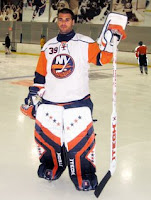
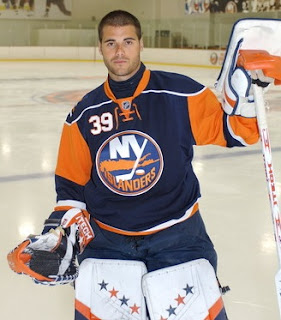
Islanders Unveil New Uniforms!
 Thursday · Aug 16 · 2007 | 1:13 PM PDT
  29 Comments
 Today, the New York Islanders made their new Rbk EDGE uniforms official. We got a first look from Newsday yesterday.
Here is Isles goalie Rick DiPietro donning the blue home threads for the cameras.
We've also got Brendan Witt posing in the jersey alongside a surf board. I'm not really sure what I should be looking at here. Jersey or surf board? That reminds me, did any of you watch "John From Cincinnati" on HBO this summer? I know it's not hockey related but the surf board reminded me. Weird show but it was awesome.
 Anyway, moving right along here. If you needed a reminder of what the road jersey looks like. See left.
By the way, I'm adding these photos and more to the great big Rbk EDGE uniform photo gallery. If you've got any photos that I don't that warrant being in this gallery, feel free to send them along. The more the merrier, I always say.
Finally, huge thanks to all the people who sent in pictures and links to me. You guys are awesome and you're why this site works so well! Thank you!


Reader Comments (29)
I'm no Isles fan, but I must say they look pretty good.
i saw the cell phone pic and i never thought they were that bad but now i see what everyone ment by how ugly they are
the look better than i thought they would. but still ugly. The isle need an upgrade.
The only problem I have with the uniforms is the number on the front... but aside from that, very nice.
Oh, and... Haha, sorry to say... John from Cincinnati was cancelled...
I know it. So sad. That's why I was referring to it in the past tense. Although I can't say I was entirely disappointed by the ending. It was a quality show, if you ask me. (Not that anyone did.)
Thanks for the comments!
It looks like in the Brendan Witt photo there are numbers on the sleeve, but not in the DiPietro photo...
As a Sabres fan, I dig the front numbers. But I think they should be orange on the blue jerseys. The white looks awkward.
As long as the fisherman is long gone, that's what's important.
WOW those are hideous. I feel sorry for any player or fan who has to pull one of those over there head and look in a mirror or just know the shame of having to wear or cheer for one of those. It's all caught in a time warp its trying to be vintage and futuristic at the same time. What is with those awful numbers in the front. I'm a purist that alows for progession but that is just wrong. You know they won't be the only other team to do it. They don't belong there. What happens if you have a Stanley Cup Finals patch or an anniversary patch or something where does that go now? On your socks? The Detroit Captain C on the right side is bad enough do we really need numbers on the front? Wow. Those are amazingly bad.
As each team starts to produce their new uniforms I am struck at the sameness of it all. The piping, the laces and the oh so misplaced NHL logo on the collar -- much like the NFL does. I would much rather have different companies design different team uniforms. With RBK designing each and every uniform the monotony becomes numbing.
This mad rush to be modern and updated puzzling. Do you see the Yankees or the Red Sox trying to create a new brand image?
Unfortunately these uniforms will not address the real problems in the NHL: too many teams, a bland product and ... too much Gary Bettman.
Look at the Jersey Witt is wearing -- can you say BUSY. The huge oversized logo, the A on the left the number on the right, the strings and the NHL logo on the collar. It makes me dizzy just looking at it.
As for the tight fitting sweaters themselves I think they look ridiculous. When we first saw them at the All Star game with all the equipment bulging out from underneath it looked like the equipment manager left the sweaters in the wash for too long.
There is nothing like a hockey sweater flapping in the back as a winger streaks down the ice. All that is lost now.
I still like 'em, except for the "A" on Witt's jersey is bigger than the numbers. And if there are numbers on the sleeves, why do you need it on the chest?
I was under the impression that the NHL would go back to white jerseys at home? Perhaps I heard wrong?
Ouffff the last comments are KINGS.
For the teams that have numbers on the front (i.e. Buffalo and the Isles), where are they going to put the Stanley Cup patch for if and when they make the SC Finals?
I guess they could put them on the shoulder a la the '94 Rangers, but then they would have to cover up the designs on their shoulders too. Seems like a bit of an oversight on the part of the jersey designers.
Good thing we won't have to worry about Buffalo or the Isles making the Cup finals, huh?
Yep, and it looks like the owners and managers of those teams (or whoever approved the designs) have conceded that fact too. Subconsciously, they don't think their team will ever get there either. Can you say "Freudian slip"?
These are just lame.that piping outlining the shoulders is just in the way and has no purpose at all.I have to say that the Isles have done a horrible job on these. the logo is classic, but the jersey sucks!! what a let down!!
I don't like that the sleeves are a different color. On the blue jersey, see how they've outlined shoulder bars in white? That whole shoulder bar area should be a contrasting color, either orange outlined in white, or white outlined in orange, and leave the sleeves blue.
I've always contended that contrasting shoulder bars make a jersey look so much better, a la Bruins in the early 70's, or the early Capitals jersey.
LOL, UGLY... Not the worst but i'd be pissed if i was an isles fan
whats with every team taking after the Sabres with the whole number on the front thing?, yeah teams did that way back in the day but, just because the Sabres did it again, they had to do it, but, nice jerseys nonetheless!
ugly with the number on front
The blue on the top of the shoulders looks awkward..but it does look pretty nice.
Just to clear up information from a previous post from before, the Islanders only put the four stripes secondary logo on one shoulder only. That means the shoulder on the other side has nothing on it, which will allow for a spot for a patch to be put on. So all in all management did NOT make a Freudian slip. A Stanley Cup patch could be put on the shoulder that has nothing on it. As an Islander fan I like the jersey. I think it would have been awesome if they did not have the big orange stripe at the top of the sleeves.
These things are pretty ugly... but, hey, it could be worse. At least Islander fans won't have the urge to throw fish sticks, or be reaching for the barf bag because of motion sickness (wavy numbers and nameplates? Worst. Idea. Ever.).
Oh, and can we lose the laces already? They haven't served a functional purpose since wool sweaters were phased out, and I, for one, think they look ugly.
the logo is too big.