Wednesday
Aug152007
Newsday Makes Isles Unis Official
 Wednesday · Aug 15 · 2007 | 11:23 PM PDT
  29 Comments
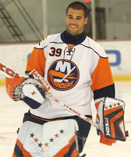
 I'm still trying to gather more information, but apparently, Newsday posted a photo yesterday of Rick DiPietro in the New York Islanders' new road jersey.
Even though it doesn't come from the team directly, it's safe to say we can confirm this as the real deal. I'm adding it to the sidebar, making the Isles the ninth team to show off their new duds. If you guys find anymore info or photos, please let me know.
Thanks to the guys that emailed me initially on this photo.
Oh, and yikes. What is going on there? The weird stripes around the shoulders... the sleeves in a different color. I'd definitely like to see some more angles of that jersey. Thoughts?


Reader Comments (29)
Not bad. I wonder how many other teams are going to have the numbers on the front. Sabres were first of course, so that's 2 officially.
At first, I thought they looked dumb, but they are kinda growing on me.
I actually like that, it's got a classy look with a modern twist. At least they didn't overdo it like the Panthers.
looks like they got rid of the numbers on the sleeves
Die hard Isles fan here, and I can't say I'm one bit happy about this at all. I heard all the rumors weeks ago about the team adopting a new jersey look, so I knew it was coming, but it still hurts.
I'll admit, it could have been worse, but what's with the silly piping at the top? And why have the whole sleeves in different colors? The laces on any of the current NHL jerseys are just stupid. Laces have no place on a modern hockey jersey.
I'm not happy about this at all. I'm hoping there is some outcry and perhaps they go back to the classic that their regular old style jersey is next season.
Yes, bitter.
i don't see how anyone can complain about this jersey, yeah it may not be the sharpest thing to hit the ice this season but i don't think that it'll be the worst either
personally i think it looks pretty kool and i'd happy if the nucks decided to throw something like this on their backs
To answer your question, I heard that the four little stripes on the shoulder represent the four Stanley Cups won by the Isles at the beginning of th 80's. The last jersey have them too.
The new jersey for me is not too bad. Like Kyle said, he's not the better and not the worst. He's looking ok for me. Maybe too much orange on the arms. In the jerseys, I don't like when there's too much yellow or orange. It's look great for stripes but not for principal colors.
WAY better than I thought it would be from the leak photos. I actually kinda like it.
Official via the team website:
http://islanders.nhl.com/team/app/?service=page&page=NewsPage&articleid=336012
The orange sleeves are too similar to the old Flyers home jerseys.
there are numbers on the sleeves go here http://cdn.nhl.com/islanders/images/upload/2007/08/jersey_3_article.jpg
sorry that last one didnt work
http://cdn.nhl.com/islanders/images/upload/2007/08/jersey_3_article.jpg
just paste that in to your address bar it shows you the sleeve numbers
i give up
a little off topic, but remember DiPietro's brown leather pads that he wore the first half of the '05-06 season? he should go back to those.
If the numbers on the home jersey are on the left shoulder will the C be on the right?
The stripes on the shoulder is the Isles' alternative logo.
PS: I like the new jersey =)
The pattern of the jerseys kind of remind me of the ones the Pens wore during the Cup years, so naturally, I'm a fan.
The only thing I don't like is the blue line around the shoulders - but I can deal with it.
These are definitely the best jerseys the Isles have ever worn.
The orange on the sleeves should have been better blue than orange and vice-versa. And I don't like the numbers in front of the jersey. It don't have their place here. There's too much things in front with them. Did someone found a pic of the home uniforms?
Maybe somebodies will discuss my taste for the uniforms (a lot of people hated him) but I loved the fisherman logo and uniforms who has been worn in the middle of the 90's. lolol
The colors where really beautiful.
they're pretty nice. I have more pictures up on my blog (click my name) and am looking for more. It's official now, by the way. Great site!
It's better than I thought it would be. I hope they keep the numbers of the arms though. It'd look really weird without that.
UniWatchblog.com has both home & road photos, and also other angles.
Would not be so bad if they removed the shoulder piping and the front numbers...
Hate the Islanders and these jerseys are horrible, but the only thing you can say, is they don't look like every other new uni that was put out. Every design has looked near identical, this is different then those.
The new jerseys are on the official website they have been officially unvieled today!
Looks like a lot of teams are going with the string on the coloars look too....
the narrow stripe going around the shoulders is not something new. a couple years ago reebok re-did all of the CFL jerseys too, and they all have that narrow line around the shoulders. it took some getting used to. so really, the nhl is the second north american league to do a league-wide jersey change.