Ducks Unveil New Uniforms!
 Thursday · Sep 13 · 2007 | 11:57 PM PDT
  10 Comments
 Even though they were already on the web site, I'm calling this the official unveiling as the Anaheim Ducks wore their new Rbk EDGE uniforms on the ice for the first time in a preseason game against the Los Angeles Kings. That game was also our first look at two teams in action wearing the new threads.
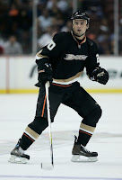
 Here you see Maxim Kondratiev sporting the new look on the ice. He scored a power play goal for the Ducks in the league's first exhibition game of the season.
Looks very much the same as last year's jerseys. I still can't get over the wordmark for the logo. I like the jerseys. I think they're great. But really, get rid of the "ucks" and just use the "D" as your logo, all right?
But that's not all. I've still got more pictures from last night's opener.
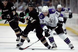
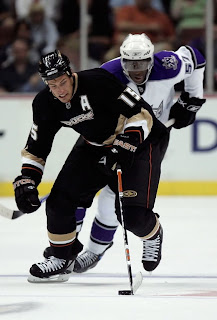
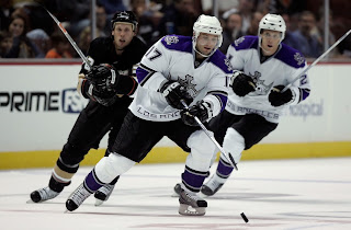
I hope no one is complaining anymore. These new Reebok uniforms really do look awesome on the ice. I know it was hard to tell since they were all draped over mannequins. We're used to seeing them in action. Now we are and it's quite a sight.
My one beef is the oversized "C" and "A" on the captains' sweaters. I don't really think they need to be that big. In the Ducks' case, it sort of overtakes the logo on the front of the sweater.
These action photos will also be a good chance for us to keep a tally of which teams are wearing the numbers on the front as well. As of yet, we still don't know how many teams are doing that.
By the way, later on today, I'll be adding these photos to the Rbk EDGE gallery. I'll try to do that for as many teams as I can find photos for as we go through the preseason and beginning of the regular season.


Reader Comments (10)
i think the jersey looks much better in game play then alone. i do agree that they need to change the size of the "C" and "A". But its not as ugly as all these people are saying. Better than half the jerseys out there.
Looks like the new jerseys look pretty sharp out on the ice. It'll take some time for me to get used to seeing the more streamlined look as opposed to the baggy style jerseys of the past. I think it'll also be interesting to see what happens during fights this upcoming season seeing as how a lot of players used the "grab the other guy's jersey and yank it over his head" technique. Now there isn't really much extra fabric to grab on to.
Chris,
I think there is more of a beef with the styling...we have yet to see teams out there skate around with those wierd socks and vertical piping...And also you notice some guys still wear tape on their socks? I remember RBK saying the new look and equipment was going to eliminate or reduce that need all together...
Either way, both teams look good and Anaheim would be better suited having a bid "D" duck print as a logo.
Why is the Ducks' logo so small on their sweaters? All of the other team's logos are now MASSIVE, but it looks like the Ducks' logo shrunk.
I agree the "logo" is tiny! it looks funny
and Tape on the players socks is just a personal comfort thing for players, i play hockey and i dont need to wear tape but i do cuz i feel more comfortable with it
the "ucks" needs to go. just use the web D foot. but its still a 1000% improvment over the "mighty ducks" which was just embarrassing for the nhl and its fans. thank god that era is over. i was hyped when they announced they were dropping the mighty. now the nhl just needs to get rid of the "buffaslug" and the nashville sabretooth tiger logo. top two ugliest in the league.
Still look pretty bad on the ice...
It looks like all the players are wrapped up way too tightly...
Overall, the Anaheim Ducks uniform change from the originals is a major disappointment. The only element I like about them is the current nameplate font. That's about it.
Whether it was last year's new uniform or the new RBK Edge VERY SUBTLE modifications (and I mean very subtle), they lack a real good crest logo and overall winning look.
Sure, some Ducks fans like them and they are entitled to. But if the organization wanted to change anything, they could've had the new colors with an updated striping pattern very close to the original jersey. It would've been nice if the Ducks kept the original numbering font, too.
I disagree with pepz that thankfully the "Disney era" is over for the organization, but the team could've at least kept the mask logo for the crest.
With these jerseys, if there's not to be the mask logo we all remember, then at least put the webbed foot D on there.
The one noticable change from last year is obviously the collar. You'd swear from afar it looks like the Ducks players are wearing necklaces around their necks with the NHL logo functioning as a medallion.
These are dumb uni's for a team that just won the Cup and in my opinion will probably not exist in 5 years and probably shouldn't have existed in the first place if it wasn't for the money grab. Greater LA can only support 1 NHL team at the best.
well said paul i was about to say that